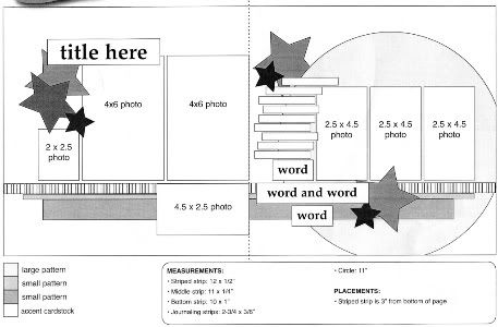
The sketch that I'm using, from Sketches for Scrapbooking, Volume 6, as a starting point for each of my layouts this week.
Layout #3 - "Taking the Wheel"
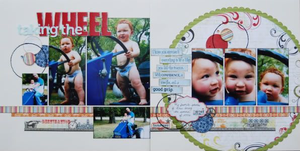
Supply List - Cardstock: Bazzill; Patterned paper, alphabets, die cuts, and sticker: Pink Paislee; Metal accent: Tim Holtz; Jewels: KaiserCraft
These just might be my most favorite pictures of Drew. Ever. Those chubby legs, the cute smile and expressions on his face, his goofy personality captured, I just love these pictures. And, believe it or not, this is not the first time I have made a layout with these pictures. One of my first layouts was with these pictures and it drives me crazy. I love the pictures and the layout just didn't seem to do them justice. I have no problems with going back and re-scrapping pictures I've done before. I didn't want to look at a layout with these adorable pictures and cringe, I wanted to look at the layout with a smile. My opinion, if it bugs you, redo it!
• Variation #1 - I really wanted my favorite photo of the group to stand out so to do this I printed it as a 5 x 7. The larger size makes it more noticeable and it easily fit in with the sketch. Because I had 1" more width that the suggested 4 x 6, I cut 1" off the width of the second suggested 4 x 6 on the left. This way I still have the same 8" width with my photos and I don't have the smaller photo on the far left too close to the edge of the layout.
• Variation #2 - I used circles punched from patterned paper in place of the suggested stars on the sketch. I also added some jewels and a stitched circle. One group of the circles (the top right) aren't in the exact placement as suggested on the sketch but as I always say, I look at the sketch as just a suggestion. For this particular layout the circles below the journaling and above the journaling ended up right above and below each other and I wasn't happy with the way it looked. I thought it looked better to move the top group over to the right. To me it looked like if I would have left the top group right above the journaling strips it was kind of leaving the pictures on the right page out. Sometimes things we add to our layouts can mean making some adjustments somewhere else. It's all about what looks right to you!
• Variation #3 - One thing that can be kind of tricky with this sketch is the journaling. I think that it is important to fill that space provided for the journaling. Not doing so can leave some weird gaps and holes on the page. Let's say you don't have as much to journal about and don't know how to fill that space. My solution was to use a large font size and cut my journaling strips a little larger than usual. What space I didn't fill in at the bottom, I added some circles to.
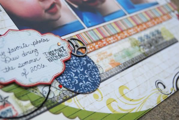
• Variation #3 - I used a journaling die cut in place of the word strips on the sketch. It's still the same concept, words in that place, it's just a different look.
• Variation #4 - Instead of using a patterned paper for the bottom strip I used a clear border sticker. It was the perfect width and added some fun designs to the page. Substituting strips with border stickers, border punched paper, or anything that is in a line is a great way to change the look of the sketch.
Right Side of the Sketch
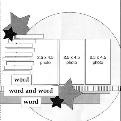
I'm usually not a one-page scrapbooker but sometimes, like the layout below, a one-page is the best option. Plus we've had a lot of people ask if our sketches were usable for one-page layouts. The sketch is perfect for that purpose!
Layout #4 - "Now You Look at the Camera?"
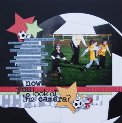
Supply List - Cardstock: Bazzill; Patterned paper: Reminisce, Creative Imaginations, October Afternoon, and My Mind's Eye; Alphabet: Prima and Doodlebug
• Variation #1 - This picture makes me laugh every time I see it. In a massive sea of soccer pictures I found this one of Drew running and smiling at the camera. Since that one picture was all I needed to tell the story I went with one 5 x 7 in place of the three 2 1/2 x 4 1/2 photos on the sketch. It's a smaller width but I didn't worry about that part.
Keep in mind that this would also work on the two-page version of the sketch. A 5 x 7 would look great on the right page of a two-page layout.
• Variation #2 - Because the width of the photo was smaller I made my journaling strips a little longer to take up some of the space. I like to try and have the same margins on the left and right of the page. Obviously that isn't a "have to" kind of rule but it does help to create a nice, balanced look to the layout. Making the journaling strips a little longer made it possible for me to have those equal margins.
• Variation #3 - Since this side of the sketch didn't have the title I had to find a place for it. I ended up using the word strips at the bottom as my title. There were already large words in that area so why not turn it into the title? A title would have also worked great along the top of the photo.
• Variation #4 - I used a torn strip of patterned paper in place of the bottom straight edge strip of patterned paper. It's a very simple variation but still something you can do to change the look of a sketch.
Yesterday's sketch book winner is...
Erica Hettwer said...
Love these layouts! Quick question, how do you test out your titles?
and a little surprise giveaway...The car, road sign and arrow punch out sheet, some of the patterned papers, and Doodlebug alphabet stickers that I used on my "Reckless Driver" layout from yesterday goes to...
Micki said...
Why didn't I find these while I lived in KC and could visit the store in Springfield often? :) I'll be ordering the older books asap; need some much-needed guidance to make up for the lack of scrapping the last 3+ years. Saw the links on 2p and these are worthy of all the buzz - great style!!
Email me at alidavis1919@hotmail.com with your address. Erica, you'll need to let me know which volume (1-6) you would like. Keep in mind that Volume 6 won't be in our hands until around the end of June. :)
Day #2 means it's a new day to win a copy of Sketches for Scrapbooking (volume choice is all yours!)

76 comments:
I love all your sketches, but especially how you adapted this to a one-pager :)
Wow your layout is amazing! I just love this sketch.
Another great job with a sketch! I'm usually a two page scrapper, so I LOVE your sketches, but I also like the fact that they are versatile enough to inspire one page layouts too!
These are great layouts again!! I don't know how you do it everytime. How do you always find the perfect paper and it all matches and looks good together. Drew is so cute and small in these pictures, I love chubby legs on babies too. I also redo layouts years later if I'm not happy with them, especially on my favoirte pictures. I also will scrap more then one layout of some of my favorites just because I love them. I never knew Drew played soccer, we are soccer fans here at my house so I LOVE LOVE this one page layout. I love how you adapted it all to fit and it looks great. Tearing the paper is always fun and I like the title at the bottom for a change too. You did it again Allison I'm impressed and going to be scrapbooking along side your sketch again today. Congrats to the winners and how nice to have two layouts again and two winners. You ROCK allison.
I just love your sketches and am going to see if my lss will carry them!
Love how you show how versatile these sketches are! Great job!
I just love your variations on a sketch. And funny that you choose to highlight a sports pictures with someone looking at the camera, I try and always find ones where they are not looking straight at me.
I love how you used a 5x7 to draw attention to your favorite photo. Many times I want to make my favorite photo a little larger but am not sure it will fit in my layout. You have still included lots of photos and made it so easy...that's why I love your Sketches books!
My comment is the same as Dawn. How do you find the perfect paper for your layouts. They are papers I would not think to use (example-circle on "Taking the Wheel". Love your pages, love the sketch books and love how you are providing the way to adapt your layouts.
Linda from KS
Thank you for showing a 1-page adaptation of the sketch!
Thanks for giving us so many different looks today for this sketch just by changing the photo to 5 x 7 and making it a one page layout. I have some clear borders and didn't know what to do with them and how I know.
I'm one who believes to "Just do it" if it doesn't work out there is no LAW that states you can't redo it...if we sit and hope for the perfect LO to come to us all the time sometimes it will never come. Sometimes just doing it produces a fabulous LO to! :)
LOVE the LOs as always Ali!
I really like the title on layout #3! I don't ever think to over lap or layer my words/title, such a great look!
I love this sketch and your layouts. Thanks for detailing the variations you do....I tend to have tunnel vision with sketches and have a hard time changing them.
Beautiful layouts! Those chubby legs are too cute!
These are super cute!! Love how you incorporate cute embellishments into your pages!! The soccer page is adorable!
I love that this sketch lends itself to a one page LO very easily.
BTW I love Drew's chubbiness, all four of my kids had rolls upon rolls when they were babies.
Just found your blog via an online friend - amazing! Love what you have done with the 2 page layouts and your sketches are simply fantastic!
Love, Love, Love the one pager. Your sketches are so versital
I love the varying fonts that you use to create the titles. It really makes them pop.
That is a great idea to make the journaling a bit bigger to fill spots. Thanks for all the inspiration. I loved the one pager. The photos are so cute!
Amy S from Texas
Such cool layouts, Allison! You are so stinkin' talented! I've just been doing my POTD project, but you're definitely inspiring me to actually do some layouts. I'm so ready for school to be out so I can get started on some!
Love the 5x7 variation on the sketch-we have a ton a pictures from my son's 1st birthday photo shoot; in lots of sizes. I think I'm going to use that variation of the sketch to scrap some of the pictures.
Thanks so much for the inspiration!
I love how you changed the sketch to be a one page layout.
I've got a ton of soccer photos waiting to be scrapbooked...I'll definitely be scraplifted that soccer page! Thanks for including your supply list, makes it so much easier to find the gorgeous products you use.
I can't wait to pull out some pictures and try this sketch. I love to see all the options with your sketches!
Your layouts are such a time saver! Perfect for the busy mom scrapbooker :)
Love his chubby legs...too cute!
Love the one page variation of the sketch! Question though: In the original sketch you had a visual triangle of stars. In the one page layout the 3rd star grouping is lost. How do you know when a sketch/layout can stand on it's own w/o the visual triangle?
I love the circles and clear border sticker as well as the fun circle paper (I have a sheet of that in my stash as well LOL). I Don't normally scrap one pagers either, but this layout worked perfect for that:-)
Thanks for all the great tips. What an exciting week for us devoted followers! Thanks again for the adorable layout ideas!
I love sketch week. I'm a very literal when I use a sketch, so these variations really help me to look at sketches in a new way. Can't wait for tomorrow!
So love to see your interpretations of your sketches. Can't wait to get the DVD. I just got back some prom pics with a 5x7 of my beautiful daughter. Off to find some papers and embellishments!
Love the soccer lay-out - will use it for my grandkids - thanks!
I just stumbled into you blog this morning... I LOVE your sketches and layouts! Sketches always seem to have flowers placed on them. I have a boy and have a hard time figuring out how to embellish masculine pages. I know I don't have to use flowers where the flowers are placed on the sketch, but I have a hard time picturing something else in that spot, KWIM?... You do boy embellishing so beautifully! I've gotten some great embellishing ideas here for my pages! AND the sketches are fabulous!!!
Both layouts are incredible! I love that clear border sticker...I looked at those at SG but didn't realize that they were clear.
Love this layout. I awlways do 2 page layouts, so am loving these.
Terri, that would be awesome! We're pretty excited to start seeing them in other stores too! :)
Dawn and Linda, I always match my pictures to paper. I sit down with my photos and then go through my paper to find colors that are in the pictures. Sometimes I get lucky and a group matches perfectly but sometimes I have to mix up different brands. :)
Scrapthat, that is so, so true!
Renee, that is a great question. I had actually started to add a third group of stars so I would have that visual triangle but when it came down to it I just didn't think it needed it. I would say that I have a visual triangle 99% of the time but there are some cases where it just isn't needed. On the soccer page the title, stars, journaling, and the portion of the picture with Drew in it are all grouped together so of course that is where the eyes go. Since a visual triangle is used to "frame" what you want the viewer to see, I didn't need the right half of the photo to be that noticeable so the visual triangle wasn't that important to me. :)
Joni, I know what you mean. Sometimes it's hard to look at a layout with girly stuff and imagine it as a boy layout. :)
Yesterday, one of the first thoughts I had about this sketch was how good either page would look as a 1 page layout. I am almost exclusively a 2 page LO girl, but sometimes you need a single page layout. I'm going to try using these as album title pages...which are a real struggle for me. Thanks! Great week so far Ali!
I love all of your sketches!! Your work is just fabulous. Thanks so much for sharing these layouts on your blog. I ordered all 5 books and can't wait to get them. Of course, I will *need* volume 6 and the DVD when they come out - LOL! I love the two pagers and multi photos. Your style is PERFECT!! :)
Love the versatility of this sketch. Adore the soccer layout...perfect for my boy too :)
Thanks for all the giveaways.
Love the pages today!! The one page layout is great! Creative titles!
Just love your sketches and layouts. Thanks for showing a one pager.
Love the soccer ball as the big circle. Is that Reminisce? Again, love the layouts.
meleges will be THRILLED SHE WON! (aka Erica)
Thanks for sharing the details and for opening our minds to countless possibilities. What an inspiration!
The great thing about your LO's is they can be personalized to each person's needs. Thanks for making scrapbooking stress free and fun again!
NancyS
love the use of a one pager! Don't need it very often but the use of just one part of a sketch is a great idea!
I love how you show how much fun boy pages can be! Thanks for another round of inspiration!
I love all of your sketch! I can't wait to create with one. Thanks for all the inspitation and the chance to win!
-Cher
Very cute incorporation of a 7X5
Love how you incorporated the 5 x 7 and also just used one side for a one page layout. Very nice.
Your scrapbooks must all be amazing. Thanks for sharing with us!
I love how you incorporated the 5x7s into the sketch. It seems that especially with sports or music photos, it's great to include a larger photo... Or like you said, when there's that one photo that really stands out.
Looking forward to seeing more...
I love that you do a whole week of this! I look forward to it.
Love how you used the big soccer ball on the one page layout - it gave me a great idea on how to use the 2 big basketballs I bought a couple of years ago!
Adorable pics of Drew on the first layout. I really like how you used a larger picture and love the soccer ball on the 1 pager.
LouAnn
You have made me be in love with scrapbooking again! It was starting to be stressful...you have made it fun again! Thank you! xo Lisa
Love the circle element and how you used it for a sports ball/page!
AWESOME pages :)
Love this wonderful variation on the sketch! Beautiful work.
Another great set of pages!
I love the soccer page! Thanks for sharing how to use a double page sketch for a single page layout!
Wonderful pages...and I have to agree, if you're not happy, re-do it! Love that your sketches can be one pagers too! TFS
Great pages! I love the way you've used these (and I love the pics on the first layout...just love a baby with cubby legs!). Gotta say, I about fell out of my seat when I saw a one page layout, lol! You're right though, this only needed one page for the story.
Another very fun sketch!! Love using sketches because it helps to make it easier to scrapbook especially if you cant figure out a design for your photos!!
I love this sketch. Each side can easily stand alone, but the strips below the pictures that span both pages really tie them together.
Girl! What are you taking that gives you so much creative energy? Already 4 layouts and it's only day 2 of sketch week. I really love the sketch. My favorites lo's are "Reckless Driver" and the single page soccer layout.
You are rockin' the sketch world. Congrats on hittin' it big with the publishing of your sketch books. Just remember us little people when you become all rich and famous. We love you.
Love the new sketch, can't wait for the new book:)
I am loving this sketch! I have sketch books 1-4 and have already tried using a sketch for a one page layout and it turned out great! So not only do the books come with 30 double page layouts, you could possibly get 60 one page layouts out of them also!
Stacie in OK
I sure wish my pages came together like yours do. You are super talented. Can't wait until the DVD comes out, it's the only DVD I have ever pre-ordered.
I love the variations on each sketch, thanks!!
Heather B.
Can't wait for sketch book #6. Love this sketch.
scott.lisa3@verizon.net
I just ordered my first books! I couldn't listen to one more person on Two Peas talk about them without ordering! I cant wait to have them in my hands. This sketche is great and thanks for showing us how to make one side just a one-page sketch!
I love that there are variations with the sketch! Lots of options. - Susan U.
I love that you were able to incorporate a 5 x 7 into this layout. I always have such a hard time working with pictures other than 4 x 6. This helps me to see how you play around with it and make it work. (I have a really hard time not following sketches exactly to the letter, it is my OCD side coming out, lol!)
Love your blog! Just got the first five books, can't wait for the sixth!
Love these layouts and how you used half the sketch for a one pager.
Post a Comment