The sketch that I'm using, from our DVD - Stretch Your Scrapbooking, as a starting point for all five layouts this week.
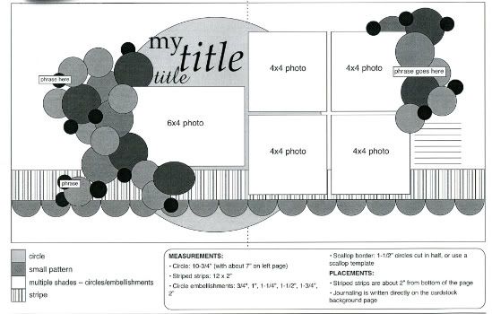
Layout #3 - "The Word Nerd"
(I think I proved my inner nerd with that silly title!)
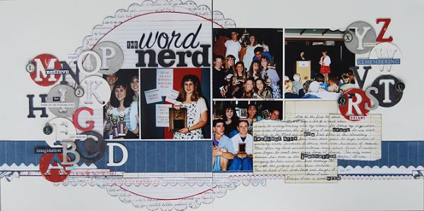
Supply list - Cardstock: Bazzill, Patterned paper: BasicGrey and Graphic 45; Typewriter key alphabet: Tim Holtz, Alphabets: American Crafts and Making Memories; Journaling note pad: Jenni Bowlin; Chipboard alphabet: Tattered Angels
I think the simplicity of the layout mostly comes from the colors and the extreme is definitely the choice of elements.
Variation #1 - So far this week the layouts I've shown you followed the sketch by using circles. For this one I mixed it up a little and used a combination of circles and letters. Actually I had originally planned on using just letters but I happened to stumble across a set of chipboard letters that included a letter within a circle. Perfect! I ended up using the whole alphabet across the layout and boy was that a puzzle to figure out! I didn't want to overlap the letters too much like some of the circles on the sketch since I wanted each letter to show.
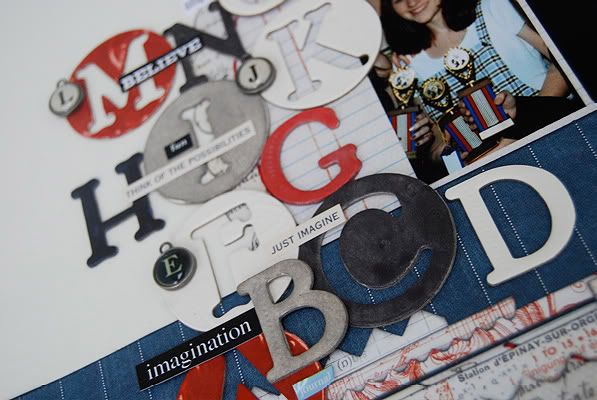
Here are some other ideas for using the whole alphabet on a page:
• The ABCs of ___________ (fill in the blank)
• Have your child write out the letters for a page about them learning the alphabet or learning to write their name.
• For layouts with pictures of kids reading or being read to.
• First day of school or really lots of different school layouts.
Variation #2 - On the left page I used two photos in place of the 4 x 6. They both have the 4" height and together they have the 6" width. I also left off one of the 4 x 4 photos on the right page to make room for more journaling, which leads me to the next variation...
Variation #3 - I knew that the story of my nerdy writing history was going to be too big for the suggested space that the sketch provided. My solution was to remove the bottom 4 x 4 photo so I could have ample space for the story.
Something a little different I did with my journaling space was using multiple journaling note cards. I have so many little journaling note pads that I love but it almost always seems that they are a little too small for what I have to say. Luckily, the journaling note card I wanted to use came with several of the exact same one. I layered three of the same journaling note cards on top of each other to give myself a lot more space. I love that I had plenty of room to tell the story and it also ended up looking kind of cool.
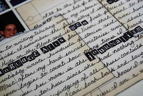
I also used tiny letter stickers to highlight some of the words in my journaling. The reason for this little addition? I misspelled a word while writing in pen and didn't have anymore of the journaling cards. Mistakes happen and sometimes that's when you really need the creativity. (I have another story along these lines involving a smashed gnat and a button.) The little letters stickers ended up being the perfect size for covering up my mistake.
Variation #4 - In place of the scallop strip suggested on the sketch this time I used several different border stickers. One thing, as a two-page scrapbooker, that can kind of frustrate me is that most of the time border stickers only come with one of each piece and sometimes I'm wanting two to stretch across my whole layout. Of course this never stops me from buying them! I loved these border stickers and was determined to use them on this layout. I finally decided to layer a variety of them in different styles and sizes and this way I was able to use them across the whole page and I used up almost the whole sheet of stickers.
Third chance for the giveaways starts today! :)

80 comments:
again, lovin' the layout! :)
Love,love,love the journaling...it is a very clever and unique idea!!
Brilliant use of those round chipboard alphas that I'm sure we all have in our stash from a few years ago.
i am loving this lo!!! Thanks Ali for inspiring me again!
This might end up being my favorite. I love the letters and that you used all of them, that you are on this layout, the title is funny, the journaling cards are cute and perfect, love it all. I like that you included all your varitations and thoughts. Using this on a kids layout will be easy for me to do. Thanks for inspiring us again.
Will this go into an album for you or somewhere else?
Love this idea with the letters! Very cool! And I am enjoying all the variations of this sketch!
I knew you could write from the first time I came to the store and saw one of your layouts.I am not surprised to see you won writing contests. I was horrible in the writing department in school, lacked creativity. While I admire your layout creativity, I think your journaling is creative. You can tell a story!
PS - I am seeing early birds on your blog today!!!
Linda from KS
Aboslutely FANTASTIC!!! I loved the journaling idea...happens to me all the time too, now I know what to give a shot at!
I really like your lo today. very creative.
Great layout...I love the multiple journaling cards, very cool! And thanks for being honest about the reason for your little letter stickers in the journaling, it makes the rest of us feel better to see awesome scrappers like yourself make mistakes too, lol! BTW, I wish most border stickers came two to a pack as well...it stinks having to get really creative with hiding seams if you want to stretch things across a 2 pager.
OMG! I love the journaling cards layered! Great idea, I am using that for a pup LO today!
I love the alphabet idea - great idea for school layouts.
This is a great layout about you. Love the border stickers. Nice to be able to use different borders, not have everything so matchy.
Kathy R
Love the variations. Amazing what you can do with a sketch. Thanks for sharing, and inspiring. Traci
Where do I start on what I love about this layout? The chipboard alphabet, the layering of the journal cards, the border stickers, and the mini alphabet stickers--what a great layout!
The laying of the journal cards is one of my favorite pieces from this layout. It is something that i don't think I've really seen done and it creates a very unique effect. An inspiring layout.
I totally know what you mean about the border stickers. I also wish that they were actual 12 inch length as well. What I have done for a couple layouts is trace the border sticker twice onto a coordinating paper from a set & then cut them out. Instantly two border strips that match.
Amy S (TX)
This is wonderful! Love the circles with the alphas!
Love the journaling with the tiny letter stickers withing your handwritten journaling.
Another echo to the request that those of who create two-page layouts on a regular basis would love to see two of the same border included in a pack! Great use of them on your layout, though, and great use of the alphabets. Love how they sub for the circles!
I love the addition of the mini alpha!! I never sweat mistakes because I always look at them as opportunities, I often find that the revamp looks better than the version I had originally planned! I think this happened with your alphas!
Of course I love your trade mark stitching...you always inspire me to want to do more of it myself.
TFS Ali...fabulous LO (Oh and I love the use of the Alpha and it's perfect it was circles! :)
I just bought some tiny type Cosmo Cricket alpha stickers-love the idea of mixing those with handwriting.
Love this sketch and the alpha project is amazing. Anything with circles and letters is a go for me. Thanks Ali, this is a winner.
I love the letters!! I like how you combined the chipboard letters with some small letters like the "E" and "J".
Such ingenius ideas! I love the layered journaling cards. And the layered border strips. That is a frustrating thing about border strips when you make two-pagers. :)
Thanks for your amazing inspiration!
I love how the journalling is done on squares! I've never done it that way. Great layout!!
Great Layout. I love how you used the entire alphabet. I have so many letter stickers, what a good way to use some of them up.
Another super layout. Love the layering of the journaling cards and mixing alphabet stickers with your handwriting. Thanks for sharing.
I LOVE this layout! And what a wonderful story to tell! Layering the journaling cards is a great idea and I'm always needing new ways to use the tiny alphas, thanks for sharing!!
OMG! I almost forgot it's sketch week. It's been a busy summer and with the weather actually nice, I haven't been on the computer as much.
I love the idea about the stickers over the journaling. I think we all have times when we mess up something in pen and need to figure out a "creative" way to cover it up.
I also like your idea about the borders....whether you use different strips or change up the border each time you use the sketch.
Thanks for sharing your creative inspiration with the rest of us. I can't wait to order sketch book 6!
SO CREATIVE!! I was a math nerd, I think I might scraplift and use numbers instead of letters.
I think the best part about this layout is the journaling with the tiny little alphabet stickers. That caught my eye right away!
This one definitely falls in the extreme category for me. I love how you were able to fit the entire alphabet in circles on the layout.
I love how you used an entire alphabet on your layout. You're so clever!
This is awesome! Love it!
Great layout! Love the idea of using the whole alphabet on a page.
I feel the same way about border stickers. My usual (but pricey) solution is to buy 2, or hide the gap under photos. I'm going to try your method.
I also really, REALLY, love those layered journaling cards. I can't wait to get up to my scrap room today!
I love the red, white, and blue! Very festive :)
Love how you used the whole alphabet!
Love this layout. The color combo is fantastic. Nice and clean, even though there is a lot going on.
It had never occurred to me to use all the different border stickers across the page. I always either buy two or give it up as too expensive. Great thinking!!!
How is it that every LO you do seems to be the PERFECT adaptation of the sketch? LOL
LOVE that the stickers on the journaling was to cover a 'mistake'. They totally look like they belong. Brilliant!
Loved the way you layered the journaling, and the reason you used the stickers in the journaling. I have to keep that idea in mind. I also love that you did a layout about you. I keep meaning to do one about me, but it hasn't happened yet...
This is off the hook! LOVE the usage of letters. This will be awesome for DS's soon-to-come kindy pictures!!!Love the variation in the letters!
The journaling is great and I love how you used the little letter stickers to cover your mistake. I make those mistakes and never thought to use little stickers like that. Thanks!
Very cool layout! :) Love the letters and the way you did your journaling.
Love this one. What a great way to use those alphabets. I think I even had an old sizzix alpha that has letters in circles.
LouAnn
I love what you did with the letters! I know what you mean about the border stickers, too. Thanks for the great ideas!
I love how you layered your journaling cards - they are always way too small perfect solution - have to remember this.
OK- I love this!! Totally love your journaling on this- cool idea to layer the journal cards. I love how you got the entire alphabet on this, too.
Love the journaling idea. What a smart idea!
As someone who really needs to work on using up her stash, I love the use of the various alphas (and the depth created by the varying heights/overlap is very appealing). Ingenious way of covering up mistakes. Should we even say "mistake" in scrapbooking - maybe it's a "creativity opportunity? Finally, the colors really caught my eye - maybe because of the patriotic holiday that just passed!
I agree with some of the other comments - what a great way to use up some of the different alphas I have collected over the years! I love the journaling block as well -your layouts are so much fun!
I love the mix of handwriting and letter stickers!
I love how the hodge podge of letters works so well on this page and I too find the journaling spots to be too small so what a genius you are for putting them on top of one another!
Awesome layout!!
Wow you always have such wonderful ideas!!! I love how you used the letters- especially the circle letters I have some of those gathering dust in my stash too lol The journaling was really cool too:-)
I love tiny alphas but had never thought of using them in the journaling like that, what a clever idea, definitely writing it down on my list of ideas, thanks!
I love the way the differetn elements are layered!
Wow! This is super cool! I will have to use the letter idea on a school page! What a great way to use up extra letters! You are so creative!
goo dto know even the very experienced sometimes "goof" up and need to come up w/a way to cover it up. Great layout.
Love how you used all the chipboard alphas on this lo. Great way to use up mismatched alphabets.
love the journaling tags overlapped! It gives a lot of depth to the page..another great layout.
Another smash hit!!!! I have many letters that will make a great lo, thank you!!!
Love how you used the alphas and love how you did your journaling!!!
I love love the paper used for the large scalloped circle in the back ground, I a sucker for script papers.
Love the large die cut circle. Can't wait to see more. A great layout!
Once again a great layout! And I love the idea for dealing with a journaling mistake - very clever!
What a great idea with the chipboard letters and circles, love it. I never thought of adding the border stickers, what a great idea.
I love the tip about layering the border stickers. I almost always do two-page layouts and I also get so frustated when they don't have two 12" border stickers alike. Layering them solves the problem and looks great. Can't wait to try it!
I LOVE this! What a great idea to use the alphabet in place of the stickers. Great embellishment on its own, but also doubles as reinforcement for the theme. Would be great for any school days layouts!
LOVE the idea of the whole alphabet for a child reading page - perfect idea for my kids doing the Summer Reading Program at the library. You are so wonderful to share your ideas with us - thanks!
Dawn, this will probably go into my album but it's also a possibility that it will go in a frame for my next scrapbook room.
Linda, thank you so much! I think I've got the creativity part in my corner but my spelling is horrible and sometimes my grammar isn't the greatest! :)
dlhfks, I like the idea of using numbers! I bet it would look great! :)
Michele Mc, I think "creative opportunity" is a perfect name for it. :)
I'm so glad that I'm not the only one who gets frustrated with only one strip in the package! :) Thanks everyone!
Oh wow. Love how you layered the journaling cards ~ another great idea from you that I never would have thought of. That's why you're the professional, LOL!
Thanks for all the wonderful layout inspiration :)
~Erika
Great layout, Ali! Thank you for the other suggestions for using entire alphabets on a layout!
LOVE how you used the alphabet - what a great idea for extra letters, too! How very creative!!!
Another great layout I share your frustration about border stickers and sometimes, I hate to admit, I resort to buying two packs. UGH!
What a GREAT idea! I love the way you used so many different letters as accents! I would NEVER have thought of that!
LOVE those letter accents!
such a fun way to use up mismatched alphas
Great use of all the letters. I loved the title!!!
Post a Comment