This time I've used one sketch and created five layouts based off that sketch. The sixth layout is the original that the sketch itself is actually based off of.
The original layout
"Bad Hair Day"
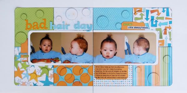
The only thing that changed from the layout to the sketch is a few minor elements on the accent cardstock tabs. On my layout I had used word stickers and on the sketch we went with stars.
This is the sketch, from Sketches for Scrapbooking, Volume 3, that I will be using as a starting point for each layout.
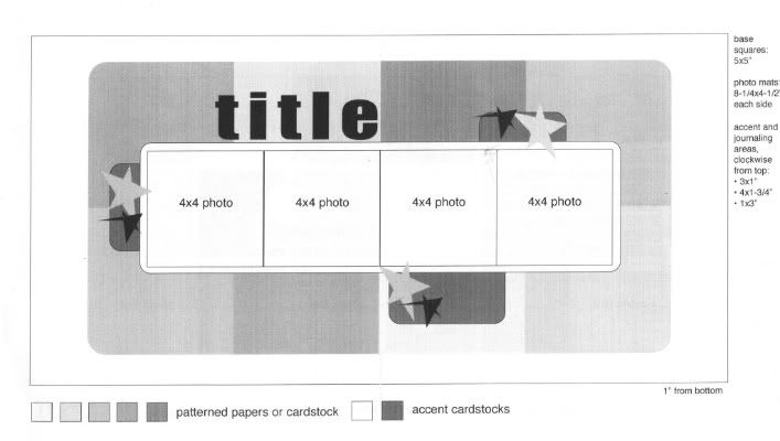 One thing I love about this sketch is that you really don't have to do a lot to get multiple layouts out of it. It really doesn't need a lot of variations to change the look. With the large squares of patterned paper as a background, simply changing the papers makes a huge difference.
Another thing I love about this sketch is how the most important elements (the title, journaling, and photos) on the page are all grouped together in the middle of the layout. It makes it so much easier to find everything on the layout instead of searching for certain elements.
Layout #1 - "Can't Hold Him Back"
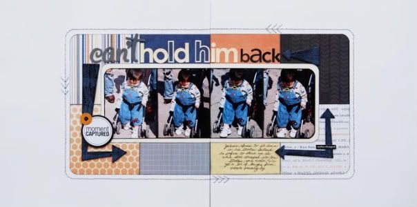 Patterned papers - Kaisercraft, chipboard arrows - BoBunny, alphabet stickers - American Crafts (can't), SEI (hold him), Doodlebug Designs (back), removable adhesive (for texture technique) - Scrapbook Adhesives by 3L, stickers - Scenic Route (circles), 7Gypsies (word)
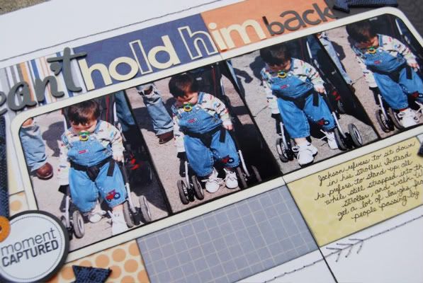
Variation #1 - What probably stands out the most is that everything is smaller than the original sketch. I had every intention of using 4" x 4" photos, like suggested on the sketch but it just wasn't working with these pictures. The pictures are from a festival we were at and on each side of Jackson were legs. Lots and lots of legs from the people all around us. It was kind of distracting so I decided to crop them even smaller. I kept the 4" height but cropped the width to 3" to cut out the busy surroundings.
Variation #2 - Since I ended up cropping my pictures down to a smaller size I was afraid that the 5" squares suggested on the sketch would be too much. I didn't want the patterned papers to overshadow my pictures. I ended up using 4" squares instead with the same placement and the same amount of squares.
Variation #3 - I used arrows in place of the accent cardstock tabs and stars around the picture block. They may not be in the exact place and they may be a different size than the rectangles on the sketch but, like I told you all last time, it's all about taking a sketch as a suggestion. They may not be exactly what the sketch suggests but as long as it's in the same area, it's going to work.
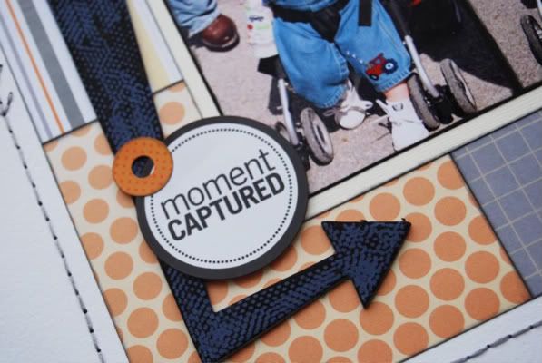
• A little technique for those of you with boys:
This is one of my favorite things to do to add a boy-type texture to elements. The chipboard arrows I used on the page where just plain blue. To add the texture I used a tape runner with removable adhesive (little dots) and ran over the top of the arrows. Then I took black paint and painted over the arrows. After the paint dried, I ran my finger over the dots to remove them. Super simple and so fitting for a boy page!
Variation #4 - Instead of journaling on an accent cardstock below the photo block, I decided to write mine directly on the paper.
Variation #5 - Because this page had so much white space, it looked a little plain to me. I added a stitched border around the patterned papers in hopes to take up a little more space and not have it look so swallowed in all of the white.
Just like last month, I'll be doing a giveaway! I'll be posting everyday, Monday - Friday, with a layout based off the same sketch. All week you'll have a chance to leave a comment and next Monday I'll post the winner who gets a copy of Sketches for Scrapbooking (volume choice is all yours.) You can leave more than one comment through the week to be eligible but not on the same day. :)

Variation #2 - Since I ended up cropping my pictures down to a smaller size I was afraid that the 5" squares suggested on the sketch would be too much. I didn't want the patterned papers to overshadow my pictures. I ended up using 4" squares instead with the same placement and the same amount of squares.
Variation #3 - I used arrows in place of the accent cardstock tabs and stars around the picture block. They may not be in the exact place and they may be a different size than the rectangles on the sketch but, like I told you all last time, it's all about taking a sketch as a suggestion. They may not be exactly what the sketch suggests but as long as it's in the same area, it's going to work.

• A little technique for those of you with boys:
This is one of my favorite things to do to add a boy-type texture to elements. The chipboard arrows I used on the page where just plain blue. To add the texture I used a tape runner with removable adhesive (little dots) and ran over the top of the arrows. Then I took black paint and painted over the arrows. After the paint dried, I ran my finger over the dots to remove them. Super simple and so fitting for a boy page!
Variation #4 - Instead of journaling on an accent cardstock below the photo block, I decided to write mine directly on the paper.
Variation #5 - Because this page had so much white space, it looked a little plain to me. I added a stitched border around the patterned papers in hopes to take up a little more space and not have it look so swallowed in all of the white.
Just like last month, I'll be doing a giveaway! I'll be posting everyday, Monday - Friday, with a layout based off the same sketch. All week you'll have a chance to leave a comment and next Monday I'll post the winner who gets a copy of Sketches for Scrapbooking (volume choice is all yours.) You can leave more than one comment through the week to be eligible but not on the same day. :)

33 comments:
I just ordered Volume 5 of your sketches and am loving it! I recently brought it to a crop night and all my friends had sketch book envy. I think they'll be ordering soon! Thanks again.
Hi Allison,
I can't believe you are doing sketches week already. We didn't have to wait too long. I love this idea, but I know it will be hard for me to get that many papers just right onto my paper. I have tried similar ways and not all of them match or line up correctly so I give up. Do you have any tips on how you chose the paper and how to know what sizes for sure. I don't know how else to explain except I tried something like this and it went all wrong. I love love the layouts you did for it and want to do that if I can. Thanks for giving us another chance to win, I want book #5. Can't wait to see tomorrow's.
I'm LOVING sketches week Allison! It's great fun to see the variations on your sketches. Can't wait to see all the rest! :)
Dolly
Just got a huge amount of photos printed. Can't wait to use this sketch over and over by altering elements, paper etc. Thanks for the great ideas!
Lisa
Just wanted to say that the tip about painting over the adhesive dots and then removing them for a textured look was sooo helpful! Thanks!
cute, cute, cute! Love the tip about the arrows. Thank you for another sketch week, Love it!
Jody, IA
I love this feature on your blog!
Super fun photos! I really like the punched circles on the first layout!
Love your pages. I think the sketch books would really make it easy to get more pages done. Thanks for the chance to win! r7kwoods@hotmail.com
It is amazing that the layouts are from the same sketch, yet they are so different. I am really liking sketch week, especially now that I have the latest sketch book of yours coming my way :) I can learn a lot from you.
Love your sketches! I do boy pages too and love your ideas.
Thanks,
Kathy
I really liked the idea of running dotted tape over the arrow, painting it, then rubbing off tape dots. I will utilize it.
What a difference the addition of the stitching around the pictures makes and so clever to add the little arrows in the stitching. Great ideas and layouts.
So glad to see that you are doing this again. I use sketches a lot so will be looking forward to this feature.
LouAnn
I'm so excited you're doing sketches again this week. It's perfect timing! With the snow falling here in Minnesota, I'm hoping to spend some extra time scrapbooking. I also loved you're tidbit about the paint, adhesive, and arrows. I don't have any paint but I'm hoping it would work with ink too!
Looking forward to another great week!
So excited that sketch week is here. Just ordered my first sketch book (#5) and have been scrapping up a storm. Thanks for the inspiration.
Woo Hoo!!!! I am so excited about your monthly sketch week. Yesterday I almost got in the car and drove down to Springfield for the sale at the store. My husband pointed out that since it was snowing lightly and more yucky weather was expected, it might not be my best idea ever. So, reason prevailed and I stayed home. Maybe next time...
Love the sketch, and use book 3 (actually 1-4) all the time. I'm, going to have to try that paint technique. I bet it would look really cool on the BoBunny clear arrows and letters, too. I've been using my paint daubers to paint those lately.
Once again, woo hoo sketch week!!!!
I'm so glad this is going to be a regular feature on your blog! :) I love the paint technique! Going to have to use that on some tractor layouts I've got planned. :D
i love the tip about the arrows!
Those arrows look so cool...I knew you had done that in one of your demos at Palooza, but it looks even cooler to see it on an actual embellishment. (Obviously I'm not commenting to win a sketch book...that wouldn't be fair at all now would it!)
Those arrows look so cool...I knew you had done that in one of your demos at Palooza, but it looks even cooler to see it on an actual embellishment. (Obviously I'm not commenting to win a sketch book...that wouldn't be fair at all now would it!)
Wow! I really like your tip about painting over the aesive dots! Such a cool and yet simple technique! Thanks for sharing these.
Love your take on the sketch! And thanks for the tip to use on boy pages! I can't wait to see tomorrow's!
Stacie in Oklahoma
You are seriously my new favorite sketch artist. I ordered a couple of your books recently and they arrived today. Can't wait to crack them open!
Love the layouts.
so glad that you are making this a regular feature. I was hoping to take your sketch and do a l/o a day like you, but I just had a baby yesterday. Maybe next month.
I am so glad you are making this a regular feature on your blog. The second week of the month has now become my favorite week!!!
Rhonda H said....
I am waiting on the DVD, so a sketch book would tide me over. Can't wait for either...or BOTH!
LOVE this monthly sketch feature. I keep a notebook of your layouts I collect from CK, the blog, etc...
Such a great idea...thanks for sharing like this. Somehow I just stumbled upon you last week...where have *I* been?!
Love the tip to add texture to the arrow... I love the way you take something simple and make it special!
I am so going to try your trick with the adhesive and paint. Your work is so inspiring. Thanks so much for another chance to win a sketch book.
Brenda, I'm glad to hear you are loving the book! :)
Dawn, are you using a paper trimmer or hand cutting the pieces for your layouts? If you are using a paper trimmer they should be coming out the same. A little solution for you though, on this particular sketch you only really have to worry about the outside edge of the papers lining up. The inside edges are all covered up by pictures so perfection isn't a factor. I hope that helps! :)
Lori G, it will definitely work with ink too. I've used it before and it work just as good as the paint. :)
Amy, I haven't tried the technique on clear shape but I'm going to now that you mentioned it! I bet it would look pretty cool.
Reen, thank you so much! You made my day! :)
CodyandTraci, congrats on the baby! :)
Thank you so much everyone for the super sweet comments! I'm so glad you are all liking sketch week as much as I am. I love that I'm getting a lot of pages done!
I love this layout! especially the inking on the edges of the papers, and the stitches.
The arrows are awesome. Girl, your mind must run 100 mph. I can't believe all of the ideas you come up with. Love them and appreciate that you share.
Linda from KS
Alison,
I noticed my comments on each day are not showing up. Are you getting anything from me? (Kroller) I have commented each day last week and this week...just wondering. Who knows if you'll even get this one : )
Post a Comment