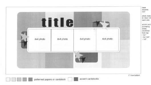
My starting point, the sketch that my layouts are based off of from Sketches for Scrapbooking, Volume 3.

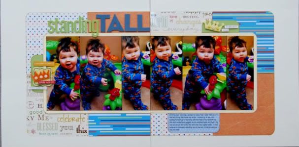
Layout #3 - "Standing Tall"
 Patterned paper - Piggy Tales, My Mind's Eye (orange solid), transparency - Creative Imaginations, alphabets - American Crafts, felt shapes - Fancy Pants Designs, brads - Doodlebug Designs
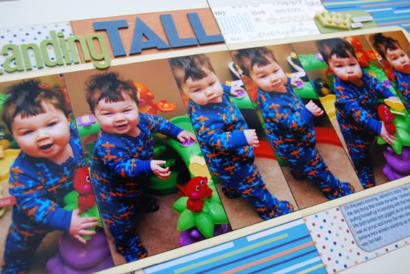
 Variation #1 - Again, the first thing you probably notice is the pictures (and Jackson's crazy "bed head" hair!) With these pictures if I would have cropped them down to 4" x 4" like suggested on the sketch I would have been either cutting off Jackson's head or his legs (which play a pretty important part in the story.) I, instead, kept the 6" height of the photo and cropped the width down so I could include more photos than just four. The whole photo block ended up being a little bit wider across the layout than the suggested size on the sketch but it's not enough to alter the overall look.

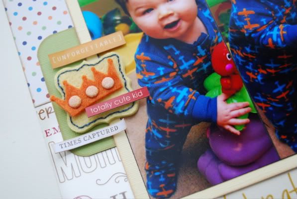
Variation #2 - On this layout, unlike the last two, I did follow the sketch exactly on the accent cardstock tabs. However, the embellishments I decided to use are different...

I used felt shapes and added my own little touches to them like hand stitching and brads. I also added some word stickers, one of my scrapbooking supply staples. I probably use them too much but I can't resist. They are such an easy thing to add and you can fit them in the smallest of spaces.
Variation #3 - In place of two squares of patterned paper I used a transparency with words printed all over it. Not a huge variation and probably not that noticeable but something a little different.
There weren't as many variations on this layout but, like I said in the post on Monday, this sketch really doesn't need a lot of variations to look different. The patterned paper background is such a huge part that simply changing the papers, changes the whole look.
It's a clean slate for day three and the giveaway! :)

33 comments:
i just love piggy tales. It's great to see them getting some "publicity!!" I love reading your blog and seeing your lo's. Thanks for sharing!
It's so helpful to see the variations on the sketches and realize that if our own photos don't quite work with this sketch, we can still use the basic design and just modify the sketch. I particularly like the one today with the vertical photos that you left at 6" and just cropped on the sides. Very lovely and very helpful!
I just love your ideas-it would be so helpful to have one of your books!! Thanks for the chance!Have a great day.
I'd love a chance to win a sketchbook. :)
I love all the colors for this layout. He looks so cute and little. Thanks for showing us so many different ways with photo sizes, I like these cropped and focused just on him standing. Good job again. If I were to fly out there for one of your retreats which airport should I land in and what hotels would you recommend? I really want to come and go to a retreat and see your store. I just checked out the SG blog and love the way you set it up. Would love a chance to win book #5 so I can use these sketches. Have a good day.
First of all...that is the cutest little bed head!!
Second I love your take on the sketch here too...Love the crown embellishment area! I just love seeing all the different spins! I wish we could see this everyday LOL but I guess you are too busy for doing it EVERYDAY. One nice thing is that your albums should have alot of continuity even though they are changed there will be a similar feel to the pages....I would love to see your albums in a few years! Great job Ali!
Another great layout. Love the bed head. Can't wait to get a chance to play with this sketch.
LouAnn
As usual, wonderful. By the way, I have gotten two of your recipe card sets and they are top notch!
I really like how you kept the pictures 6 in. I can visualize using this for some of my basketball pictures and showing the motion of making a basket.
Thanks for the inspiration and variations! It helps me to think outside my box (or sketch).
Another reason I LOVE your work: You use REAL PICTURES and create REAL LO's! LOVE LOVE LOVE the details!
Love all the little accents you add.They really make the page.
Kathy
Love how this sketch uses multiple papers. So glad you showed us that we could use 6 inch photos. Can't wait to get a chance to make a trip to the store.
It is amazing that you can work with the picture sizes without having to change the whole sketch. And like you said, just changing out the pattern papers, changes up the whole LO, fantastic. Do you print all of your pictures in 4x6 and then just crop them to the desired size or do you print them smaller at times too?
So so cute. I am so grateful that you are doing this. I have never felt comfortable using sketches, but with your ideas, I feel a lot more prepared to try. Thanks!
The photo size change really makes this layout look different to me. Great job!
Great layout! Thanks for today's variation. Can't wait to try this using this sketch again!
Stacie in Oklahoma
Well, I also love the fact that you use 6 inch photos on this layout. A lot of times I can't crop a picture down to 4 inches because I will lose an important part of the photo. However, so often when taking pictures of my son I end up with distracting or unsightly elements in the picture.
This also lets you fit several different photos of essentially the same thing on a layout. I know some people would say to just choose your favorite shot and complete a single page layout, but I have a hard time doing that. (Most of you will know what I mean from personal experience with your own cute kid when I write that there are often too many pictures of my son looking adorably just a little bit different in several shots.)
And speaking of single page layouts, Allison, what do you do for the first layout in an album? Do you use it as a title page? I would love to see some examples of the things you do with those. I sometimes just skip that first page, and plan to go back and do something about it later...but I could use a little inspiration.
Thanks again for sketch week!
Love the skinny photos on this one!! Breaks up the pattern a bit, and makes it really appealing!! Thanks for another great idea!!
Love your pages - they always get me excited to try some new ideas.
Linda J
Ali,
Love your layouts! Here is the link to my 4 layouts using one of your sketches. http://s736.photobucket.com/albums/xx4/sharislp/sketches%202/?albumview=slideshow
I used another of your sketches and did 2 layouts. http://s736.photobucket.com/albums/xx4/sharislp/sketches/?albumview=slideshow
I love this segment of your blog. Shari
OMG, he has the sweetest cheeks ever, I just want to give them a big squeeze, he is such a doll!! (Please don't think that is freaky coming from a total stranger, he is just too stinkin cute.)
I love this sketch variations series. I have all five books and the card sketch book also. I've started using my scraps for cards. I like that there are so many dimensions to your layouts. I need to stock up on pop dots I've went thru several lately. Keep on inspiring us.
Your kids are so cute!! The sketches are great!!
I love patterned paper so I am going to have fun with this sketch myself!
I love this! Thanks for showing the difference you can do with just one sketch. I like what you do it really helps when you are having a block.
Michelle Dorland
I love this! Thanks for showing the difference you can do with just one sketch. I like what you do it really helps when you are having a block.
9:21 PM
Super cute layout! I'm loving all the variations for one sketch!
I love so many of your layouts and Scraplift many times. would love to get a copy of the sketch book.
Dawn, there is an airport in Springfield. After that the closest ones would be in St. Louis, Kansas City or Tulsa, which are all around a three-four hour drive. All of the retreats are from Friday-Sunday and include hotel so you wouldn't have to worry about that. Scrap-a-palooza and Scrapmania are similar to the retreats but it's a Saturday only event. I would have to dig a little deeper on the best hotels for that area. :)
Penny, I'm so glad you like the recipe cards! I'm really hoping to start doing those again in the future. They were quite popular! Hopefully after the DVD is all done I'll be able to pick that up again.
Patricia, I almost always use 4 x 6 photos. I just think it's easier. If I ever want smaller photos I either crop them down or order wallet size prints.
Amy, I so know what you mean about multiple photos that look similar. I hardly ever do single page layouts so I use them all the time. Right now I don't have anything in the first page of my albums. I organize my albums by theme/holiday...like all my Halloween layouts are in the same album. That way during October we can set the album on the coffee table. Same goes for Christmas, Easter, etc. For the rest "everyday" type layouts everyone gets their own albums. Anyway, I'm rambling! One day I hope to make just a simple "title" page for each one. It probably won't have pictures, just a little info about what's in the album. Of course I'll make it pretty though! :)
Shari, you did a fabulous job on those layouts! I love how you made each one all it's own. None of them look exactly the same! I also love all the little details you added. Great, super, wonderful job! (I have to add, the pictures on "Sweet Baby Kisses" are adorable!) :) Thank you so much for sharing these with me!
Kim, your comment made me laugh. I promise I don't think you're a freaky person! We get that a lot with those chubby cheeks! They are impossible not to kiss and squeeze and I'm one lucky momma to get to do that on a daily basis!
Super cute layout! I'm loving all the variations for one sketch!
lg Manuela from Switzerland
OMGosh, I love this. I use a lot of vertivcal pictures and hate to cut them down. Thank you for such inspiration.
Jody, IA
OMG! while I am loving all the sketch ideas, I think I love Drew's bed head even more! Gotta love the not perfect photos that document real life.
Have two of your books and need another! I want it all!!!!
Post a Comment