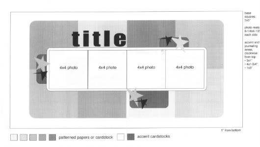
My starting point, the sketch that all of my layouts are based off of from Sketches for Scrapbooking, Volume 3.
Layout #4 - "His Favorite Girl"
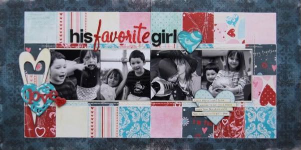 Patterned papers - Fancy Pants Designs, alphabets - American Crafts, felt - Autumn Leaves, chipboard hearts - Creative Imaginations, Fancy Pants Designs, chipboard word - Fancy Pants Designs, Glimmer Mist - Tattered Angels, jewels - KaiserCraft
Variation #1 - Well, I guess this really isn't a variation since the sketch doesn't suggest what kind of pictures to use, but I thought I would include it anyway. I did stay with the suggested 4" x 4" photo size on the sketch. Usually I use color photos but sometimes it just happens that black and whites work better. These pictures were all over the place in color. Most often that doesn't bother me but I really wanted to use a Valentine theme (partially because I love, love, love Valentine/love paper and seem to buy a lot more than I need!) and the colors in the pictures were not going to to work with that.
Variation #2 - One easy way to really change the look of a sketch is to use a patterned paper instead of cardstock as your base. I went with one that had a muted pattern so it wasn't overpowering. The subtle patterned doesn't overshadow the rest of the layout and the black helps the other colors on the layout stand out.
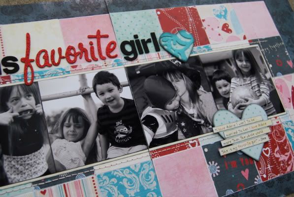
Variation #3 - This time I changed up the patterned paper background by using 2 1/2" squares instead of the suggested 5" squares. Using the smaller squares adds a completely different look while basically still having the same background, it's just broken up more.
Variation #4 - I didn't round the corners on the patterned paper background or on the photo block like I have on the other pages. I also added a stitched border around the photo block. Not a huge change, but really it's all about little variations that can help you to get several layouts out of one sketch and each one look different.
Variation #5 - Since I was going with a Valentine/love theme I decided to use hearts in place of the accent cardstock tabs.
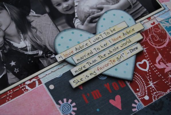
I love involving Drew in my scrapbooking (and he loves it too!) While I was making this page and got to the journaling point I thought who better to explain Drew and his favorite girl than Drew himself. He was thrilled that he had a part in this layout. I love that he's at the age where I can use his words on my layouts. Everyday he says something that has me laughing and I hope that one day he will be able to look back at layouts like these and laugh too.
Another day, another chance at the giveaway for a copy of Sketches for Scrapbooking! :)

Variation #3 - This time I changed up the patterned paper background by using 2 1/2" squares instead of the suggested 5" squares. Using the smaller squares adds a completely different look while basically still having the same background, it's just broken up more.
Variation #4 - I didn't round the corners on the patterned paper background or on the photo block like I have on the other pages. I also added a stitched border around the photo block. Not a huge change, but really it's all about little variations that can help you to get several layouts out of one sketch and each one look different.
Variation #5 - Since I was going with a Valentine/love theme I decided to use hearts in place of the accent cardstock tabs.

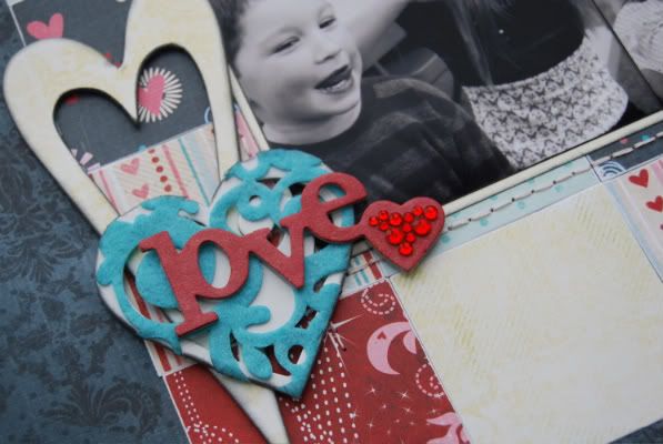
I took chipboard hearts and covered them in die cut felt and then trimmed off the excess felt hanging off the edges. I also added a chipboard word covered in Glimmer Mist and jewels.
* Tip for adding Glimmer Mist:
I love Glimmer Mist but one thing that bothers me about it is the waste. If you are covering a small piece of chipboard you end up spraying more on your protective surface than the chipboard. Here's what I've been doing lately, shake the bottle like you usually would to mix the glimmer and then use a paint brush and brush it on the surface. Looks exactly the same but you don't have the huge amount of waste.
Variation #6 - I decided to continue the heart theme for my journaling space. I covered a chipboard heart with patterned paper and added journaling strips on top of it. My favorite part about this layout is the journaling...

I love involving Drew in my scrapbooking (and he loves it too!) While I was making this page and got to the journaling point I thought who better to explain Drew and his favorite girl than Drew himself. He was thrilled that he had a part in this layout. I love that he's at the age where I can use his words on my layouts. Everyday he says something that has me laughing and I hope that one day he will be able to look back at layouts like these and laugh too.
Another day, another chance at the giveaway for a copy of Sketches for Scrapbooking! :)

28 comments:
LOVE the color combo on this one!
Just received my book last night and I'm so excited to use it this weekend! Good luck to all those that are leaving comments.
Just wanted to say THANKS for making this a monthly feature. I love all the ideas!
Love this layout! And I love that Drew did the journaling-how sweet!
I really love the smaller squares just as well on this one. I like the patterned paper on the BF as well!
Great work again...Sooooo loving this.
I am loving these variations. Thank you so much for your blog.
Love this with the black and white pics and the smaller squares.
LouAnn
This LO rocks! Drew is too cute :) I love how you did the journaling and also how you made the embellishments pop with just a little bling. I don't know how you come up with all these ideas but you're amazing!
This layout gives me a great idea for some pics I have of my little guy and his "women" LOL love Drew's journaling.
Love this! Great idea for my 2 yr old Grandson. He just loves his 9 yr old sister.
Kathy
I wouldn't have thought to use four 2-1/2" squares instead of the 5" squares. Great idea! I'll steal it! -- MOM
I like the variation of using black and white photos as well as the smaller 2 1/2 squares. You are inspiring me in so many ways. Keep the inspiration coming.
It floors me how many different layouts you can get out of one sketch! I REALLY need one of these books!!! Hint, hint....
Hi Allison, can't believe this is the last one this week. I love it and perfect for valentine weekend. My son had a crush when he was 4 in pre-k the whole class knew and it was so cute. I actually am working on a layout like yours if I get it done I will post it for you. I would love love to win a book!!
Great layout! Using the smaller squares of paper is a great way to use up scraps. Thanks for the idea!
Stacie in Oklahoma
I would never have thought of using smaller blocks of patterned paper. It looks like a great patchwork quilt.
Thanks for all the great ideas!
This is so sweet! I need to scrap little man's words. Thanks for the reminder! :D
I really needed the reminder of having my kiddos help with journaling. Thanks for the time you take to inspire others.
This is so adorable! I love his words:)
Another beautiful layout! Everyday I can't wait to see your blog! thanks for the inspiration
This is so cute! I especially love how you used Drew's own words for journaling.
Love that quote, "She's my favorite girl" so sweet. I like the black & white photos with the valentine colors, good idea.
I really like the 2 1/2 inch squares. I'm really starting to see the versitility of the sketches. I have to start thinking outside the box or the sketch.
I like the journaling on strips over the heart. That's my favorite variation on this one!
Thanks for lots of great inspiration!
Love the smaller squares and the journaling is too cute!
Love this layout.
Linda from KS
I like the patterned felt used to cover the chipc=board hearts. I can see so many uses for that technique. I also love the journaling strips on the chipboard. I frequently use journaling strips, but have never put them over a chipboard shape...I'm going to do that soon!
Thank you for the tip on glimmer mist. I have some but have yet to use it. Intimidates me a little. LOL Now, I am diving in
Jody, IA
I love the colors and pp you used on this layout! It looks so different from the rest even though the sketch is the same.
Post a Comment