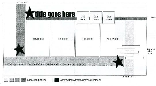
The sketch, from Sketches for Scrapbooking, Volume Four, that I have used as my starting point for each layout.

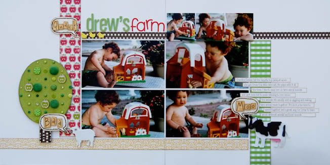
Layout #6 - "Drew's Farm"

Supply list - Cardstock: Bazzill Basics Paper; Patterned paper: Nikki Sivils, Scrapbooker, KI Memories, October Afternoon, and Bella Blvd.; Foam alphabet: American Crafts; Alphabet stickers: Doodlebug Designs; Chipboard tree: Nikki Sivils, Scrapbooker; Foam animals: Jolee's; Brads: Nikki Sivils, Scrapbooker, Doodlebug Designs, and We R Memory Keepers; Jewels: My Mind's Eye and KaiserCraft; Embroidery floss: DMC
• Variation #1 - One weekend when I was teaching a class at one of our retreats I overheard a girl say, "I never take vertical pictures." The class I was teaching happened to be all vertical pictures. I stayed with her after the class to show her that many times you can substitute horizontal pictures in place of vertical ones. What started as a problem ended with a layout that worked with what she had. On my drive home from the retreat I knew that this would be a great variation to show for Sketch Week.
The paper design for this page easily allowed for the extra height needed for horizontal pictures.
• Variation #2 - Since I had more height on the page, because of the 8" height of photos instead of 6", I had to alter the papers just a teeny bit. I substituted the 1 1/2" strip on the bottom with a 3/4" strip. Having a larger strip put it a little too close to the bottom for my liking. I try to have close to the same margins along the top and the bottom (most of the time).
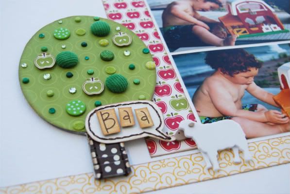
• Variation #3 - One thing I loved about using horizontal pictures was the extra space I had one the left and right of the page. Since it was one 4 x 6 it was only a 6" width instead of two vertical 4 x 6 that ended up with an 8" width. This extra space allows for a larger embellishment (the big tree) on the left side.

One thing I love about Nikki Sivils, Scrapbooker mini albums is that they don't have pre-punched holes. You can easily use them on your layouts as embellishments for those times that you want to have a larger element on the page. To see it you would never know that it's suppose to be a mini album page.
To make the tree I first cut a strip of brown patterned paper, pleated it, and then adhered it to the trunk part of the tree. Next I covered the top portion with green patterned paper. To dress up the tree a little I added brads in all shades of green, green apples cut from a patterned paper, dots from some green alphabets, and green jewels. I also added two stitched lines to the trunk. Stitching on chipboard is little harder than paper just because it's a little tough to get the paper piercer through it. Once you get the holes pierced it's super easy to stitch.
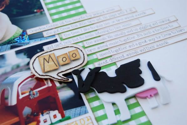
• Variation #4 - Just like on the left page, I had some extra room on the right page. All I had to do to balance out the big tree was use longer journaling strips. I used 4" strips in place of the 3" strips suggested on the sketch.

• Variation #5 - I had so much fun with these cute little Jolee's foam farm animals that replaced the stars suggested on the sketch. I also had an idea to pull from my journaling by adding the little word bubbles with the animal sounds. In the journaling I talk about Drew making all the farm animal sounds and thought that the word bubbles would add a fun element to the page and support the story at the same time.
To make the bubbles I drew the shape out of cardstock, cut them out, and added a stitched border. You all know how much I love stitching! It's such a great way to enhance a simple or plain cardstock element like this one. For the words I printed them onto yellow patterned paper, cut a block shape around them, then added them to the center with foam adhesive.
Today is your fourth chance to win a copy of Sketches for Scrapbooking! :)
• I always love replying to my blog reader's comments and questions and have kind of slacked in that area this week. It's been a busy one! If you asked me a question you might want to go back and check it. I'm off to answer them all now! :)

62 comments:
I'm up late...happen to be one of the first and noticing that your images aren't loading up from photobucket...hopefully you can figure out that problem soon. Loving your different versions of your sketch this week! :)
Yes, photobucket is being a pain! They are doing site maintenance and I guess it's messing with my pictures. Hopefully it will be up soon! :)
well, the first two photos are working now :) Very cute, I like it with horizontal photos too!
What a great way to start my morning's this week Allison!!! I love SKETCH WEEK.... totally love love this layout. I'm super excited again because I have the foam farm animals and I just took my kids to the farmpark Easter morning. I can't wait to do this page now. I love all the details, like the animal sounds,the tree is the best ( trees are always my favorite ) the colors, I have apple paper too, so excited to see this page!! My baby cousin is also making anmial sounds even though we just read a book with anmials, so I think this would be a layout for that too. Thank you so much. Before I read about your tree I thought those were apple brads you had glad to know it's just paper so I can do that too. I know your busy but I have my Easter and farmpark pictures on my blog maybe when you have a few minutes (haha) to look at them, the link is http://everydaymemorieswithprojectlife.blogspot.com
I'm sad tomorrow is the last day for sketch week, thanks for giving us two extra ones this week. Do you have next months planned already?
I love the farmer pages...my husband is a farmer. Need to get the grandkids to the farm for some photos.
Linda from KS
First of all, I have all your sketch books and love them! I can't wait for Volume 6 and the DVD!
This page is awesome, and that tree filled with all the green brads is just too stinkin' cute!
Thanks for showing how easily you switched the vertical photos for horizontal ones! This is awesome!
Thanks for the horizontal picture variation. I was having trouble finding all verticals for some of the variations I want to try.
This page is absolutely adorable - I love how you coordinate your embellishments to accent your story.
Love it!!!!
I have the opposite problem; I almost never take horizontal photos. After seeing how easy it is to switch the orientation of the photos shown in the sketches, I'm going to have to go back to some of the ones in the sketch books I've skipped over. Thanks for all the inspiration!
What a sweet page! Love the farm animals with the word bubbles and the tree with all it's green embellishments. I tend to take both horizontal and vertical photos (because I know I'll be scrapbooking them at some point). I love how this layout uses horizontal photos since that is what I have the most of. :)
I love how you replaced the vertical pictures with horizontal ones- this is such a fun versatile sketch! The tree and other embellishments are so cute:-)
TOO cute! I love the tree and I love your addition of the embellishments to it! Great trunk! I also love the animal bubbles! Such a cute idea! Now I am going to have to try to find those stickers!(or I'll end up piecing my own [rolling eyes emoticon here LOL!]) Thanks so much for another fabulous spin...I love looking at these!
I love the farm animals and tree. Thanks for showing how to use different sized pictures with the sketches.
This is my favorite layout of the week! What an adorable boys page (which can be hard to do sometimes!).
I am doing mini scrapbooks for my daycare kids, and I was running out of ideas...I think I will use the tree, so cute! Thank you!
I love the tree. WE go apple picking every year and I am always looking for new ways to jazz up that layout. You can bet your tree will be on my layout next year.
Thanks,
Heather
I love this layout. It is so cute! I, too, tend to take more horizontal pictures than vertical. Seeing all the neat layouts with the vertical photos, has inspired me to take more. Love the big tree with the stitching.
Cute! Mootiful!
Thanks for sharing how to adapt a sketch! Another beautiful layout!
The tree = adorable!!! I'm counting down the days to my birthday so I can order some of your books! I can't wait.
I really love how you can make them look so different. I like the variation of vertical to horizontal. I so need to do this more. I need to look at a sketch more objectively from now on. The tree & animals are so cute & I love how you stitched on the word bubbles to make them stand out more. Very cute stuff!
Amy S from Texas
That is such a cute layout! I love all the hand stitching. Very inspiring.
I love how you embellished the tree!! Great Layout!!
I love the horizontal switch. You have amazing talent.
I love your farm page, Ali. But I don't have any pictures that lend themselves to that theme - which is why I totally love your sketches! They are so adaptable to whatever pictures I grab to scrap. I love having the sketch to get me started which leaves teh fun part of putting it all together totally up to me!! Thanks!
I never used to take vertical pictures...now with a 2 year old it seems easy!
I was wondering if you ever thought of having your books available for download, so they could be printed at home? Like the log your memory books?
Thanks for a chance to win!
I really liked the tree and trunk ideas - Thank you for taking the time to explain how you add those extra touches that make your layouts so breath-taking!
So, pretty much you're saying we can do anything we want with the SKETCHES? LOL!
Really, they should be named: SKETCHES by Ali (with a 1000 VARIATIONS!)
I ADORE what you did with the little tree! Thanks again for the chance to win your amazing books.
We have that Fisher Price Farm, and I have some great pics of my son playing with it. He loved it so much that he used to ask for different animals to go with it. I spent lots of time scouring ebay for extra chickens, calves, lambs, and piggies, extra fences... by the time I was done he had a chicken coop and horse stable, and a whole stye full of pigs. Gosh, that's a story I have to get down in a layout. How could I have forgotten that so quickly?!!
Well, I spent last night combing through all 5 sketch books looking for a layout for 4 verticle and 2 horizontal pics, and have concluded that I need to get some printed as wallet size. I'm going to try and find some time today to play with the positioning. I used to just skip making layouts if I couldn't find a sketch or example to match, but as I become more comfortable fiddling on my own I don't have to do that. I am finding that your variations and tips help me find my own inspiration to design, create, and set out on my own. Thanks!
(I still love your sketches, and most of the time find myself starting with them as part of my process. I don't expect that to change!)
I just love this layout! That tree is just so stinking cute!
What a cute layout. Love how you embellished the tree. I too have and love Sketch book 5. I want to order another book soon and would love to have one that is revamped with the stripes. Have you finished revamping any yet? If so which one? That is the one I will order next. Also waiting for the DVD.
Another great layout! Love the tree! It's too cute! Definitely another embellishment that could be homemade. I have on more than one occasion changed the sketch by using horizontal pictures instead of the vertical. I have way more horizontal than vertical pictures. I just one day decided it's my scrapbook page & I can use horizontal pics on this sketch if I want to. It is definitely a sense of freedom when you realize you don't have to copy the sketch exactly as it is.
Thanks again for great inspiration!
Stacie in Okla.
I love today's variation of the sketch. I also tend to take more horizontal photos and although I do my cropping, editing and photo printing at home---not all horizontals can be (or should be) converted to verticals. Thanks for this simple variation!
By the way, it seems you are always using white CS for your background. Do you ever use other colors or even prints for your base? If not, why not?
LOVE the horizontal pictures. I too, forget to take vertical. Great LO and awsome sketch! Jody,IA
Oh man! That tree and those farm animals are just so stinkin' cute!! I predict a scraplift in my future...
Absolutely great layout! I love that you changed the direction of your photos. And I love how the speech bubbles tie the animals together in rules of three!
LOVIN' YOUR SKETCHES!!
I have lots of horizontal pictures so this works well for me. Love the tree and the talking animals.
LouAnn
another great variation, I would have never replaced the vertical photos with horizontal, I would have just looked for a different sketch to better fit my photos. Thanks for letting us know it is possible.
Hehehe ... love the rhyming :) Tomorrow you should say Let's keep this alive with Day Five :) Thanks for all the inspiration!
Thanks for addressing the matter of horizontal pictures. I have a bad habit of taking more that way that vertically and always find most sketches are geared more toward vertical. This will really help me in the future to be able to see how to modify it to fit my pictures.
So cute!!! What kind of adhesive did you use to get the pleated paper to stay on the chipboard so well?
Yet another nice variation! I still scrap 8.5x11 and I think I'll be able to adapt this sketch nicely. Thanks again!
Very nice LO. Love the tree and farm animals. You have inspired me and I am now into stitching. Love it.
How cute is that tree!
thanks for sharing how easy it is to swap the orientation of these sketches, love it!
I love seeing you use horizontal pics in place of vertical ones. I too take mostly horizontal so I rarely used the sketches that called for vertical photos. Thanks for addressing that in your example.
I also am vertically challenged! I am trying to train myself to mix it up a little now and then but old habits die hard! Thanks for another great page!
I've really enjoyed the series of pages you've shown us this week. I often have a grouping of photos like this so it's nice to see some ideas on how to present them. I will definitely try this sketch sometime soon!
I like how you used the horizontal photos in place of the vertical ones! I've really learned a lot from you this week--thank you!!!
I wish every week could be sketch week!! ;-) Thanks so much for doing this! Love love love it!!
Dawn, I always make time for those that are as nice to me as you are. Your comments are always so sweet and I really do appreciate that you always comment! :) I'm off to check it right now!
Heather, that would make for such a cute layout! I want to see it when you do it! :)
Laura, such a mootastic comment! lol!
Erin, it is something that we have talked about but we still haven't decided on it yet. Right now we are getting ready to do some big things with the sketch books so that's kind of occupying our thoughts most. :)
Luv2talk, LOL! Amazing, isn't it! :)
Amy, you have to do a layout about that! What a funny story! And I love your comment about the sketches. It's amazing what you can do with them and really make them your own.
Cindy, I think we are going to be starting with Volume Four and work our way back. I'm not sure when it will be done though. I do know that it can take awhile to build a computer generated sketch but I don't know how long it will take her to go through and "update" them. Stacey had told me that Mom had started working on them this week so hopefully soon. :)
Stacie, I love this from your comment, "I just one day decided it's my scrapbook page & I can use horizontal pics on this sketch if I want to." That is exactly what kind of thinking I want others to gain from Sketch Week! :)
Steff, I think I answered your question in the "Part 5" post. :)
Jennifer, it's so nice to have someone who laughs at my super dorky moments!
Erica, I used the E-Z Runner from Scrapbook Adhesive by 3L. I ran a couple of lines on the tree trunk, added the pleated strip, and then went back and added some adhesive under the pleats.
Kim, me too!
Thank you everyone! I'm convinced that I have the best blog readers ever. You guys always take the time to say such thoughful things. :)
Back to check what I missed last night (thanks to photobucket!) and wow. Those animals and tree are ah.may.zing! Love this!!
I love the bright colors today. I can't wait to try this sketch at my next crop.
I'm so glad you showed a horizontal layout. I struggle with switching the orientation of pictures on sketches and love to see that it can be done. The details on the tree and animals make them that much more adorable.
I love seeing how you changed the vertical pictures to horizonal. How you get it to work. Stitching on chipboard. Now there's a new trick. Thanks for sharing!
Love this page. I especially love all the extra bits on the tree!
i would have never thought of using mini album on a page!! your lo so rocks!
The colors that you've chosen are just great! So beautiful.
Another fun page Allison!!!
Love what you have done with the sketch and your embellishments - your tree is awesome :)
...new to sketches & your site through Fiskateers and I'm loving it!!! Now I'm going to look back through past sketches for even more inspiration - THANKYOU :o)
Just LOVE the animal talk bubbles - such a whimical touch!
Jolees? You used Jolees? I guess I'm going to have to start taking a closer look at them again. LOVE the farm themed page. I grew up on a farm and have plenty of real farm photos to scrap. I find them hard to work with often though.
I love love love this layout! I love the tree and the farm animals!
Post a Comment