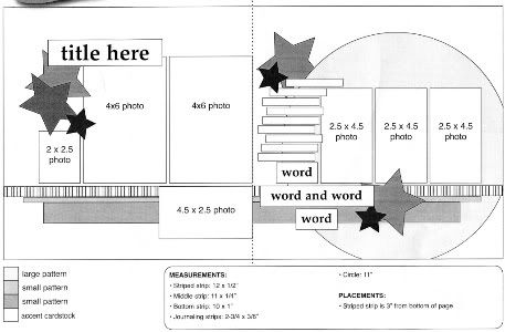
This is the sketch, from Sketches for Scrapbooking, Volume 6 (available July 1), that I'm using as the starting point for each layout this week.
Layout #7 - "Shooting Practice"
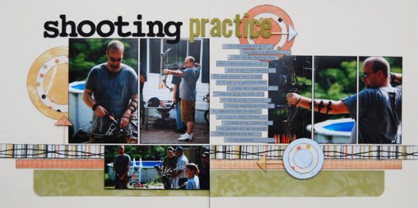
Supply List - Cardstock: Bazzill; Patterned paper: Rusty Pickle; Alphabet: American Crafts and My Mind's Eye; Glimmer mist and Glimmer Screen: Tattered Angels
• Variation #1 - While the circle on the sketch does play a big part in the layout, the layout can stand alone without it. On this one I decided to leave the circle off. Sometimes you might not have a die cut patterned paper to use or have a way of cutting such a large circle. Don't worry, you can skip the circle and still get a well balance layout.
• Variation #2 - For the bottom 2 1/2" x 4 1/2" photo on the left page I ended up using a 2 1/2" x 6" photo. I wanted to make sure and include everyone that was in the picture and not crop anyone out. There is plenty of room for the extra width and you could even add more photos along that bottom.
• Variation #3 - On the left page I use one 8 x 10 photo and cropped it down for the three 2 1/2" x 4 1/2" photos. It's all the same photo but separated into three different pieces. I just thought it added an interesting look. You could also do the same thing and not cut them into the three pieces.
• Variation #4 - Instead of the stars suggested on the sketch I made targets by layering patterned papers cut into circles. Then on each target I have a little arrow made from toothpicks and a patterned paper triangle. They were super easy to make!
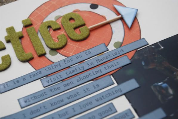
• Variation #5 - I changed up the strips on the bottom this time. For the top one I added a pleated striped strip and then added some wavy stitching across the top of it. I thought the wavy line would help to add movement to the page and would fit well with the arrows.
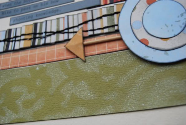
For the bottom strip I cut it a little larger than suggested on the sketch. I wanted to add margins in between the strips for a different look but that put my 1" bottom strip barely showing along the bottom of the 2 1/2" x 6" photo on the left page. I thought if it was going to show below is should have a little more than just a teeny bit. (Sometimes I wonder if you guys read this stuff and think I'm a little quirky with some of my reasons!)
I also added a subtle pattern to the green cardstock with Glimmer Mist in Marshmallow (one of my favorite colors!) and a Glimmer Screen.
• Variation #6 - I had a long title so I stretched it across both sides. That's a great thing about this sketch. There is a lot of room for a longer title but it also looks great with a small title.
Layout #8 - "My Sunshine"
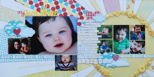
Supply List - Cardstock: Bazzill; Patterned paper: My Mind's Eye, Fancy Pants Designs, and Reminisce; Die cut punch outs: My Mind's Eye; Alphabet: Doodlebug and American Crafts
Where to start? There are a lot of variations on this one!
• Variation #1 - I guess the best place to start would be with the most noticeable variation. I have had a sketch in my sketch book at home that I had drawn out a couple of years ago that looked very similar to this. It had a large circle off to the side with sun rays/patterned paper going across the page. This isn't the same sketch but when I looked at it I thought the idea would work perfectly. So, I add patterned paper strips that stretch across the whole layout to serve as sun rays. I also added in some hand stitching in between a few strips. To complete the look of the sun I added buttons with embroidery floss tied through them around the outer edge of the circle.
• Variation #2 - Because the sun rays where so bold and colorful I didn't want to clutter up the page too much. I decided that the striped strip alone would be enough. Adding too many strips would have made the whole sun design kind of lose itself in those strips. It would have been too much. I definitely wanted that sun design to stand out.
• Variation #3 - I love the large photo of Jackson on the left page. I just can't get enough of those blue eyes! I wanted this photo to really stand out so I had it printed as an 8 x 10 and then I cropped it down to 6 x 8. It's still got the same width and height of the two 4 x 6 photos on the sketch, it's just one picture instead of two.
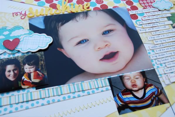
• Variation #4 - Instead of using the suggested 2" x 2 1/2" photo on the left page I used a 2 1/2" x 3 1/2" picture. I didn't want to crop it down and because the large photo had some empty space on the bottom left I was able to overlap the smaller photo onto it. This way the longer width didn't have it running too close or off the edge of the page.
• Variation #5 - I also used a 2 1/2" x 3 1/2" photo in place of the 2 1/2" x 4 1/2" photo on the bottom of the left page. There are so many options with that photo on the bottom since it kind of stands alone. There really isn't much, like page design or other photos, that make it a big pain to use a variety of smaller sizes.
• Variation #6 - I hardly used the photo sizes suggested on the sketch for this layout! On the right page I used one of the 2 1/2" x 4 1/2" photos in the center and then added four smaller photos in place of the other two photos on the sketch.
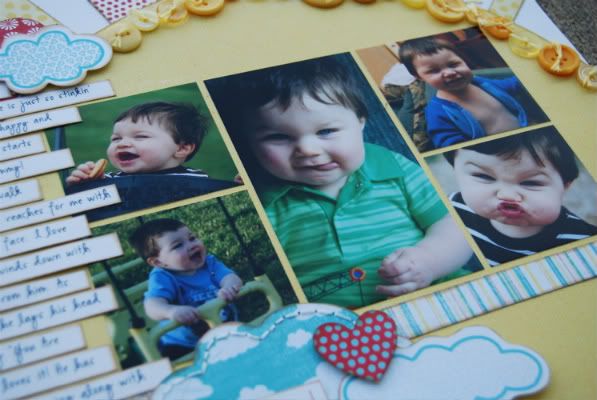
With any sketch you can always exchange smaller photos for larger ones and it's a great way to get more uses out of the sketch. Just think of all the possible photo combinations you could do!
• Variation #7 - Along the bottom where the three word strips are on the sketch, I did something a little different but at the same time very similar. I took one sentence, made it larger and a different color, and then cut around each individual word.
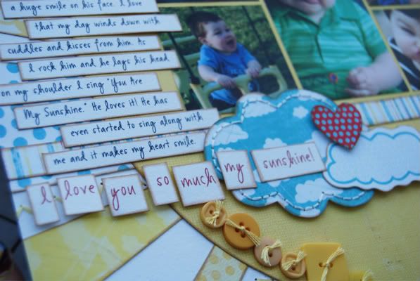
It's not a huge difference but yet an easy way to give it a different look.
• Variation #8 - To go with the whole sunshine theme I added clouds and hearts in place of the stars suggested on the sketch.
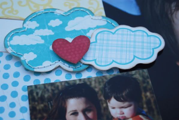
The clouds with the white edge and the hearts were die cut punch outs and then the blue clouds were from a set of cupcake shaped chipboard that I had. I just traced the shape, cut it out, and then added some hand stitching around the edges.
I know that this layout is more of an extreme version of the sketch but I just want to show that you don't have to follow a sketch down to every single detail. There aren't any rules, as far as I'm concerned, when it comes to scrapbooking. :)
The winner of Sketches for Scrapbooking from yesterday's post is...
Miss Misi said...
Love the "crayon" look of all the accents...perfect for theme!
and a little surprise giveaway today - The same blue glitter star border that I used on my "Freedom" layout and some coordinating tags (sooooo cute!) and a small set of acrylic stamps from We R Memory Keepers goes to...
Sonya said...
I love seeing how different your layouts look, all using one sketch! Thanks for the inspiration.
Email me at alidavis1919@hotmail.com with your shipping information and Miss Misi you'll need to let me know which volume you would like. :)
I just wanted to let everyone know I am having some issues with blogger and have had trouble with leaving comments. I always go through and reply and answer questions so don't think I'm ignoring you. I'll keep trying!

82 comments:
I love your blog...and even ordered 3 of your sketch books. Maybe I'll get lucky & win another :)
I love all the variations of your sketches. I may have to purchase some of your sketch books or perhaps I'll win one first :)
Hi Allison,
So nice to see your husband on a page and especially Jackson, love love his blue eyes and smile and all that dark beautiful hair. He is a ray of sunshine when he smiles so I love what you did with the layout, especially adding the more pictures on the right side just making them smaller, I was thinking of doing that also. My kids especially Sam loved that song. Love all the details on that one. The shooting one is great because now I know it will look ok without a diecut on the right side, almost did that yesterday on my page but kept my heart. I love the way you kept it one photo on the right just cut it into three. These were both awesome pages.
I posted my layouts from the last couple days on my blog for you to see at http://everydaymemorieswithprojectlife.blogspot.com
I'm hoping to do a couple more and post them. Thanks for such a fun week, sad to see it end tomorrow.
I can see why 'My Sunshine' is one of your favorite pages! Just adorable. I love the arrows made from toothpicks on the 'Shooting Practice' layout.
These 2 layouts looks so different from all the others that I had to compare them to the original sketch to be certain they followed the basic sketch. These are great examples of how to take a basic sketch and make it totally your own. I hardly ever scrap without your sketches.
"My Sunshine" is beautiful - page and little Jackson. It was also nice to see the "man page".
Linda from KS
Once again, great layouts! It was cool to see lots of different variations on the sketch, including not using the big circle. The Sunshine layout is absolutely amazing!
Love your sketches! I purchased all five and can't wait for the sixth book to come out! Thank you so much for publishing these...I can't live without them now :)
Super cute!! I really love your style!!!Your sketches are just wonderful. They have become my "go-to" resource!
Thanks for the inspiration!
Thanks for showing us how to deviate from the sketch. I have trouble doing that.
Wow the My sunshine layout is incredible. You are quite talented and I am loving sketch week.
What gorgeous blue eyes and yes I do read all the detail. Love the extra texture given on the green with the marshmallow glimmer mist.
These layouts are so great! I love how many variations you come up with off of one sketch. I finished my first layout based on this sketch and now I know that I need to go back and make at least one more. Thanks for the inspiration and the great giveaways!!!!
I love the sunshine! I am so inspired by all these different layouts!
I absolutely LOVE the sunshine with the buttons all around, the rays and the stitched clouds. They make for such a happy layout. I also like how you made the targets and cut the large picture into 3 parts on the other layout. Very cool. :)
That Sunshine layout is just too freaking cute :)
The Sunshine LO is just darling! I love that you use so many variations of each sketch.
Love these new layouts. Totally off topic, but I just got an email about this, and since you had one in your LO earlier this week, I thought I would pass along the info! http://www.step2.com/recall/PushAroundBuggy/
The little red car has a recall and repair kit offered to fix it. Thanks again for sharing your talent!
Coming from a bowhunting family #7 really spkoe to me. Now Im inspired to get some of them done. And, YES, I do read all the variatioons LOL
Love the Sunshine LO. I like how you spread the "rays" across the 2 pages.
I love that sunshine layout- very original!
That sunshine layout is adorable. The radiating spokes give it such energy.
I love the arrows and bullseyes in the first one! Very nice....and in the second one....You're "Sunshine" is such a cutie patootie...got to love those chubby little cheeks! TFS Very cute as always!
I really like your My Sunshine layout. It inspires me to do a layout about my daughter Lily, (she just turned 3 on Monday)she always says I LOVE SUNNY DAYS!!! I might have to try a layout like that. Thanks for the idea.
I love the sun and the rays. This is my favorite new thing to try.
Great variations for the original, We don't think you are quirky, I really like to hear why you do certain things, it helps us look at the sketches in a whole new light.
As always thanks for sharing your talent.
I love the sunshine layout! I have one made in the same way for my little guy. It is also our song we sing together. He will run up to me at any given time with a hug and say "Mommy! I'm your sunshine! Doesn't get any better than that. I didn't really sing it to my oldest, we sang a different one. But whenever we sing this one, he follows it up with "I'm your little raincloud..." He's even made up his own words for his version. Too funny, it's no secret he's our pessimist and the little ones our easy going child. They both continue to make me smile in their very own way.
Such fabulous layouts!! Thank you so much for sharing your sketches, layouts, and variation details!! You have such a gift, and your work is absolutely inspiring. Thanks again!!
Another set of amazing pages! You are so talented.
These are so amazing. I love the sun, so creative. I like how you made the targets & arrows for the first layout. Thanks for all the details you give. Its given me tons of inspiration to try different things on sketches.
Amy S from Texas
Love your layouts today! So sad the week os coming to a close
All I can say is WOW, You are AMAZING!!!
Just when I think you can't get any better you just go ahead and get better! Amazing!
I love the shooting practice layout- the smaller circles you used work perfectly and the target arrows are super cute:-) I also love how you cut the large photo into 3 frames- it gives it a really cool look!
Love your layouts. I hope to see your sketch books in my area soon.
Love the Sunshine layout. The rays of sunshine with different papers is great and so are all those buttons.
LouAnn
I like how you used the glimmer mist and screen on your manly layout. Great idea.
The Sunshine layout is the best. I agree with you. Thanks for sharing that inspiring layout with us!
Yes I do read "all this stuff" and look forward to all the variations and tips you give. LOVE the LO's.
MY SUNSHINE has a completely different feel. You don't really 'see' the sketch until you look for it. Another great 'twist' to to jazz up your sketches. COOL!
I love them both and your explanations make me laugh. I bet everyone thinks the same things!
I absolutely love the sunshine page!! I also like how you cut the 8x10 picture into 3 pieces on the first lay out.
I love your sunshine layout. The way you did the sun was awesome! So Beautiful!
Thanks for all your inspiration. Looking forward to the new sketch book and DVD.
Great layouts! And thank you for answering my visual triangle question from the other day. Also thanks for all the detail pictures. I would never have known that you used glimmer mist on that green paper w/o them. I would have just thought it was patterned paper.
I love in #7 how you took the large picture and cut it into three. I always think that looks so neat when I see it in layouts, but I forget to do it in mine. Off to add that to my to-do list!
I love, love, love your sunshine layout!!! I too have a little boy and he is my sushine also. So sweet. I can't wait to use this layout myself. Thank you so much for all the time and effort you put into this blog. Your explanations are really helpful.
Great layouts again today! Love the My Sunshine Layout. What a great way to use up scraps by using them as sunbeams. Thanks for the reminder that we can use a sketch over and over again and our layouts don't have to look the same.
Stacie in OK
Love your work!! Love to see what can be done with these sketches! :)
I love all the variations you made to the layout - it shows how really versatile your sketches are when you think a little outside the box!
Thanks so much for the great inspiration!!
The weather here in KC has been dreadful this week, with many thunderstorms and LOTS of rain. Your sunshine layout was like a spring promise that the sun will shine again...in the meantime, sometimes we just have to create our own! Thanks for the timely reminder.
On the pages when your free handing the large circle, or star what kind of pattern do you have? Do you have a large circle cutter or do you use a dinner plate? I can't cut a straight line w/o a ruler so I know I wouldn't be able to free hand a large circle like that.
Nice to see Jackson in the sunshine layout. He is a cutie!! The details for the sun are amazing.
I just love that sunshine layout--I'm going
to have to copy it soon!!
You brought a much needed (and unexpected) smile to my face! Thanks!
I love the variety you've shown and your little man's chubby face always gives me a grin!
Can it be Thursday already? I don't want it to end! LOVE the My Sunshine layout - just stunning. Just wondering (since even with your sketchbooks, it's taking me forever to just look through and figure out which one to use) - what amount of time on average do you spend on each layout? You put so much detail into them but then you seem to have so many tricks in your arsenal that maybe that doesn't slow you down at all!
That is some really great detailing on "my sunshine"! I think the sun and rays spilling over to the other page is spectacular!
This is such an awesome idea. I'm looking forward to scrapbooking this weekend and using some of these ideas. Thanks!
Love the sunshine layout-what a fabulous idea!
Wow, Ali! That Sunshine layout is amazing! I can see why it's one of your faves. I also really like the Shooting Practice layout---gives a more masculine feel and I always seem to need that kind of inspiration living in a house of boys!
Love that sunshine layout. He's got gorgeous blue eyes!
Kathy R
Love that button sun, that layout is really cute!
I love the sunshine LO! So cute!
Your layouts are always beautiful, but the "My Sunshine" layout actually made me gasp out loud! Stunning!
I love love love the "My Sunshine" layout. So cute!!!
OMG! LOVE how you made the right side of the layout a giant sun. AWESOME!
OMG! LOVE how you made the right side of the layout a giant sun. AWESOME!
I love them both...but that cutie pie face is adorable! :)
Love how you made a sun out of patterned paper and added buttons! Thanks for sharing your ideas!
Another great sketch. You've got some mad skilz Ali!
I love how you made the circle element into a sun! It's adorable.
Really cute layouts!!
Love your blog, can't wait to get my 3 sketch books I ordered.
I love seeing how much just a little stitching adds to a layout. I need to try this more.
LOVE the sun rays!!
The sunshine layout is my favorite. It is just such a happy layout. I especially love all the details, the buttons around the sun and how you tied each one, the stitching, you take such care with all the little things and then end up with one awesome layout!
Two more OUTSTANDING layouts!
I love the way you "split" the 8X10 photo. I've never tried that.
That sun on the second layout is stunning, too!
I always look forward to sketch week to see what you can do from the same starting point. You see endless possibilities.
Me too, I love My Sunshine.
Your sunshine just triggered so many memories of my grandma singing You Are My Sunshine to me when I was little that I just have to copy this layout!! Thanks for sharing and inspiring us!
I am so enjoying your layouts. It's very generous of you to share with us. Thanks!!
Love the layouts! The buttons on the sunshine are fabulous!
Dawn, I'm excited to go look at your layouts. It's been a crazy week or I would have already done it! I'll take a look this evening. :)
Scrappin' with Wendy, I don't think I could live without them either! I use them all the time!
joel & ginny, thanks so much for the recall info. We've retired ours but had planned to pass it on to a friend. I'll have to be sure and get the kit to fix it before we do that. :)
Jody B., how cute is that! That would work great with that layout. :)
kroller, I love that story! "I'm your little raincloud..." That is just too funny! You definitely need to do a layout about that.
Jennifer E., I hope so too! Tell your local stores! :)
Amy from KC, I couldn't agree more!
gmlindsey, I have a big circle template that I use. It's made by Crafter's Workshop (thecraftersworkshop.com)It's got several rings around it so you can make lots of different sizes of circles. All you have to do it trace and cut. :)
Michele Mc, when I'm using a sketch I would say that on average I spend about an hour, maybe a little bit more depending on details. One thing that I do to help save some time is I have about 10 or so sets of photos printed at the same time. Then I take the time to package up kits with each set of photos (paper, embellishments, etc). Then when I go to make a layout all I have to do is pull out the kit. It really saves me a lot of time. :)
Thank you all so much for the nice comments! :)
Post a Comment