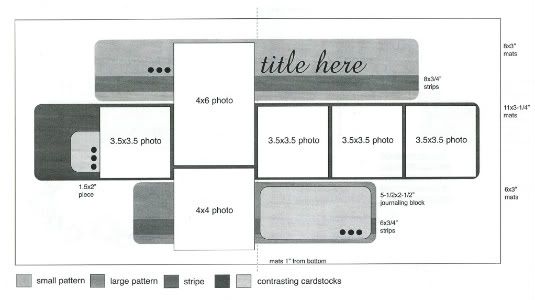
The sketch, from Sketches for Scrapbooking, Volume 2, that I've used as the starting point for all five layouts this week.
Layout #4 - "The Terrible Twos"
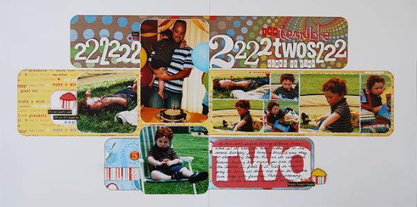
Supply List - Cardstock: Bazzill; Patterned paper: Reminisce, Creative Imaginations, and KI Memories; Chipboard: American Crafts, BaiscGrey, and Heidi Swapp; Alphabet stickers: My Little Shoebox and Doodlebug Designs; Cupcake punch: Martha Stewart; Word stickers: 7Gypsies; Jewels: KaiserCraft; Paint: Making Memories
This page makes me smile when I remember this day. Sure birthdays are supposed to be happy and fun but when you're turning two you never know what you're going to get. Drew showed us exactly what the "terrible twos" where on none other than his second birthday. How's that for perfect timing!
Variation #1 - I had so many pictures of this little guy being Mr. Pouty Pants that I wanted to find a way to include a bunch more than what the sketch called for. I had a few of the pictures printed in wallet size so I could get a lot smaller of photos on the layout. On the left page I kept the photo sizes as suggested on the sketch but on the right page I made a large grouping of smaller photos.
Variation #2 - I thought it might be a different look if I rounded the pictures to match the rounded corners on that background pieces. For the photos on the right page I grouped them together without margins in between them and only rounded the four corners of the whole group together. I didn't want to round the little pictures because that would have been cutting them a little too small, at least in my opinion.
Variation #3 - In place of the strip across the top piece of patterned paper I painted a bunch of different sizes and styles of twos and adhered them across the paper.
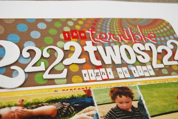
When I got to the area where the title would go I spelled out the word two instead of using the number itself so that I could use it as part of my title.
A little side note, on the "terrible" letters I had originally used just the red alphabet stickers but they were blending in with the patterned paper. Since it was making it hard to read I used the same style of sticker in white, put them down on the page first, and then added the red ones on top of them with a little bit of the white peeking out to create a shadow.
Variation #4 - For embellishments on this page I used a cupcake punch and turned it into a dimensional piece without much effort. To do this you punch two of the shapes. On the backside of one of the shapes sketch the line of the shape around the piece in a little from the outer edge. Cut along that line and then use foam adhesive to adhere the smaller one onto the larger piece.
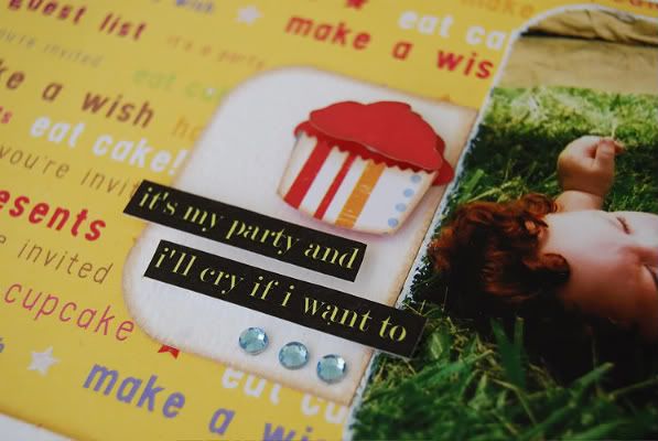
I also added a word sticker or two and some jewels to finish off the embellishments.
I used the same size of journaling block as suggested on the sketch but I wanted to share how I did the text on text look without using a computer.
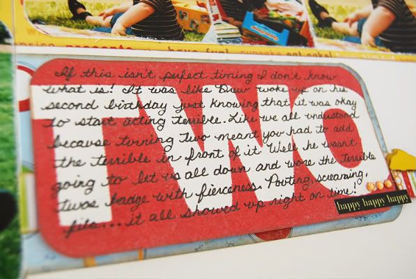
I've seen this look done several times with computer journaling but since I'm trying to use my handwriting as much as I can I wanted to see if I could do it without the computer. It turned out to be so easy!
• I cut my journaling block to the size I needed it to be and rounded the corners.
• Next I found the letters that I wanted to use on the background and adhered them onto the journaling block with removable adhesive.
• After that I sprayed the paper with Glimmer Mist and then blotted off the excess. The color was a little lighter than I wanted it to be so I sprayed over it a second time to get a darker red.
• When the piece was dry I removed the letters. What was left is exactly what you see in the picture. The area where the letters where adhered is white and the surrounding area is red.
• The last step was to add my journaling.
Day #4 = your fourth chance to win a copy of Sketches for Scrapbooking or the Nikki Sivils, Scrapbooker giveaway! :)

69 comments:
Staying up late to scrapbook and using this sketch for my layout too!!!
I like the group of pictures you added instead of one photo. It definitely adds to the story!
Really, with all your amazing creations, you really are the McGuyver of the SB world! LOL
Way to do it the 'old fashioned way'!
:)
This is so cute!! :D
Super cute layout...love all the 2s!
I paticularly love the journalling block. Great idea.
Well, the double-layered letter stickers in the title are great. I've dealt with the same issue, and feel really silly not to have thought of that myself. I used to take cut out letters and do the same thing on my bulletin boards when I was a K teacher. I can't believe it didn't occur to me to do that on a layout! Thanks for the wake-up call on that one...sheesh.
What color glimmer mist did you use for the red journaling block? I have tried several different reds from that company, and keep ending up with something more pinkish than red.
Oh, the 2's weren't that bad in our house. It was the 3's that were more challenging - doable, but not as easy as 2.
Thanks for the supply lists, Ali!
:)
Love the layout! What pen do you use for your journaling? I love the way thin sharpies write but haven't found an acid free version that gives me the same look. Yours seems to be the same thickness.
You did it again, Im totally amazed by this layout. I love love it for several reasons. The first thing I noticed was the journaling block, that is such a cool idea, so simple. Next love that there's more pictures on the right side it does tell more of the story. Love all the 2's, I've done something like that before. I didn't know there was a cupcake puncher so cute. Love how you did the title, wouldn't think of that. The best reason is because my daughter did the same thing at her 2 bday, she woke up to a teletubby decorated house and threw a fit. So I've never scrapped this birthday because it was awful didnt want to put that in her album but now thanks to you I will. She was fine after that it was the 3's for all 4 of my kids that were terrible. Thanks so much Allison, sorry the week is going to fast.
I love all the details on this, especially the journaling block!
what a great idea to glimmer mist the word, then you can write on it. And what a great way to use up all those extra numbers!
Thanks for explaining the journaling block. I love how you used the letters/Glimmer Mist.
Linda from KS
This is one of the cutest, funniest pages yet! There's so much I love about it but the string of 2's around the title is what drew me in.
What a wonderful day to post about birthdays. It's mine today and I am taking the day off to scrap with your sketches.
Love the layered lettered, I would never have thought of that! I find so many details to use. thanks! Happy Birthday to me! You're sketch week is my gift! :)
Wow! Another great layout this week. No wonder why this is my favorite week of the month.
I love all the 2s and your idea about layering the stickers and the cupcake. I have never tried Glimmer Mist, so that might be another to do list item this summer. What you did with the Glimmer Mist seems so easy but it had such a big impact.
Thanks for sharing your creativity. It brings many of us out of our boxes to be more creative and motivated to scrapbook.
Love that journaling box. Must try that!
Kathy R
What great techniques you shared today about how to create the journal box and the dimensional accent. I can't wait to try those on pages.
Heather
I really like all the "2"s on the top. cute!
I love the row of 2's and how the title is incorporated into that. Thanks again, Traci
Ali, I just loooove your sketch weeks... so inspiring!
Your layouts are gorgeous and I can't wait to try myself. I have a nice pic set of my girl blowing bubbles… can be nice!
Thanks for sharing. Cheers,
Valerie
I was working on a LO last night that was giving me grief. I left it and went to bed, but while I was laying in bed I thought about your sketch of the week! I knew that when I got up in the morning you would have a gem for me to fix my layout!
I cannot wait to "fix" my title today :)
THANK YOU!!!!!
Made a layout from this sketch last night...Love it!! Makes it easy for me to mix patterned papers.
Awww..poor Drew! Poor mommy and daddy too!
Love the journal card and I LOVE all the 2s in the title! TFS!
Great Layout. Lovin' all the 2's. What a great way to use up some of the extra number's I have left over.
Ali...I love the idea of layering the letter stickers so they will show up better...never ever would have thought of that!!!! And thanks for the directions for making 3D embellies! Gonna dig out those punches and start making some of my own!
Candy Conner
Oh that journal block is great! Thanks for the instructions on how to do that. So cute to have the 2's running across the page like that & then broken up with it spelled out. Mine is three now - A fun age but very challenging at times! Scrapping is my therapy to keep my sanity. :)
Amy S (TX)
Love the new use of glimmer mist. Can't wait to try it! Thanks for all of your great inspiration.
Great layout! I love the use of the smaller photos, I'll definitely remember that one to use when I scrap! And I really love the journaling block...great idea!
Very creative as usual. Where do you get your pictures printed?
Love how you did the TWO background for your journaling. I need to give Glimmer Mist a try!
I love all the little pictures on the right side and those papers are great!
Super cute! I never thought about painting letters if you didn't have the right color. Will definitely have to remember that.
Love how you created your own journaling block. I'll have to get out some mists and play myself! TFS!!
I've never used glimmer mist, it looked too messy and I didn't know what to do with it. Nice use of negative space. Thanks for sharing.
Thanks for using the glimmer mist, it is my latest obsession and I'm always looking for new ways to use it!! LOVE THIS LAYOUT!!
Really cute layout! Love the use of 2s. Great way to use up the 2s from our sticker sheets we all have laying around.
Stacie in OK
You just amaze me with all the variations you come up with. I love the layout. My three children always seemed to sail through the twos but turned terrible at three!
My favorite tip today, the TWO journal block.
I can so relate to the terrible 2's! I have a 2 and 3 year old and the terrible 2 bug hits this house daily for one or the other!
Thanks for sharing
I love how you did the journaling box! I am going to have to try that idea!
Another creative layout. I love the idea of printing wallet sizes. Going to give that a try.
Love the journaling block!!
I love all the little details you use that I might not think of myself - the shadowing of your title, the 2's in the title, and a great new way to use my glimmer mist! I share a birthday today with someone who responded earlier - but I'm working. Spending the day at home scrapping would have been MUCH better!
I love this page! The twos and journaling look great!
Cute layout. I used this sketch yesterday and my layout came together so quickly. I've got to buy your books.
LouAnn
Again a very lovely layout with this sketch!
Love how you showcased the non-celebratory side of Drew's 2nd birthday! Fabulous! Love your style, Ali!
Love this layout, and all the two's !!! Thanks for all the great inspiration.
Another amazing layout. I especially like the technique you used with the journaling block. I have made a note to try this on a layout soon. Thanks again for the chance to win!
Your sketches complete with measurements make scrapping a breeze! Thanks again for yet another fabulous sketch!! And your examples....AWESOME!!
So creative. I love how you incorporated all the twos!!
I love the journaling block you made! Another great LO.
Love the how you used the #2 and then spelled it out for the title and the journal box. LOVE the LO.
My favorite thing on this layout is definitely how you did the journaling block! Genius! I also love the number 2s all along the top!
Love the 2/s everywhere!
Again, it just looks so simple. Your creativity amazes me. Love the twos but my fav is your journaling block!
I just want to say how much I appreciate you taking the time to do this each month. I know it takes a long time to write up every day's blog post. I am learning something with every post, today I loved how you layered the alpha, the red on white, I have traced around them before but never thought of layering them and I love to layer pp, so why not alphas too?!
So sweet:-) I love how you changed he pictures sizes- the block of smaller photos works perfectly!!!
Love the handwritten journaling!!
i just love the variations of your sketches. you can do so much with one sketch!
Great idea w/the pictures and a fun idea w/the 2's.
Cute layout!! Love how you layered the word "terrible" :)
jennifer hamilton
I appreciate that you scrap 'real life-the good, the bad, and everything inbetween.
I, too, learn something from each and every layout you do. Thanks.
Your sketches are amazing, versatile, and inspiring. Thank you so much.
Your title of 2s is a great idea! What a wonderful bright way to remember those "terrible 2s"!
I love the row of "2s" at the top of the layout! That is neat the way you latered the journaling over the word "two" also. I LOVE to look at your layouts! They are so inspiring!
I really love how you made your own journaling block it looks great and I never would have thought to do something like that. I love how you give us all these great ideas in addition to the great sketches.
Any word on when the DVD will be out - I am hoping to buy the rest of the sketch books at the same time as I only have 4 and 5 but I need them all LOL.
Love the journaling idea, can't wait to give it a try.
scott.lisa3@verizon.net
What a great piece of family history to capture. Wonderful!
Cute layout-I have one in the throes of terrible two's right now. :)
Very nice layout. I like how you made a shadow effect with your letter stickers in the title and also love how you made the journaling block using Glimimer Mist.
Post a Comment