Day two of Sketch Week brings a lot of variations and not one of them is complicated or take any extra time. It's amazing how simple, little variations can make a big difference on a layout.
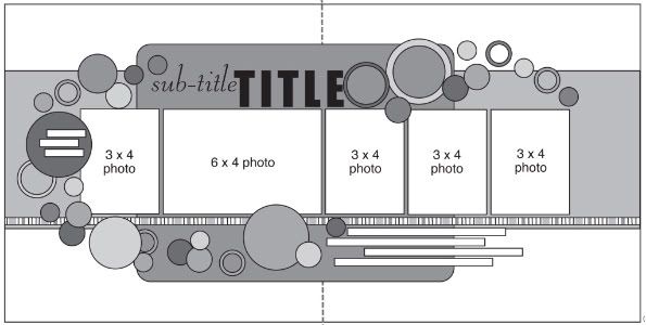
The sketch that is the starting point for all five layouts this week.
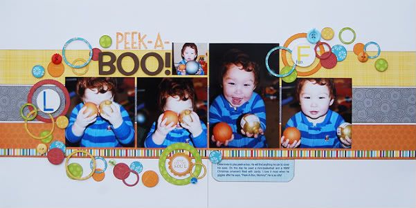
Layout #2 - "Peek-A-Boo"
Supply list - Cardstock: Bazzill; Patterned paper: Echo Park, My Mind's Eye, KI Memories, and Bella Blvd.; Alphabet: American Crafts and Doodlebug; Stickers: Creative Imaginations and Pebbles Inc.
While I did follow the circles on the sketch pretty much everything else has been altered. The pictures, the papers, the title, and the journaling are all slightly different than what is on the sketch.
To make the circle rings like on my layout you need two different circle punches in two different sizes. You punch the smallest one first and then center the larger circle punch around the hole that the smaller punch left in the paper. When you punch the larger one you punch out a ring.
• Variation #1
Today's layout is a great example of needing only 4 x 6 photos for this sketch with the exception of the little 2 x 2 photo beside the title.
On the left page I used two 4 x 4 photos which are one of the easiest sizes to crop out of a 4 x 6 photo. All you are cutting off the picture is 2". A lot of times you can get away with cropping one inch off one edge and one inch off the other without cropping out anything important.
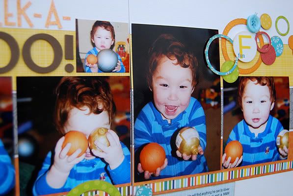
On the right page I used a vertical 4 x 6 and another 4 x 4. I used the vertical 4 x 6 on the right page so that I wouldn't interfere with my title.
If I would have used the vertical photo on the left page two things could have happened with the title. The first is that I would have had to remove some of the circles. That seems like an easy option but to get the overall swirl look I thought it needed that little curve of circles at the top. The second option would have been to place my title above the vertical photo. Again, this seems like an easy option but doing this would have left a gap on the right page from the bottom of the title to the top of the 4 x 4. I'm not usually a big fan of gaps in the middle of important elements on the page because it can be so distracting.
Another thing to point out is that, just like yesterday's layout, the combined width of the photos on each side of the layout is the same.
• Variation #2
I already mentioned it above but I also added a 2 x 2 photo beside the title. I had one more picture that I wanted to squeeze in somewhere and this was a good spot for it. It's not taking up too much of the title space since it's so small.
• Variation #3
While I'm on the subject of the title, on the sketch the title stretches in one line across the left page. On my layout, because I added the 2 x 2 photo, I had a little less room for that title. My easy fix was to turn it into a two line title.
• Variation #4
A big difference in this layout and the sketch is the absence of the background rectangle. Since I wanted to have so many colors in the circle swirl and used multiple strips going across the page, I removed that piece so it wasn't color overload.
One thing to remember about background pieces that aren't a part of the photo design, you can always remove them without needing to make other adjustments to rest of the page. There isn't anything on this layout that relies on that background rectangle so removing it was easy.
• Variation #5
On any sketch that you use, if you are looking to add more papers, breaking up one piece of paper into multiple pieces is a great solution. On my layout I replaced the 12 x 6" pieces with three 12 x 2" pieces. This is so easy and you can do this with any piece on a sketch.
You can even get into different shapes other than altering the strips. Like maybe a using six 2" squares in place of a 12 x 2" strip of paper. Or you might try turning a square piece into a lot of smaller strips. There are tons of possibilities!
• Variation #6
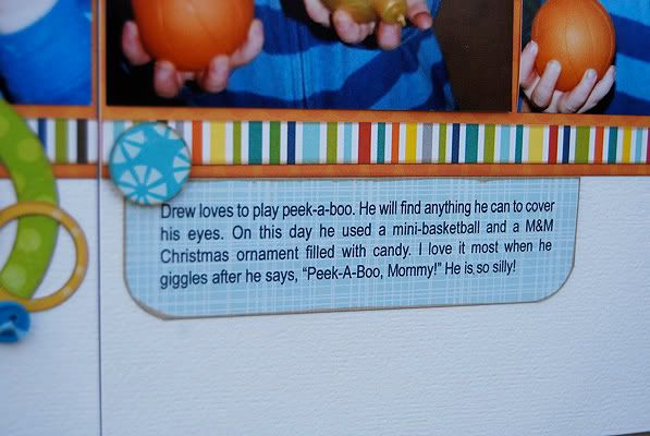
I love journaling strips but one great thing about this sketch is that the area designated for the journaling is open for any format. Sometimes you might get stuck with using journaling strips because of space restrictions or other elements on the page that you have to wrap around. Because this sketch has a big open area for the journaling without any other elements interfering, you have lots of options.
I used a simple journaling block with rounded corners for mine.
See, all of those variations were fairly simple yet it all contributed to a different looking layout.
Day two means that it's your second chance to win a copy of Sketches for Scrapbooking!
The Monday winner is...
AmyBug said...
Wow! I love those sprinkling of stars. The added stitching is great too.
You can email me at alidavis1919@hotmail.com with your shipping information and which volume you would like.


95 comments:
Super cute layout! I like the 3 pattern paper strips!
I too love the 3 stripes of pp in the background and of course all those circles.
another super cute layout! love the circles!
great LO! I love all the circles and the striped pp!
Another fab layout. I love how you've pop dotted some of the circles for dimension. I don't do that enough.
I love the circles. I like the buttons that are mixed in with the circles.
What a cute layout! Love how you used three different papers for the background!
I love the bright colors in this LO!
Ohh, I love the colours and design here!
Thanks for explaining how to get the beautiful circles with punches! Love the layout!
I like Variation #5. What a good excuse to use all of those pretty papers in my stash!
Super-cute layout! I like the picture sizes on this one and I really love the bright, happy colors! Your pics of Drew are adorable and they remind me of some that I have of my oldest when he was a little guy...I feel a scraplift coming!
I love broke up the backround into three different pattered papers. Another great layout.
Love this version of the sketch with all the circles and standard size pics.
Wow, I love this! All of the little circles are just perfect...
- April W
adorable! ... love the circles, i am such a circle fan :)
Love the mini pic you added next to your title!
love those pics of Jackson, he is such a doll! I love how colorful this lo is. super cute
This one is great! I love the circles and background paper. great job!
Jennifer D
What great pictures, what a great moment to have captured.
Love how many different ways you can change a sketch to make it work w/ what you've got. And the many things you can use as the swirl across the page!
I like how you substituted the paper strips. those circles really add the zing.
Love the strips of patterned paper and the journaling card!
I love the 3 strips and love love circles. The circle punch is one of my fave tools. Going to scraplift this one for sure. Of course Drew is adorable too.
I love this layout!!! The circles are so bright and fun- they are one of my favorite embellishments to use:-)
Love the way you make simple changes work so well - 3 strips in place of the block of paper, buttons to add a little dimension with the paper circles. What fun!
OMGosh...the whole lo just bubbles over fun! The colors are great, the flow is great, the circles are great! Awesome Allison!
Love the sketch & can't wait to use it. Just got done with your sketch class at MCC & have ideas for the "extreme" take!! Thanks so much!!
Wow, it must have taken forever to get all those circles cut out. I love it!
wow, love the sketch and layout!!
Thanks so much!!
lg Manuela smaili
Love the papers on this variation of the sketch! Also LOVE that smile of Drew's! Looks fabulous! TFS!
love the circles. Just got the Martha Stewart circle cutter thing too! (:
Love how you created such a great layout with only two circle punches and some patterned paper. An inexpensive idea using supplies you have already to make a fabulous page. Fantastic!
K in PA
Have I ever mentioned how much I love sketch week? Thanks for sharing so many great ideas with us :)
what a great sketch--as always! I like all the variations you give for each layout too...lots of great ideas!
I love the stips of paper in the background. They add a lot of depth to the layout. As always, another awesome layout idea!!
These pictures are so cute! Love the circles.
Circles are timeless!! I love it, need I say the model is very cute!!
Mandy
Woo-hoo! I'm can't believe I was the lucky gal. This totally made my morning. Thanks so much.
I wanted to also say that I love how you divided the large piece of patterned paper into 3 strips. I will have to remember that when looking at sketches.
I love all of the bright colors on this layout. Can't wait to use this sketch myself.
Need to try this with my circle punces. Really cute photos pop right out of this layout!
Michelle
What a great sketch...and I love the variations you made to it...fantastic layout.
This is such an adorable layout!
I think i need to get more circle punches! Love it!
Your circles are amazing!! Thank you the great tip on making the rings.
I like the 3 pattern paper strips. Very cute LO. Thanks! - RacheT
Aww, such a cutie! Love the fun colors.
I didn't even realize the background rectangle was missing til you mentioned it. LOL. Once again, you really do show how the possibilities are endless.
Wow! I absolutely love all the circles and rings on your layout. I have to admit that when I saw the sketch I thought it might be a little too much, but the end result is perfection! :)
Circles are such a happy embellishment. They make me smile, just like the cute pictures of your son.
I love the buttons added into the mix!
This is a great way to use scraps of paper to punch your circles or even do the long strips of paper. Great ideas, as always!
Wow, since taking your class I really look at sketches and see more possibilities than I ever did before. When you take out the larege shaped piece, the allowance for variations in photo size and arrangement really explodes. I love this layout, and Drew is so little! :)
The subject of this LO is just darling! What a precious moment/memory to preserve!
I'm loving the circles, rings and buttons! And you always get such a great mix of colors into your LO's.
It's REALLY making me wish that I could have fit your sketch class into my schedule! :)
I love the use of 4X6 photos!
This layout compliments these photos so well.
I love how colorful this is! And thanks for the tip on dividing up a background piece to use more papers. I love the three strips!
Love, love sketch week! And I love all the circles on today's layout! Circles and dots are what I find myself always buying/scrapping with. Love your work!
My friend Amy just introduced me to your site and I'm hooked!!!! Thanks for so much inspiration!!!!
I love the 3 strips across instead of one solid piece on each side. Perfect!
I really love the colors you used for this layout. Really love the variations!
oh- love the circles and ALL the patterns..just wonderful, and just look at the child- just adorable!
thanks for sharing once again!
The circles are so cute. Love your color choices for this page.
I love those circle rings and I never knew making them was so easy, thanks for the tips!
Another cute layout!! I really like all the circles.
I love the mix of circles and circle outlines! I'm definitely going to have to try this one!!
Love all the bright colors on this one.
Wow, by altering the 12 x 6 paper into the three 12 x 2 strips I can use up my scraps when I lack full sheets! Great idea!
Thanks for the idea of using the three stips on the background instead of one big sheet.
That's so cute! Those pictures are priceless!
I love the three strips for the background paper to add the color. I also love the cirles!!!
Love all the circles. My niece loves peek a boo too with anything she can find :)
Drew is too cute for words! This is a great layout and variation on the sketch! The circles are awesome!
These photos are adorable! I love the circles with the ball and ornament he's holding in the photos!
LOVE it. The colours, the pictures, just beautiful! C'mon, do one with fall leaves swirling, that's what I see in the sketch but I could never pull it off!
This is really adorable! I love the swirl of circles. Too cool!
This is just so adorable!!!
I really enjoy seeing how you change up the picture size. I am still working on this on my own layouts.
I love how adaptable all your sketches are!! Thanks for sharing them with all of us!!
I really like the circles with these photos!!
Love the background strips and the bright colors. I'm a vertical picture person, and love how that ones stands out among the others.
you are so right that was the perfect place for that 4x6 photo, it filled in nicely with the circles that are also on that page. I love how you use the paper as an embellishment.
love the circles so much! can't wait to use this sketch!
Peek a boo, how sweet are you! Wonderful variations!
I {heart} the 3 strips of paper behind your photos as a variation from the larger paper, I am totally lifting that!!
I love your color combination!! Great layout as usual. :) My 14 month old daughter loves peek-a-boo too!
Very cute layout! Love the pictures of Drew!
Love the circles! Beautiful layout. Can't wait to use the sketch
Super cute layout, and very versatile sketch !!!
Karina
Paper Doll, I think you'll like tomorrow's layout!
I agree with all of you that said circles are one of your favorite embellishments. They are mine too! They just add such a fun touch!
Thank you everyone! :)
so adorable! love it.
I love the changes you made! Makes the sketch look so much more do-able! Thanks, Ali!
So So Cute. You are so talented! Thanks for sharing! Traci
LOVE all the circles! Great Job!
Post a Comment