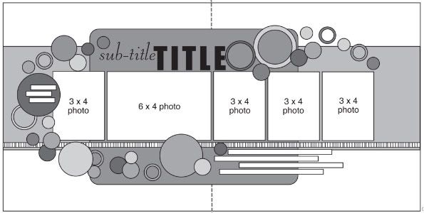
The sketch that has been used as the starting point for all five layouts this week.
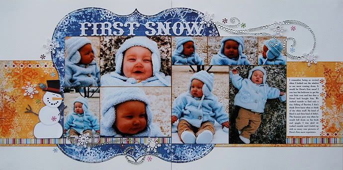
Layout #3 - "First Snow"
Supply list - Cardstock: Bazzill; Patterned paper: Fancy Pants; Jewel flourishes: Prima; Alphabet: American Crafts; Snowflakes punches: Martha Stewart and EK Success; Glitter accent: Stickles; Jewels: KaiserCraft
• Variation #1
Yesterday I took out the large background piece and today I completely changed it and used a die cut patterned paper. It is a little bit larger than the suggested piece on the sketch but, just like yesterday, because it's not a part of the photo design you can pretty much do whatever you want without having to adjust anything.
• Variation #2
Have you ever had those times when you have an idea and then it ends up taking a completely different direction? That's what happened with the pictures on this layout. I had originally planned on using the same photo sizes as on the sketch with a second row of the same above it.
However, once I started playing around with the arrangement of the photos I was quickly discovering that it just wasn't going to work with the photos I had. I had too many vertical photos that I wanted to work in there too. This is a great example of how you can always adjust the sketch to fit what you have and what you want to use.
I ended up taking a five photo sketch and turning it into nine photo layout by simply widening the height of my photo block. The only big concern was running my title up too high and not leaving enough room for the swirl pattern across the bottom. A few things I did to adjust for those two elements were first, I removed the margins between the photos and second, I trimmed the height of the photos down a little. (For example, I started with a 4 x 6 on the left page and trimmed it down to 3 1/2 x 5.)These small adjustments were enough to allow for those other elements on the page.
• Variation #3
When I added extra pictures and a lot more height to my group of photos it made a big difference in how I was able to do the swirl pattern. I like for the swirl to be fluid and smooth and with a bigger block of photos it would have been a little difficult to do. I ended up throwing the swirl out and went with something a little more simple. I add a jewel flourish on the bottom left page and the top right page to help replace the big swirl across the page.
To add some finishing touches to those I added some snowflakes punched from paper and accented with jewels and glitter. I kept the amount of snowflakes low since there was already so much going on with the extra pictures, the snowflake covered papers, and the big jewel flourishes.
• Variation #4
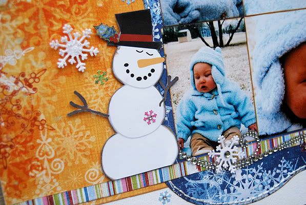
I also added another larger embellishment to the left page. The snowman was cut from a patterned paper and adhered with pop dots.
This goes for both the jewel flourishes and the snowman - using larger embellishments than what is suggested on a sketch is always an option. You might try to get that large embellishment in the same general area as the embellishment on the sketch and it should work. It might take some adjustments here or there and there will even be those times that it won't take any adjustments, like on my layout. The biggest thing you might want to pay attention to when adding larger pieces is if you are altering the balance of the layout.
• Variation #5
When I added more pictures to the layout it ended up leaving me with very little journaling space along the bottom. My easy fix was to move it beside the photos on the right page. There was plenty of space in that area. I also added a little decorative edge to the journaling block with a border punch.
Tuesday's giveaway winner is...
Gretchen LIndsey said...
This is a great way to use scraps of paper to punch your circles or even do the long strips of paper. Great ideas, as always!
You can email me at alidavis1919@hotmail.com with your shipping information and to let me know which volume of Sketches for Scrapbooking you would like.


102 comments:
I love this layout! The snowman and the swirls are so pretty! Thanks as always for the great ideas!
I always admire these swirls in the store but don't know how to put them on a page. Now I am ready. I also love the punched border on the journaling box. It adds so much to your already beautiful page.
Okay, I used this paper and now I wish I hadn't! How adorable are the jewel swirls? So adorable!!
Love the die cut paper and the orange and blue color combo. Super Cute layout!
I saw the page and said, "Wow"!
Love how you added the color orange and it goes so well all together! Love it!
What a totally different look this layout has. What a great way to add bling on a boy's page.
Wow, I love that pop of orange!
Love the variation on the number of pictures you placed on this layout...so often, I can't see beyond the numer/size you indicate on your sketch but I'm learning! :)
I love this page and you are right it certainly doesn't look like ti came from the original sketch. Your layouts are an inspiration to really think outside the box.
Love it! I love anything with snowflakes and this layout is beautiful!
Holy Moly, this is beautiful Allison!
Christina Hoffman
Oh MY! I love the blues! What a great way to get more photos on. Darling pictures!
Wow! Love this one. The die cut and the snowflakes are great. Another great idea! THanks!
Jennifer D
This is my favorite so far! I love the fact you added more pictures and the flourishes work great (they're always something I want to use, but find I can never find the best way to use them).
I love the blue and orange combination.
Love the colors and the die cut paper!
Love the bling and the stitching. Perfect with just the snowman and snowflakes.
Love the way you used the jewel flourishes for your swirl along with the snow-patterned background block. Great layout!
What a great way to add jewel flourishes to a boy's page! I have two boys also, and I appreciate the ideas on ways to incorporate some of the prettier, girlie things!
I love your use of the jewel swirls. I always want to use them and can't always figure out how. The same for the die cut paper. Can't wait to try this out for myself!
WOW...stunning! I don't know if it's the color, or the bling, or the movement/flow or what...but your layout is soooo beautiful! Great work girlie! Thanks for showing us yet again a great layout!
I LOVE this layout - great twist on the sketch.
OMGosh! This has to be one of my all time favorite LOs from you Ali!! I love love love the non traditional orange popping the beautiful blue die cut paper! I love the addition of bling (I was beginning to wonder if you ever used bling on your LOs! ) I love how the photos are so neatly grouped!
Just a tip for your readers...you must click on the photo of the LO to get the full effect...at least for me the pic gets cut off at the journaling and there is space after that you can't see until you click on the LO itself.
IT"S FABULOUS ALI!! TFS!
I'm just blown away by this layout. Never in a million years would I have thought to use that orange patterned paper, but it's absolutely perfect!! I really like the way you explain all of your variations; they make so much sense!
So glad I discovered this site!!
It amazes me that your layouts never look too busy. You always seem to know exactly the right amount of stuff to put on them.
This layout is soooooooooooooo sweet! I love it!!!! That snowman with the bling is the perfect embellishment for this too!
Love the "frosty" feel of this layout. Another great layout and sketch that I will use time and time again.
I just love how you used the large die cut for your page, I have so many of these, because I love the look, but I am never sure how to use them in my layout, you make them look so good !!!! I just love colors on your layout, the blue's and oranges together with the snowflakes awesome, and another great sketch Allison.
Gave me some great inspiration for my daughter's snow pictures - beautiful as always!
I would never have thought to use orange on a winter layout. Love how you always make your layouts so colorful.
Cute layout, love the bling!!
Mandy
Well, looks like everyone beat me to it but I agree with all the above comments.
1. Would never thought to use orange
2. love love love love the photos, he is adorable love his coat/hat
3. all the pictures but still doesn't look busy
4. you are amazing every sketch week just keeps getting better
5. this is my favorite so far this week love love it
Thanks sooooo much Allison for all you do and the inspiration!!
awesome variations & I love the blue & orange together!!!
Staci
I love the snowman and the snow punches. Your work is awesome! Thanks for the great inspiration.
Lori in Lawrenceburg, KY
Love this layout!!! So different than the first two. The bit of orange was a good addition.
Another terrific layout. I love all of the changes that you made and the additional photos.
GOREGOUS! Love the snowman accent, the bling flourish, the journaling on the side and the pics are so balanced!
Love the bling swirls. Wouldn't have thought to use them on a "boy" page but they look great. Thanks for all the great ideas.
Kathy R
Gorgeous layout! Thanks for sharing.
Love the swirls you used here. Everything is so perfectly coordinated in this LO!
Oh, beautiful layout. The colors you used allow the pictures to stand out so nicely. And the snowman is so sweet.
Your sketches are the bomb! I love the jewel flourishes!
I LOVE this! I love how you used the diecut paper, the orange on a winter LO, the jewel flourishes and snowflakes - it is awesome!
This is my favorite so far this week. Great layout!!
Awww, this is so cute :)
This is such an adorable layout!
The BLING SWIRLS are totally cool. I also really like this color combo for WINTER.
Love your layouts.....they are so efficient with paper and really focus on the photos.
oooh... what a cool use for this paper!
Wow! Your jump from sketch to layout is fascinating! Thanks for giving us all the details.
Love love love this layout today. The photos, bling flourishes, snowflakes, stitching, the colors, all of it.
I think this is my favorite one...so far! :)
So cute!!! I love the background paper, it's suits the photos perfectly!
visualizing the sketch and detailed variations has helped me "envision" sketches so differently-especially with todays flourish. Thank you for the inspiration!!
Love the extra photos! This layout makes me excited to scrap winter photos!
Your jump from sketch to layout is fascinating! Thanks for giving us all the details. Wow, wow!
lg Manuela from Switzerland
awe... adorable page!
I love the diecut paper on this & the way that you incorporated so many pics!
Absolutely stunning!!!
- April W
I love this!! so adorable for winter theme! Looking forward to next one. All of these different layouts allow me to use my scrap up. I always have so much of them left.
I love this!! so adorable for winter theme! Looking forward to next one. All of these different layouts allow me to use my scrap up. I always have so much of them left.
This layout is GORGEOUS!! I'm not sure what I love the most: the jeweled flourishes, the beautiful color palette, or those adorable photos! Thanks for another spectacular design!
Very cute! I love the way you used the flourishes. Great job once again!
I think this is my favorite of the 3 so far, cant wait to see what otmorrow brings!
Very pretty paper, especially the die cut sheet. The jewels accents make you think of the wind whipping around during the winter time. Another great layout!!
I love how the jewel accents take this layout to another level.
Love it! Did you make the snowman or is it a diecut?
I like the idea of using a diecut and also using more photos.
Beautiful layout! The colors are great!
love all the photos you scrapbook with and do sketches for.
Very cool layout! I love that color combination!
Such awesome and inspiring variations on this one!! I love the orange; it really pops the photos.
Sabrina
love this layout!
Darn! I was at the dentist getting a crown and forgot to comment yesterday.I'm not forgetting today in hopes of winning a sketch book. :) This layout is wonderful! Love the flourishes.
Another stunning layout!!! I live how you incorporated the large diecut sheet of paper- it fits perfectly!
I love the color combination! You normally see just blue or purple snow paper, but the orange is nice! The snowman is super cute as well!
Oh my gosh! I almost missed Sketch Week - love this sketch and all the layouts so far.
I am working on a Super Sketchsaver layout right now and I'm loving how everything comes togegther.
Your a genious!
Love how you used the die-cut paper and all the bling!
Really enjoy seeing how you change the sketch to meet the needs of the project you are working on. Many times I find myself with more photos and I need to learn to still make the sketch work. Thanks for the inspiration.
Michelle
Wow!! I love the colors and the swirls and just all of it!! Did you also ink the edges of the photos? This one is so eye-catching and creative--I don't know how you do it!
So many ideas here. Thanks so much for the inspiration!
Today's layout was brought to us by the letter s: snowman, swirls, stitching, snowflakes, snow, and smiles. Love them all and that pop of orange with the blue is marvelous. Thanks for sharing!
K in PA
Gorgeous layout! Thanks for the inspiration.
Beautiful layout - my favorite of the week so far. I really like how you used the punch on the journaling block.
I love that big scallop piece. I am constantly amazed how you can take one sketch and make so many layouts that look so very different. Thanks for all the inspiration!
What a beautiful layout! All the sparkle and detail with the snowflakes---so pretty! I also love the stitching around the die-cut paper. You've done it again, Ali!
Wow...I love this layout. The swirls stand out so beautifully and I love the snowflakes.
This is a great layout Allison! I really like it and it's so pretty! Great job! :)...
Ashley L.
Allison, you're right, I love it! Thanks for that. I had a layout sitting on my desk for weeks, just not sure how to finish it. Idea ... the swirl, so I'm adding a swirl of flowers over the two pages. It was just what it needed! Maybe I can pull off those leaves.
I'm loving the bling on this one instead of circles. Very cool. I also like that you used an older line. I still have some of that and it's nice seeing another mom of boys use it. ;)
omgosh, I love everything about this LO--the colors, the bling swirls, the die cut paper, the pics! This is one of my fave LOs ever!
I love the pretty swirls - they are so fitting for the snow themed layout. Thanks for all the variations with the number of photos. I tend to stick exactly to the sketch and I really need to remember to adjust the sketch for my photos, instead of the reverse.
Ohhhh...I'm going to have to scraplift this one! Love it! Such cute pictures too!
I love this layout. I am so glad it is Sketch Week here on your blog, as I am really sad about your class on MCC ending. At least there is a Sketch Week to help me out with my sketch withdrawal...now what will I do next week?!! :)
What a stunning layout. I absolutely love your style and your choice of paper and elements. Thanks for your inspiration.
So adorable!! Love the decorative edge on the journaling block! TFS!!
The orange and blue together is perfect! Love the snowman too.
beautiful! I love the pictures layered onto the die cut paper!
This is beautiful! Thank you!
i love the embellishments on this layout. super cute and so pretty at the same time.
Great LO! I have very similar pictures of DS#2 in the snow for the first time. Thanks for the inspiration.
Post a Comment