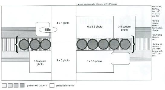
The original sketch that I'm basing my layouts off of from Sketches for Scrapbooking, Volume 5.

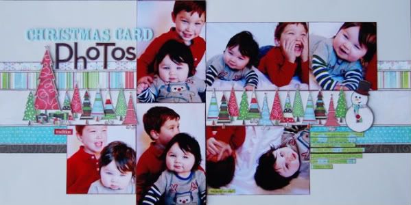
Layout #3 - "Christmas Card Photos"
 Patterned papers (including the Christmas trees, snowman, and journaling strips) - BoBunny, alphabets - American Crafts and Making Memories
 Just like layout #2, this one has a several variations.
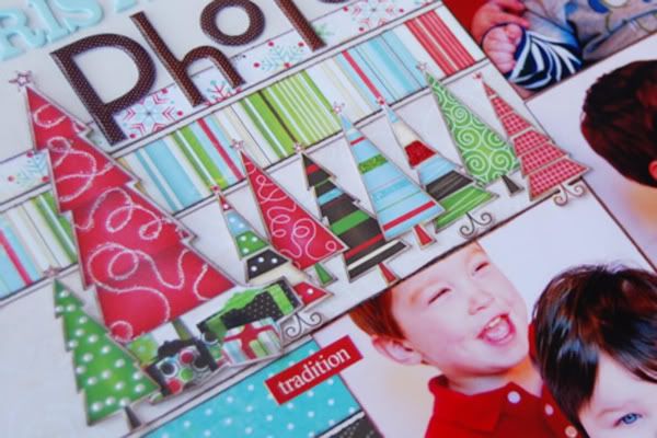
• Variation #1 - Of course, the biggest change is, again, the middle section of embellishments. This time I cut all those little trees from a piece of patterned paper. To add a finishing touch I added some Stickles to a few. I also have them all adhered to the page at different heights by using foam adhesive. I tend to get a little pop dot crazy and sometimes probably go a little overboard with them. I personally think it's a great and easy way to make certain elements stand out.

• Variation #2 - The larger tree sitting with all the smaller ones is the element that I used instead of the square on the original sketch. Just like the last layout, it's not in the exact spot as the square on the sketch. After I added the title, the taller tree was a perfect fit and it's still close enough to the general area of the square that it serves it's purpose, to add balance to the layout.
• Variation #3 - One thing we include on our sketches in Sketches for Scrapbooking is a little key/guide to help you with picking out the right papers. On the sketch for this layout the middle strip is suggested as a stripe. I decided to use a solid color instead since the multiple colors of the Christmas trees would have most likely gotten lost in the colorful stripe, especially since some of the trees themselves are striped.
• Variation #4 - You might not notice it right away but I went with different photo sizes than on the sketch. I almost always work with 4" x 6" photos. Most of the time if I have cropped photos they are cropped from a 4" x 6" print. With this set of pictures there really wasn't a lot of room for cropping. Since the photo measurements on the sketch are only 1/2" difference I decided to leave them as 4" x 6" for the larger ones and on the photos that are supposed to be a 3 1/2" square, I instead cropped them to a 4" square.
• Variation #5 - Yesterday I had mentioned using journaling strips and on today's layout I did. I really like the look of journaling strips because you can use them in so many ways. You can have them all the same length or for fun, all different lengths. You can add them to the page in a straight formation or you can "wrap" them around something on the layout. I tend to use them a lot!
A new day means a clean slate for the giveaway entries! :)

41 comments:
That is just too cute - Ali!!!! Thanks for all the wonderful ideas!!
Brenda
I look forward to this every morning. Thanks so much for the ideas!
Beautiful, as always! 2 questions: What did you use to edge the trees, just a silver marker? And what do you use on the edges of the pictures to make them look (almost) matted ~ chalk ink??? Thanks!
I'm loving the tips!
I just adore the trees! Such a clever little chickie!!
Wow Ali, I wish you had time to blog everyday!!! I am just amazed at all of your creations and feel honored to have seen these in person and get some really good close up pictures of each one of these layouts. I must say you have truly been blessed with such talent!! You Rock and I look forward to seeing more of your AWESOME creations!!
Christina Hoffman
Love this layout and I just LOVE the sketch books. It took me a while to move past the whole idea that using a sketch was "cheating". But I've obviously gotten over it as I just bought my
2nd SG sketchbook recently. Love the different variations and am inspired by your great work!
I love that you are posting the variations on the sketch and pointing out the differences!
Question?? if you use a sketch and then you submit that page do you write the sketch names etc down in your list of supplies? I don't use sketches usually because I'm not sure on that one and if I have tried my page usually goes way off the "sketch" path and I end up with something that doesn't resemble the sketch LOL. I may however make an exception and give your sketch a whirl...seems like an easy way to bang off a multi-photo page!
TFS and the inspiration!!
:)
Dolly
Wow, this is my favorite LO. Love the trees! I look forward to reading your blog every morning and seeing the new creations. Thank you. Jody, IA
Beautiful work! I can't wait to try out this sketch.
Love this layout, especially all those little trees.
LouAnn
I love all the different ideas this is giving me!! Robin P.
This one is my favorite, so far. I used this layout last night with some beach pictures and I love it! Thank you for the ideas. Oh, and I really want book 5!
Hi Allison,
I love your reading your blog every morning, we are getting spoiled. Wish you could do this more often. I'm always amazed with what you come up. I love love the trees, they are all so different.Thanks for staying up late and working hard for us. I like the pictures of the boys, they look like it was fun. Can't wait to see tomorrow's.
Nice as usual! I appreciate all of the extra ideas you include.
Bettyann, the trees came from a piece of patterned paper with a cream colored background. When I cut them out I left a little bit of the cream color around the edges. No edging other than that.
I did use chalk ink around the edges of the photos. I should probably mention that chalk ink doesn't always work on photos. It all depends on were you get your prints. It won't stick to a lot of photos. Staz On ink is what I usually use to edge my photos but when I went to work on my layout I couldn't find mine. I was lucky that that my prints happened to take the chalk ink. :)
Dolly, I would add the sketch source in the supply list. I see sketches as a tool for scrapbooking so I would definitely add it in. Plus it's always nice for she sketch source to get some credit. :)
Dawn, I'm thinking about adding this in as a monthly feature. It gives me a good excuse to get some layouts done!
I LOVE IT!!!! I am going to have to try this version of the layout too!!!! Keep the great ideas coming.
~Shelby~
I really like the Christmas layout. I may have to try it this week-end with some photos. Can't wait to get to Missouri in April to get my hand on book 5....
Allison,
That would be so great to see this every month. I love seeing your little boys in layouts. I have mostly girls in my family so it's a nice change. As you can tell from your comments you have a lot of fans who would read your blog every time you did this. Even if you didn't give something away I'd still would read it, the giveawy is just an extra bonus. Have a good day.
Love this sketches series!
I love the look of journaling strips but I can never seem to get them to look right on my layouts. Any tips?
Love the tree's and snowman in this layout. Your boys are adorable!
love the freshness of this layout...and this sketch is so versatile! (By the way, I love pop dots too...I think I used an entire sheet on 1 of my last pages! LOL)
Allison,
I am really enjoying this series. I was excited to see your comment that you are thinking about doing it on a regular basis. Again, I love your sketches---they save me all that time I used to spend staring at my blank page waiting for inspiration. Now the sketches are my inspiration and I move quickly to the scrappin' part.
WOW! You have alot of patience cutting out all those BoBunny trees for the middle accents! I love this layout too! Thanks again for your peaks at your beautiful work : )
WOW! You have alot of patience cutting out all those BoBunny trees for the middle accents! I love this layout too! Thanks again for your peaks at your beautiful work : )
WOW! You have alot of patience cutting out all those BoBunny trees for the middle accents! I love this layout too! Thanks again for your peaks at your beautiful work : )
Love, love, love this layout. I would love for you to include the line of paper you use for your layouts.
I love the little snowman accent!
Thank you for explaining all the little techniques you add to your pages- and I never thought of "inking" my photos!
Love sketches and this is adorable!
Ok, I admit it! I have a ton of stickles and I never think to get them out and use them. I love how you used them to take cutouts from patterned paper and make them look like specialized embellishments. I just need to set out a little basket of stickles on my worktable so that I can remember to use them.
OBTW, I have been looking forward to your posts every daythis week. I am having as much fun as I did when you used to post a layout a day. I know that you have a busy life. :) (Something that we all seem to have in common!!!) It is such a treat for me that you have been willing to share some of your time this way. Thank you!
I love that you use 4x6 prints. They help me keep my pages affordable. Thank you for all the great ideas.
Thanks for the comments that you are sharing with the layouts. It is very helpful. I love the layout.
Linda from KS
You've got some PURTY babies! Great layouts!
Thanks for sharing Ali. I love your style.
Love all the little trees. Such a cute layout, thanks for all the inspiration!
love this sketch and how you've brought it to life!
in the book are there any examples of the pages? or is it purely sketches?
I've got to pick one up!
also-did you do the other volumes too? might need those too. :)
Erica, do you ink the edges? I think edging makes a big difference in how they look. They kind of blur together if you don't.
kroller, so good to know that I'm not the only one. I go through so many sheets of those things!
Cindy, I'm going to go back and include supply lists for each all of these layouts! :)
Jen**SugaredSongbird**, it's almost as addicting as inking the edges of paper. It's getting hard for me to do a layout without inking the pictures!
Amy, get those Stickles out and put them to good use! I use mine all the time and probably have them in every color possible. They are great for adding that finishing touch.
Laurel, the books have sketches only and we have Volumes 1 -5. Each book has 30 sketches. We will soon have a DVD that includes 25 printable sketches, a 75 layout gallery and an instructional portion where we take a sketch and use it three times. The instructional part has three different sketches and 9 layouts total. :)
Everyone, thank you so much for the comments. You guys are awesome and I love hearing that you all are liking the sketches! :)
Another fantastic layout! I really want this sketch book!
Post a Comment