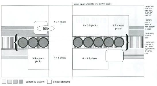
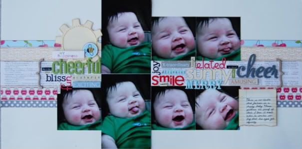
The sketch that all of my layouts have been based off of from Sketches for Scrapbooking, Volume 5.

Layout #4 - "My Happiness"
 Patterned paper, bee sticker, title sticker - October Afternoon, alphabet and word stickers - Doodlebug Designs, American Crafts, SEI, Cloud 9 Designs, 7Gypsies, My Little Shoebox, journaling card - Jenni Bowlin
• Variation #1 - Just like layouts 1, 2, and 3, the biggest change from the original sketch is that middle line of elements. Making a collage of words like that can be a little challenging and intimidating but once you get a few down it gets easier and they all start to go together like puzzle pieces.
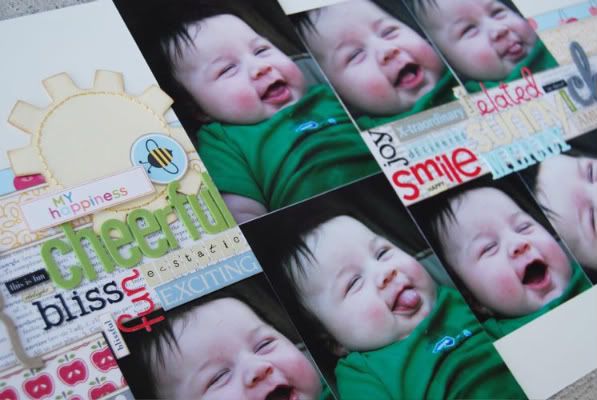
I pulled out several different colors, sizes, and textures of alphabets. I think it's easiest to start at the edge of something, in my case, I started with cheerful (to the left of the 4" x 6") and then filled in words around it. The smaller word stickers were my "filler" pieces. If I had a small space that I couldn't fit alphabets stickers into, I used the word stickers instead. You can get a closer look at in the picture below.

• Variation #2 - This time I actually did use an element behind the title. It's a little larger than the square on the suggested sketch but works nicely in that space. Another thing I might add, the sun is actually supposed to be a gear wheel mini-album page. I tend to use chipboard mini-albums on my pages more than actually making a mini-album out of them. The work great for extra large embellishments.
• Variation #3 - On the last layout I didn't use a stripe for that middle strip because I didn't want the colorful Christmas trees to get lost in it. The same goes for this layout. Using a strip for that middle piece would have made those words hard to read. The newspaper print patterned paper worked great because the the words on it are small and all one color.
• Variation #4 - I really changed up the photos this time. The two 4" x 6" photos are the same as the sketch but the rest are completely different sizes than the ones suggested. With these photos I had a lot of empty space around Jackson's head so I thought they would all look better cropped down to just his face. Cutting them all down to 3 1/2" squares kept the focus on his cute smiles and not the empty space. I could have even cropped the two 4" x 6" photos down to 3 1/2" squares and that would have worked well too but the major drool trail down Jackson shirt always makes me laugh.
• Variation #5 - The journaling piece on this page is from a pad of cute little notebook and ledger type journaling pages. It's a little larger than the suggested size for the block but I don't ever worry too much about that. I never try to squeeze my journaling into a smaller space. I always see the journaling placement on a sketch as just that, placement. I hardly ever worry about the size and instead put my focus on the story I want to tell. If it ends up taking up a little more space than the sketch recommends, I'm okay with that. To me the layout's main focus needs to be the pictures and the story. And I'll always make room for that!
Last day for the giveaway! Be sure to check back tomorrow to see who the winner is! :)

41 comments:
Ooo!!! I LOVE the word art. That's like my favorite thing ever. By the way, you don't have to enter me in the drawing! If the weather doesn't suck Saturday, I should be in Spfd and hopefully I'll get to come by.
What a great way to utilize random word stickers! I'm scraplifting this one for sure. Thanks for all the great ideas.
I love the sun shape! So adorable! He is just precious!!
I just love everything about this layout!!! I love the use of the words, the sun, the stitching and the choice of paper. Great work!!!
Christina Hoffman
I LOVE your word clumpings! FABULOUS!! Very inspiring indeed...I want to do this...well I have lifted you before as you know so I may have to just do that again!
:)
Dolly
I love Jackson in these pictures, he's so cute and chubby. Word stickers and letters are my favorite thing to collect in scrapbooking. I would never have thought to put all those words like that, but it's what I've always wanted to do. On your layout it looks right, so I will try it and hope it does on mine too. The papers you used fit the title too and look "right" for the pictures. I have started a blog thru Jessica Turners blog via Becky Higgins Project Life kit. I know you are busy but stop by to see my pictures of the day and layouts. You can reach it at htt://everydaymemorieswithprojectlife.blogspot.com
I'm sad that today is the last day, but thanks so much for making your fans happy this week. Have a good weekend.
Another great layout. Your little guy is adorable. Love those cheeks. Sad to see this come to an end too.
LouAnn
Don't be sad. Pick a new layout and start over next week...please!
I always appriciate your layouts, you tend to take several pictures of basicly the same thing like I do. I love the emotion shown in multiple ways.
Thank you for all the work you put into doing this blog.
Oh and by the way I really want book 5!
OMG! Simply LOVE this LO. I am such a fan of word groupings and you have not let me down. Im off to a crop this weekend and I am taking your sketch along. Thank you for all the inspiration.
By the way, your little one is adorable! And please post more...I know your busy, but you have a great following here! :)
Jody, IA
Oh, I think this is my favorite! Love the words across the middle.
Another great layout...love the word collage!
Love the word art!!!Your boy is darling. I just want to squeeze his cheeks. He so reminds me of mine when they were babies.
I am loving seeing how you can change a sketch and make it look completely different. Thanks for adding the supplies used. I would have never thought of cutting the trees from a patterened piece of paper. How clever.
I love how you used all the words for the embellishment. You really know how to "rock" the two page layouts : )
What!?! No post tomorrow? ;)
Ok, seriously, one of the things I love most about your sketches and your style is that you have a way of utilizing a variety of paper prints without ending up with a cluttered and overly fussy layout. The pictures and story a highlighted, but you still use a great variety of product. That is important for me because I hardly ever see a scrapbook line that I don't love in its ENTIRETY. I buy a couple of pieces of each paper, plus all of the embellishments...I mean how many valentine layouts can a woman with just one 4 year-old boy do? (And don't even get me started on Halloween...)
Your sketches allow me to use all of those beautiful patterned papers while still ending up with clean, crisp layouts. It's the perfect balance of everything.
Thanks again for this week, its been GREAT!!!
I love your take on the sketch. Thanks for showing how to take one sketch & do so much with it. I love your sketch books! Look forward to seeing more sketch ideas!!
Stacie from OK
I love showing so many faces! I can never choose just one when they are similar but all cute, so this does the trick. Thanks for all the great ideas!
All of your suggestions have been so helpful! Thanks for sharing your talent!!
I think this is one of my favs and I would have probably never used these papers. It fits so well and shows how many diff papers you can use even if they are a little diff themed and it still works. I think the diff colored/fonts/ phrases make the page! I love that I can use up more of my thousands of letter stkrs!
PS...i know you're super busy but I LOVED the page a day...maybe it could be a page or two a week instead : ) nudge nudge, wink wink Always excited about a new post...THank YOU!
I loved this week of "variations on a theme". It has jump started me to start thinking outside my box. Thanks!
Can't wait to visit the store in April on spring break from Minnesota. Hope you don't get too much snow/ice this week-end!
Awesome layout & love the way you used the words
Jackson is such a cutie! I did "wordles" for my step-dad and father-in-law this year for Christmas with all the family names on them. It was a bit of work but once you get a few words in there, it does get easier. :)
Jackson is such a cutie! I did "wordles" for my step-dad and father-in-law this year for Christmas with all the family names on them. It was a bit of work but once you get a few words in there, it does get easier. :)
I totally agree with Amy in KC about your use of multiple pattersn- it so works! Thank you for sharing all the ins and outs of using sketches!
I love the journaling on the notebook/ledger paper. It is adorable, along with your son!!! Thanks again for all the wonderful ideas. You truely can use the same layout over and over again, and make them ALL LOOK DIFFERENT!
OOOOPS that last post was from me, SHELBY!!!! Sorry!
Once again, beautiful. Thanks for sharing.
Adorable. And the layout is good too:)
I have learned so much this week. Thanks for letting us see inside your very creative brain!
I hope you do another series like this. If so I think that I will take the sketch on the 1st day and try to see what I can come up with each day. Thanks again for all the inspiration!!!
I have looked forward to checking your blog every day. Love the word collage! What a great way to use all those random alphabets in my stash!
I loved this series also! May I ask what adhesive you like to use?
Ali, I really like your scrapbooking style, and I really think the sketch book is great book for inspiration. I have a quick question. On most of your layouts that don't have pics on them yet you have a white area for where the pic will actually go, do you do that on every LO and then glue a pic on top of it? I have a ton of LO without pictures (mostly LO's I did in classes) but on some I am having a really hard time trying to figure out how the pics could fit on.
I can't tell you how much I love your last 4 posts. I personally can't scrapbook without a sketch, and yours are so great. How did you know this is exactly what I need?
I am going to try my layout tonight using this sketch.
Linda from KS
Love this!
Great way to use up extra letters and word stickers. Thanks for the mini class.
This page is just too cute!!! Love it!
All of your pages have been fantastic!
haha April! I'll get right on that! Actually I'm going to start doing it once a month for right now. I wish I could do more than that cause that means more layouts I'm getting done and in a book!
Amy, I'm a sucker for Halloween stuff too. That and Christmas.
kroller, I would love to do a page a day again. It was always such a good feeling to accomplish so much. As soon as the 75 layouts for the DVD are done, maybe I'll consider doing it again! :)
MarciaD, for most everything I use Scrapbook Adhesive by 3L. They have an E-Z Runner that I keep a full stock of at home. I love it!
Trishamaus2005, the layouts with the white photo blanks are for my classes and kits. Using the photo blanks makes it sooooo much easier. It keeps me from being limited with products because I can pick out supplies without worrying about photos to match. Sometimes if I do have pictures that match I might go back and remove the blanks and add the photos in their place. :)
Thank you so much everyone for the super nice comments! You all are awesome! :) I wish I could give a sketch book to everyone!
Post a Comment