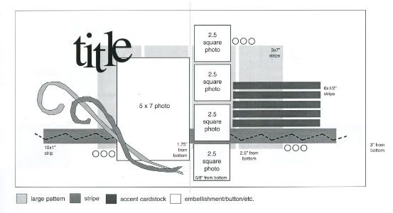
The sketch, from Sketches for Scrapbooking, Volume One, that I am using as my starting point for each layout.

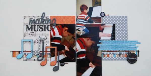
Layout #3 - "Making Music"

Supply list - Cardstock: Bazzill, Patterned papers: Making Memories (music notes), My Mind's Eye (orange), October Afternoon (dotted), Fancy Pants Designs (blue), and Sassafras Lass (stripe and piano keys); Music notes: Bazzill Basics Paper; Alphabets: American Crafts (making) and My Mind's Eye (music); Circles: Creative Imaginations; jewels: KaiserCraft; Glossy Accent: Ranger; Crackle paint: Tim Holtz, Ranger
• Variation #1 - If you ever find a sketch that you love but it has a bunch of smaller photos and you are all about the 4 x 6 photos, no problem. I would say that most often you can substitute 4 x 6 photos and make that sketch work for your style. On this layout I used 4 x 6 photos in place of every photo on the sketch. It still has the same overall design and the only huge difference is that the two photos on the right page go all the way to the top and bottom of the layout.

• Variation #2 - I also added a 2 1/2" photo beside the photos on the right page for no reason other than I had another picture that I really wanted to get on the page and that felt like a good spot to me! :)
• Variation #3 - Because I changed the photos to 4 x 6 I also had to change the papers a little. I used a technique that I like to call stretching. The photos would have been covering more of the paper than I had wanted so I used 4" x 7" pieces instead of 3" x 7" pieces. I also left one strip out since the 4 x 6 photos on the right page would have completely covered it. Instead I just added the pictures in place of the strip. You can do this with so many sketches, whether it's to add more photos, larger photos or more journaling. Just image that you are taking the design and stretching it like a piece a taffy.
• Variation #4 - In place of the flourish on the sketch I used several different chipboard music notes. I added patterned papers and ink to them and then added a little texture to a few with Glossy Accents and crackle paint. I used the Glossy Accents on the music notes with the dotted paper. It doesn't show up that great in the picture but each dot has a raised and glossy surface. The plain black music notes both have crackle paint in Rock Candy.

• Variation #5 - I did use circles for the smaller accents on the page but I only used one instead of the suggest three. Well actually I used one large circle and then three small jewels. On layout #1 from Monday I had moved the circles on the left page and I did the same on this one and for pretty much the same reason. I was afraid that adding it as suggested on the sketch would have made that area a little too busy and the circle would have been lost in the music notes.
• Variation #6 - So far I've used a different stitched line across the striped strip on each page. This time I added another strip of pattered paper (the piano keys) partially across the striped strip and then stitched a straight line across the top.

• Variation #7 - And the last one, a small one, instead of having the journaling strips all even I staggered them.
Day #3 means it's your third chance at the giveaway! :)

36 comments:
very cute! I can't wait until I have a chance to scrap later this week :)
I like this layout too. It's nice to see mostly 4x6 photos. I like the paper you used. It all fits so nice. One thing I've noticed with your sketches is that you take a lot of pictues of the little everyday moments of your sons. I never thought to take pictures of my kids eating a popicle, using scissors, etc. Now that I've seen the pictures you take, from now on I will get more of these little moments of my kids not just one picture or none at all. It is the little things that we forget later on, so thanks for reminding me of the little things. Can't wait to see tomorrow's.
I never would've thought of using 2 4x6's on this sketch instead of the 4 square photos! Neat!
I LOVE, LOVE, LOVE the music notes...so rich in detail!
Cute! I love the different ways you interpret the swirl element in different ways than shown...helps give me ideas.
I also love the music notes. I stitched on my last project but do not always know where the stitching should be placed.
I am glad to see how you were able to convert this sketch to use 4x6 photos. Thanks for the tips about stretching the papers to make it all work.
Another fabulous LO Allison!! I still can't believe how big your son is getting!
I love these different variations! Thanks for sharing!
I love how you incorporated 4x6 photos and the musical notes are so cute:-)
Love that you used 4 x6 photos on this layout. This is a fantastic little layout. I need to pull out my TH rock candy paint now that I have seen it in action. LOL!
Loving these variations and your descriptive text on techniques. Could you remind me of the type of ink you use to edge your photos?
I love the music notes!! I might have to borrow that idea for my son's orchestra concert page!!
I love this LO and have some similar photos I haven't known what to do with! Might have to lift your great ideas! The 4x6 photos work so well with this sketch! :)
I love how you made this sketch work for 4x6 pictures. That is where I always get stumped - getting my pictures to "play" nice with the sketch I want to use. p.s. I'm bookmarking this layout to use for my dd's choir pictures. :)
Question for you... Do your sketch books just show the sketches? Or do they also show 5 sample layouts for the sketch too like you have been posting on your blog? Could you maybe post a page from one of your sketch books, so we could see a sample of what they are like? TIA!
Hope you don't get tired of how wonderful I think your sketches and journaling notes are!
So glad you showed how to substitute 4x6 photos for the smaller squares. Most of the time I don't have photos to use with the small size. Could you give us a tutorial (or should I say me) on how you do your journaling strips.
Oh my! I'm so excited that you showed us how to use 4x6 prints. In addition, your theme for the page couldn't be better. Both my kids are musicians and I can't wait to try this page out on some of their photos!
Looking forward to being in Springfield in April for Spring Break!
thanks again for all the work that you put in to sketches week. I love the second week of the month now! This layout is great. Traci
I LOVE the music notes!! Thank you for showing how to use 4 x 6's when the sketches call for smaller pictures!
I was wondering how you were going to do this using 4x6 photos. I mostly scrap with 4x6 photos so this will work great for me.
LouAnn
Cute Layout! Thanks for the 4x6 use of this sketch. I'm looking forward to scrapping with this sketch.
I love the embellishment of the music paper!
I love checking in each morning to see what new creation you've come up with. Love how you incorporated important bits of information into your embellies (the date on one of the circles.)
I really like how you substituded the small pictures for the 4x6 pictures. I also really like how you added the embellishments. So creative. Thanks for sharing :)
Love the music paper, piano keys paper, music notes...it's all great!
Kathy
I have had this sketch book for ages, but for some reason have never used this sketch. Looking at your layouts, I can't imagine why. I love all of the variations. Thanks so much for the great ideas.
Renee, The sketch that Allison posts is exactly like the one from the sketch book. The sketch books have single-sided 8.5 x 11 inch pages with black and white sketches. When I find a layout from her blog that matches a sketch, I print it out and adhere it to the back of the previous sketch page. Page kits from the store often show up as sketches in the books, and so I take the color photograph from the kits and adhere those, too. I hope this helps.
CodyandTraci, I am so impressed that you are finding scrap time with a new baby in the house. When my son was a newborn, I was just excited to be going to bed each night! :)
Just wanted to second what Dawn said about taking photos of the everyday moments. My photos of Stacey and Allison are mainly of "big" events. Now, I realize that the little things are where the best memories are, and I so wish I had had know then what I know now.
Ali, thanks so much for sharing your layouts. Can't wait for the one I saw at SG on Monday to be on here! -- MOM
Super cute music notes :) I'm getting such good ideas this week.
So cute! I love your paper choices, they go so well with the colors in the photos. :)
LOVE the chipboard notes! Great idea, too. I'm not really into flourishes.
Cute layout! I like how you used 4x6 photos! Fantastic sketch!
Love this idea how you use the sketch over and over...thanks for the inspiration!
Jen, it's called StazOn ink. I'm so addicted to using it on my pictures!
Renee, the picture of the sketch on my blog is exactly what is in the book. Amy answered your question with lots of details. :)
Cindy, no problem! I most often use my computer if I'm doing journaling strips but you can easily do them when you are doing handwritten journaling too. On the computer I type my journaling with double spacing to leave room for cutting. After I print them out I cut each strip out. I don't worry about each strip having the same width, I just eyeball it. If you are doing handwritten I would suggest writing out you journaling with space left inbetween each line for cutting. You can cut the strips first and then write your journaling on them but I find it's a little harder to do it that way. I hope that helps! :)
Thanks so much everyone! :)
LOVE the variation of using 4x6 photos. Since I take a lot of close-ups, it's so hard to trim my photos. Wonderful! Jody, IA
such a pretty layout. I really love your style.
Love the musical notes! Such a cute "boy" layout!
Post a Comment