
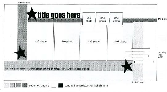
The sketch, from Sketches for Scrapbooking, Volume Four, that I have used as the starting point for all seven layouts.
Layout #4 - "Carefree Sliding"
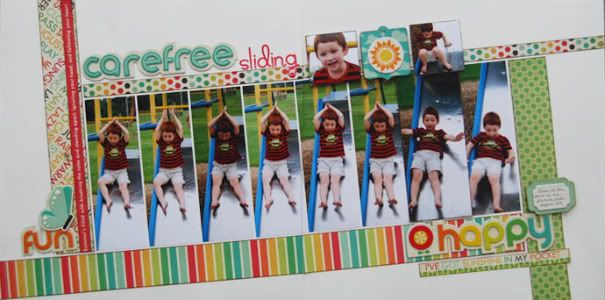
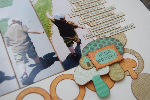
Supply List - Cardstock: Bazzill Basics Paper; Patterned paper: We R Memory Keepers; Chipboard words and embellishments: We R Memory Keepers; Cardstock stickers: We R Memory Keepers; Alphabet stickers: Doodlebug Designs
• Variation #1 - Have you ever found inspiration from a product or it's packaging? I have! The idea to add a slant to this layout actually came from the way the chipboard words from We R Memory Keepers (the ones that I used on this layout) were packaged. Slanting might not always work with the sketch you want to use but it works great with this one.
If you do create a layout with a slant and have pictures that go across the middle of two pages you will want to be careful not to cut a picture through a face or body.
• Variation #2 - Instead of using four 4 x 6 photos I used eight 2 x 6 photos. Well, technically I used seven 2 x 6 photos and then on the right page I have a 2 3/4 x 6 photo (I'll explain that in a second.) These pictures where perfect for cropping down to a smaller width because there was so much empty space on each side.
The reason I have one of those pictures a little larger is that I didn't want to crop off Drew's arms. My solution for that was to crop as close to him as I could and find a way to make a wider picture work. I didn't want to use the same spacing the rest of the photos because it would have made the layout a little unbalanced. The right side of the page would have been a little longer. To keep the same measurements as the four photos (as a whole) on the left page, I placed the three 2 x 6 photos in the correct spot on the right page and then used foam adhesive and let the 2 3/4" x 6 photo overlap onto the two beside it. I also added paint around the edges of it to help those edges stand out against the two photos beside it.
• Variation #3 - I used three words, one as part of the title, in place of the stars. They are a little larger than the stars on the sketch but like I always say, look at the sketch as a suggestion. If it's in the same general area as suggested on the sketch, it's going to work.
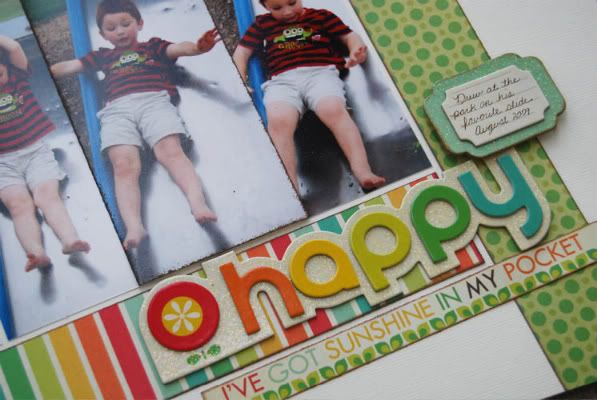
• Variation #4 - On the layout I posted yesterday I talked about how important I think the journaling is BUT sometimes there just isn't a lot to say. Sometimes it's best to let the photos tell the story. There wasn't anything I could tell you about the story of this layout that the pictures themselves didn't say. Because I didn't have much journaling for this page I used a small block instead of the strips. A simple, informative sentence and the date were all I need space for.
• Variation #5 - Here's another great solution for those of you that don't want to crop photos down to 2 x 2 for the top three pictures. On this layout I used an embellishment in place of one of the pictures. I could have substituted all three pictures with three embellishment squares but I had to get that picture of Drew smiling on the page somewhere!
In the comments on Monday's post, Luv2talk had another great suggestion for those three 2 x 2 photos. She had used the sketch and instead of having those photos she extended the title across that area. Great idea! That also works great if you've got a longer title and need the extra space.
Layout #5 - "Sunny Day Walks"
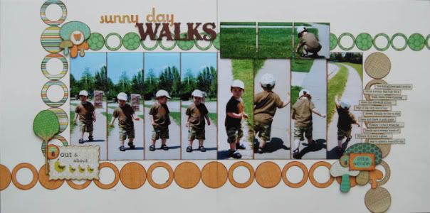
Supply List - Cardstock: Bazzill Basics Paper; Patterned paper and die cuts: Crate Paper; Chipboard alphabet: My Mind's Eye; Alphabet stickers: Pink Paislee
• Variation #1 - The reason I posted both of these layouts on the same day is that they both use the same photo format. On this one I did the same 2 x 6 photos in place of the four 4 x 6 photos. This time I adhered them against each other instead of having margins in between them. I also added some ink around the edges so that each picture stood out against the ones next to it. I almost always ink the edges of photos that are similar and placed so that the edges are touching.
• Variation #2 - I decided to have a little fun with the patterned paper strips on this one and used a line of circles instead. This is a great way to completely change the look of the sketch. Just think of all the sketches that you could do this with and how different it's going to make that layout look! This would have also worked great with a lot of other shapes too - hearts, stars, flowers, squares, etc.
• Variation #3 - I let Crate Paper handle the embellishments instead of making my own on this one.
Stars would have worked with this layout but I was lovin' these cute little mushrooms and that "out & about" die cut was perfect for our walk theme.
• Variation #4 - Another option for the three 2 x 2 photos at the top is to take a 4 x 6 and cut it down to 2 x 6 (just like I did on the layout yesterday). Then cut it into three 2 x 2 squares. You have to be careful not to cut through a face or an important part of the photo. The one I used happened to be perfect for doing this. Drew fit in the far right photo with the grass scene covering the other two. I also think adding the margins in between makes in interesting to look at.
Today is the third chance for the giveaway! :)
56 comments:
OH...I like the slanting!
I really like these two! The slanting layout is very cool! :D
I'm so excited there's two l/o today. I thought you'd make us wait for Friday. These are both great l/o. I have done tons of park pictures but mix them all up not just one theme. I like the slants, my sister does this on her park pages. I love all the colors and embellishments on this page. Thank you for explaining everything that you do for a page.I'm happy to say that I have the paper and embellishments for the second page. I bought them a while back to use on a turtle page for the kids but didn't know what to do with them. Thanks to you I know. I love circles so I love love this layout. My pictures will fit in just like yours, thank you so much. The changes you made to your homepage is great, reminds me of that dvd, is it almost time??? Please!!! Thanks again for all you do to inspire us!!
You continue to amaze me. I have the paper used in both layouts so I am excited. What "tool" do you use to cut the circle with the inside cut out?
I was happy to see you had new layouts up this morning so I could enjoy them while having my coffee. And even happier to see you put two up today. And I'm not a morning person. lol! :) I love both layouts... the slants, the bright cheery colors, the circles, the way you divided up that one picture into three. There's so much inspiration here.
Very cool! I like how in the first one today you subbed the pic with the little tag and in the second one I love how you split the photo into three small pics! Very cool! TFS Fabulous as always!
Such beautiful layouts! I'm amazed at all the different looks you can get from one sketch.
I love the 'skinny' photos and all the circles. They really do change the layout. Thanks again.
I am lovin' you many takes on this sketch!
I love how you took the one 2x6 & cut it into three leaving a grid like pattern with the picture. I haven't tried this yet but love the results of it. That Crate paper set is perfect for the pictures. The slanting is awesome. A great way to change it up!
Amy S from Texas
Allison - LOVE your sketches weeks! I have all the sketch books, but to actually see how YOU interpret them is so inspiring! I, too am "not so patiently" awaiting the DVD..so then I get you anytime I want to! The main thing I'd looking for on the DVD is your process...how do you build your page? What do you lay down first? The papers, the pictures, do you cut everything first? A girl needs to know!
Thanks for always be so willing to share!
Your layouts are showing me that I really need to ink the edges more. I just love how that looks! What kind of ink do you use?
I love both layouts...but especially the first one.....love the slant and the colors.
I love the first layout! The slanting, the great colors, and the chipboard letters mounted on cardstock that is shaped to the letters...all amazing!
The slanting is great, good call. I also love the one photo cut into sections with space between, I have always loved that look.
Thank you again for sharing with us.
You are Amazing. Thank you so much! I am really loving this sketch.
Love these, Alison! Love the slinny photos, the tilt on the first layout and the circles on the second. You always amaze me at how you can change up a single sketch so many different ways!
I'm going to be running behind all day today because I just HAD to dive in to my scrap room after looking at these layouts! Inspiration at it's peak for sure!!
I love the way you slanted the first layout. Almost all of my albums are the 3-ring ones from We r Memory Keepers, so my two pages do not touch each other when the album is open. Because of that, I usually don't position a picture to be cut and divided between 2 pages. Do you have any thoughts or suggestions on how I could make the slant work for me?
On another note, I just got your 2 April kit clubs in the mail from SG, and I also got Sketch Book 5 for my birthday. I wanted to mention how I like the addition of the actual "stripes" to the striped paper key and sketch. It's a little tweak, but it's funny how much of a difference it makes for me. :)
Love the slant in the first layout...an easy way to get a different look out of the sketch. Love the idea of using a 2 x 6 photo cut down into 2 x 2 for the top! Will have to give these a try!
I will have to show my husband these layouts- he always makes fun of me for developing a bunch of photos of the same moment- but I love the variation of expression and movement- I can never pick just one shot LOL
Absolutely love the angle of the papers on your first l/o for today. And I love the fact that you used rows of circles in lieu of the solid pieces of patterned paper. Genius! (Said like Sid in Ice Age!) :)
Now to go play myself!
Don't know what else to add that hasn't already been said.
I think this concept was long overdue. You're ROCK"N IT!
:)
As always impressed with your layouts. This month, it seems as though I am more drawn to your journaling. I guess it is all in the journey of life and scrapbooking; how things evolve. It seems like I focus so much attention on the "perfect pictures" finding the "perfect layout" and adding the "perfect embellishments". I hate to admit that more times than not I say "I"ll just wait and do the journaling later"!
Life is so in the details. I am inspired by your journaling; not only do you put the obvious that the pictures shows but you take the time to remember a detail. I went back over the last several months blogs and there is always a detail in the jounaling. Maybe something silly, sad, funny, or something that captures your heart. So I want to say thank you for the time, effort and detail that you put into your journaling!
I am always blown away by how many different looks you get out of one sketch! I know that's the whole point of this, but it still surprises me each time!
I love both layouts, they're so fun! My fav thing is the lines of circles instead of the patterned paper strips...I'm so scraplifting that!
These are great!
Love them both, and you pulled off the lo on a slant perfectly. What kind of ink do you use to ink the edges of your photos? Thanks again for sharing!
Love the slanting!! And I am so amazed at the variations from 1 sketch. Thank you Jody, IA
Like that you are doing more than on layout and I love the layout with the circles. Very different effect. Thanks
Love how you use ink and paint to define the edges of photos and other embellishments on your pages. I'm going to have to try this.
Wow, your ability to stretch a sketch amazes me! Love all your variations!
I am enjoying all the different takes on this sketch and love all the tips.
I really like how you used those tall skinny pictures and I love all the cirlces on the second layout.
LouAnn
I always use ink on my papers, but have never really thought about using it on my photos--I love the look! Thanks for the inspiration.
I love the color combination in the second layout, and those mushrooms are a nice little touch.
I never thought about cutting one picture into three squares. I've always admired triptychs so I guess it is the same idea. Thanks for the inspiration.
Soooooooo lovely, both of them. You'r a Star.
These are so cute!!! Love the inking the edges of the pic ... really does make them each stand out! TFS!!
Love the slant idea. Such a little change that makes a big inpact on the layout.
I am going to have to give that slant a try. Love the bright colors you used also. The second layout was a nice surprise. The circles really changed it up. I too am surprised how much you can vary one sketch.
Dawn, we sure hope that it's time soon. I'm getting so impatient! This is the first project that we have taken on that someone else besides us has some control over it.
I used two different sized circle punches. You have to punch the smallest one first and then punch the larger one around it. :)
Christel, raising my hand as fellow non-morning person! lol!
Sheila, that's a great idea for a future blog post. I'll have to add that one to the schedule. It would be fun to show what steps I use to create a layout.
Wendy and joel & ginny, I use Colorbox Fluid Chalk Inks for edging paper and pictures and Staz On for pictures. The chalk inks don't always work on pictures, it all depends on where you get them printed and what kind of texture they have. I use the chalk inks when I want more blended look on the pictures and the Staz On when I want a harder, yet subtle edge.
Amy, I use those same albums and don't ever worry about the gap. I figure that people are going to know that the two pages go together and get the general idea. :) As for the stripes, we love them too! We are actually going back and revamping the older sketch books so that they have that too.
April, thank you so much! Your comment made me smile! :)
Thank you everyone for the wonderful comments! :)
I love how you have angled everything in this layout, it really works with those photos.
Love the way you slanted the layout - it gives it a whole different look!
What a perfect layout for those 'progression' type photos...... can see this being used a lot.
I used two different sized circle punches. You have to punch the smallest one first and then punch the larger one around it. :)
Got it! I don't know why I was confused about this. Thanks!
Linda from KS
I like how you used small strips of bold colorful paper to add to the page without taking away from the photos.
Just love the succession of the photos in these layouts!!
great pages today! Makes me want to go out and take a walk with my son! Thank you!
Love the circle border. I love layouts like this with skinny pictures, but I have so much trouble doing them because I never seem to have the right pictures.
Another great layout! Really like the slant!
love the vertical photos!!! both the pages rock!! amazing!
Your sliding photos bring back memories from a long, long time ago when my Dad made a slide for me and my sister--about 1948. I loved it then and still remember it so well. Thanks for the memory.
Love the slanting and the multiple 6x2 photos - another fun twist on your sketch!!!
brilliant! Love this for a sequence of pics. You style is SO easy-on-the-eyes!
how did you print out 6 by 2 photos?
Carefree sliding is just too fun - love the angle of everything. The circles are such a neat variation on the second LO. Your creativity never ceases to amaze me!
Post a Comment