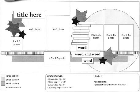
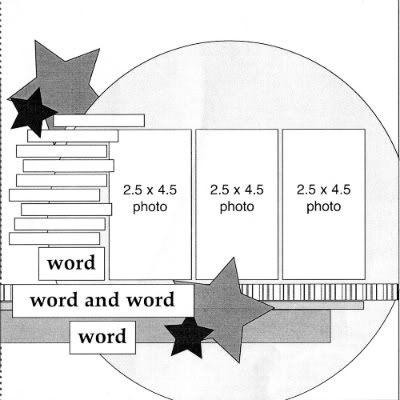
The sketch, from Sketches for Scrapbooking, Volume 6 (available July 1), that I have used as a starting point for each layout this week.
Layout #9 - "Our Day"
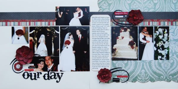
Supply List - Cardstock: Bazzill; Patterned paper: Pink Paislee; Flowers: Prima; Alphabet and flourishes: Pink Paislee; Glimmer Mist: Tattered Angels; Brads: Pink Paislee; Pearls: Making Memories; Word stickers; Making Memories, Creative Imaginations and 7Gypsies
• Variation #1 - Earlier this week I showed you a layout that had been flipped to create a mirror image of the sketch. The time I flipped the sketch upside down. There are actually two ways you can flip it upside down. The first one is to do what I did and apply everything as if you had stamped the sketch upside down. On my layout the left page on the sketch is still the left page on the layout and the right is still the right. The second way is to take the actual sketch in front of you and flip it upside down. When you do it this way the right page becomes the left and the left becomes the right. Hopefully I didn't confuse you on that one. If I did, try taking a sketch and setting it in front of you. Now flip it so that it's upside down and you should be able to see what I'm saying.
• Variation #2 - Another thing I wanted to show with this sketch, and I kind of already did with the large star on my "Freedom" layout from earlier this week, is that you can also use different shapes in place of the circle. To get a little more specific, I had mentioned that when I look at the sketch I almost instantly assumed that the large circle is meant to be a die cut patterned paper. Well, on this one I used a die cut patterned paper in a square shape. There are so many different die cut patterned paper shapes. You could use so many different shapes and designs in place of the circle.
Another thing I should add, I had the die cut patterned paper going off the edge like the circle is on the sketch. It would also look great centered on the right page as well.
• Variation #3 - The three strips of patterned paper go all the way across the page on this layout instead of being different lengths. My reason? I accidently ripped a little piece of the die cut patterned paper and this was what I came up with to cover it up. :) There's not always an in depth, technical reason for putting things where I do. Believe me I've had finger smudges, ink, a smashed gnat, I can go on and on...
• Variation #4 - With this page I had so much more journaling that I decided to go with a large journaling block instead of the strips. I also kind of felt like the block fit the theme a little better. It's more "classic" whereas journaling strips are more fun. I cut the block to fit in between the pictures with equal margins on both sides. I think the journaling area on a sketch, most of the time, is an area that you can really play around with and fit to what you need. There are always ways to have less or add more if you need to.
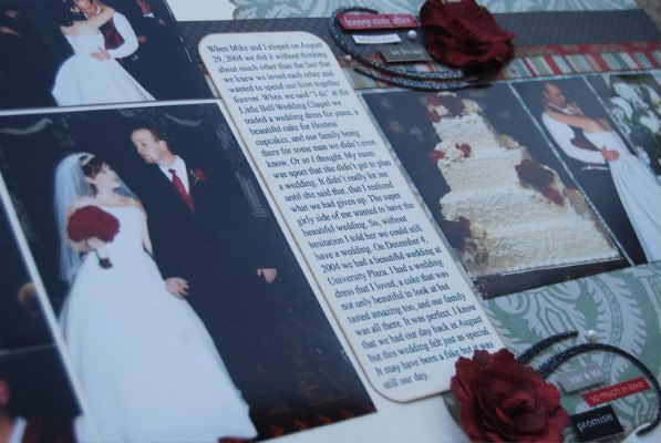
• Variation #5 - I used different sizes of photos on the right page. I cropped each photo to the suggested 4 1/2" height and then cropped the width to only what I wanted in the photo. The cake picture was larger and I didn't want to crop the edges off. The dancing photo, on the other hand, had a lot of empty space so I cropped it in to just us. That area of the sketch has a lot of room for playing around with different photo sizes.
• Variation #6 - Since stars aren't usually what I think of when it comes to weddings I used flowers and flourishes detailed with word stickers and pearls instead.
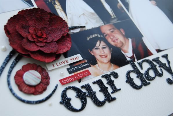
The flowers that I used were cream and black with a script print all over them. I really wanted flowers that match my bouquet so I covered them with Glimmer Mist. I love that the print still shows through the color and they have a pretty shimmer to them.
Right Side of the Sketch
Layout #10 - "Splash Ready"
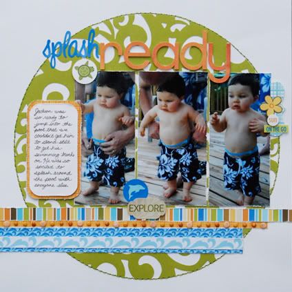
Supply List - Cardstock: Bazzill; Patterned paper: Bella Blvd.; Lace cut cardstock: KI Memories; Alphabet: Bella Blvd. and BasicGrey; Stickers: Bella Blvd.; Brads: Doodlebug, We R Memory Keepers and Basic Grey
I know that I've already shown you a layout with just the right side of the sketch but the difference with this one is the photos. I wanted to show one that followed (somewhat) the same photo sizes.
• Variation #1 - For the large circle on this layout I cut it out of some lace cardstock from KI Memories and then added a stitched line around the edge to help frame it. On this layout you can see how centering the circle, or whichever shape you choose to use, works great too. You might have to make a few minor adjustments to the other elements on the page but it shouldn't be anything major. It all depends on photo sizes, how many photos you decide to use, etc.
• Variation #2 - Just like the "Our Day" layout, I used a journaling block instead of strips. I really liked the look of the lace cardstock and with the strips I felt like I was going to be covering too much of it up.
• Variation #3 - I added a few little extra details to the strips along the bottom. On the bottom blue strip I added a strip with a wave design over the top.
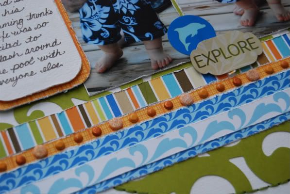
On the small orange strip I added brads in different sizes and tones of orange.
• Variation #4 - When I used this side of the sketch for my soccer layout I didn't worry about the fact that I was losing my visual triangle when I went to a one page. (the three groups of stars on the original sketch make up that triangle). I didn't feel the soccer page needed it since the important part of the picture, the journaling, the title, and the elements where all grouped together. The focus of the layout was all on the parts I needed it to be without needing that triangle. It also helped to keep the focus on Drew in the picture and away from the other children in the right edge of the photo.
On this layout I felt that the visual triangle was needed. I was afraid that the picture on the right edge was going to be overlooked without an embellishment to draw the attention to it. All I had to do was add a few stickers to complete that triangle that is formed when you draw an imaginary line from the one group of stickers to the others.
• Variation #5 - This time I cut the photos to perfectly frame Jackson. I didn't want to cut them down to 4 1/2" and chop off his feet or part of his head so I just framed it to him. On the middle picture his arms were sticking out so I left it a little wider than the other two because I didn't want to chop an arm off.
• Variation #6 - On the soccer layout I had used the bottom words strips as my title but on this one I placed my title along the top, above the photos. I also didn't include the word strips at the bottom. If something isn't working for you on a sketch, don't decided you don't like the sketch. Just remove whatever part it is that you don't like.
The winner of a copy of Sketches for Scrapbooking from yesterday's comments is...
debbi said...
These 2 layouts looks so different from all the others that I had to compare them to the original sketch to be certain they followed the basic sketch. These are great examples of how to take a basic sketch and make it totally your own. I hardly ever scrap without your sketches.
Email me at alidavis1919@hotmail.com with your shipping information and what volume you would like. :)
Don't forget that I'll have one more Sketches for Scrapbooking to giveaway! I'll be back on Monday to post the wrap up, the winner of today's giveaway, and the date for June Sketch Week.
I hope you all have a wonderful weekend! :)

73 comments:
Wow I love your sketches but I also love the way you use up your stash, that little line of brads is truly inspirational.
Love the zingy colours of splash ready. The amount of detail you put in each layout is inspiring. This layout also shows how the sketches work as well for single as double layouts.
I really love the idea of using the same sketch over and over again!!! Because with different papers & photos you're getting a total new approach.
I recently found your blog and keep on coming on a regular basis. I also wished I lived closer, so I could come to the shop to follow your lessons!!!
i am loving your sketches this month. i have a ton of small brads just laying around...i just found a great use for some! Thanks Ali!
I love all of your sketches...I think my goal for this weekend needs to be getting some layouts done (with you sketchbooks) :)
I love the colors in that splash layout! So summery! I am just amazed at how versatile your sketches are!
Love all the fun little details on your layouts!
Thanks for the "close up" photos. I would have never guessed the flowers were colored with Glimmer Mist. I loved the wedding story - sweet. "Splash Ready" is so cute. I love your ability to choose papers/colors.
Linda from KS
Awesome once again! I love Sketches Week!!! Too bad this is the end of Sketches Week and I have to wait till June for more. It's so helpful seeing your variations on the sketches, I'm trying to be me open to changing things up like you do.
Beautiful layouts again today...loved all your lovely little details!
I have loved this weeks sketch! I have to get my hands on a sketch book! What a great way to be inspired!
I love your wedding layout. That line from Pink Paislee is one of my all-time faves!
Love the wedding layout, especially the flowers and flourishes.
Kathy R
ANother round of great LOs. I love how you can mirror or flip the sketch, always versital. I just ordered 5 of the books. Enabler! LOL
I love how you have showed how to use just one half of the total sketch Ali! As always your examples are outstanding and how cute are those swim trunks I ask you! Your little fella totally made me smile this morning! TFS!
Thanks for another great week. I love the way you used enlarged pictures for your layouts this week. It's always great to see how we can really change up the sketches to fit our pictures.
I found your website after visting your store a few months ago. After seeing the variations of sketches on your blog I have decided to buy the sketches books. Thanks for so many different ideas for one sketch.
I've been thinking about doing some layouts from my wedding (12 years ago, gasp!). This was just the inspiration I needed. I have an all day crop I am going to tomorrow and I think I might just bring along all of the wedding pics!
Thanks!!!
I'm really liking the single page layouts you're creating with your sketches. Thanks for all the inspiration this week!!!
I love how you turned the flowers into the color you needed. I can't believe you can achieve so many different layouts from the same sketch. I am hoping to take this knowledge & look at sketches in a whole new way.
Amy S from Texas
I feel like a broken record, but, again, I really do love both layouts. It's been a great sketch week and I look forward to June's. Thank you for taking the time to put these samples up on your blog. I have been so inspired and look at sketches in a whole new way now.
thank you for another week of inspiration. I enjoy sketch week so much.
Looks like you captured your wedding beautifully in the first LO. I adore the colors in Splash Ready. The distressing on the strips just adds something special to the LO - gives it that laidback summer feel we all love.
Thanks for another great week, Ali! All of your examples are wonderful!
Love how you cut the lace cardstock in a circle! Also, beautiful wedding LO. I have been too scared to do much with my wedding pics--need to get over that! Thanks for another great week of your sketches!
Well, after such an inspiring week, I have no excuse not to get a few layouts done this weekend! Thank you so much!!!
Amazing! I can't believe this week is over already. Can't wait for the next one. :)
It would take me years to stitch around that circle! Looks great as usual!
Alison, I love your scrappin' style and am so glad I stumbled onto your blog!! Recently I was going thru my ideas book where I have torn layouts I liked from CK and was surprised that many of them were from you!! Thanks so much for all of fantastic inspiration!! Mary B. Minnesota.
Oh...your wedding layout is gorgeous, but I'm a sucker for chubby baby bellies & legs! What a cute-patootie! I so miss my kids being this age and having all that chub-a-lub. You've got me hooked, your sketches are the BOMB!
I love the details you add when explaining, such as using glimmer mist on the flowers. They look great! Also the brads along the strip are so subtle looking and yet really look good. Thank you for all the inspiration!
Thanks for a great week of getting us to think outside the sketch. I look at a sketch and only just see the exact layout.
That was amazing how the glimmer mist changed the flower color but not the print. Loved how the Pink P fall/autumn papers translated so well to a wedding theme.
I've enjoyed all of the layouts this week. Can't wait until June to see more.
LouAnn
Great layouts! I would never have thought all these different looking layouts could be based off of the same sketch. You have made me look at sketches in a whole new way.
Love both layouts! From elegant to fun. Can't wait for the new sketch book!
Lisa
Wonderful as always! Thanks for the great inspiration!!
Well, Friday of sketch week is always so bittersweet. I'm always revved up to get some great layouts accomplished, but sad that I won't be able to look forward to new layouts tomorrow. This has been a great week with so many amazing layouts. I have some Disney layouts to do, and am thinking about a big classic mickey shape as the shaped piece on the right side of my LO. I'm going to have fun playing with it this afternoon.
Thanks for all the time and effort you put into sketch week for us Ali. I really appreciate it!
Really love these layouts. Your wedding day layout really captures the important parts of a wedding. I love the lace paper for the circle - would never have thought of that.
Where do you get all your inspiration....thank goodness you share it with all of us!
More great variations. I have rotated sketches before but never would have thought to turn them upside down LOL. Thanks so much for doing these sketch weeks.
I didn't make it here yesterday but wanted to comment on one of your comments - yes we do read all your comments LOL. I also loved the addition of glimmer mist on your LO yesterday - so have to get some and play with it soon. I love when you discuss how you embelish your pages as well - something I need to get better at. I love how you add stuff to your pages - I am always afraid to do so for fear of it looking overdone - you add tons but they always looked perfect - you actually have to really look sometimes to notice all the little details.
I just got books 4 & 5 and hope to play with them this weekend.
Allison, I just love your sketch weeks each month! I am so happy to find such an inspiring scrapper that still makes two page layouts!!!!!! Thank you for all the inspiration. I can't wait to try some of these ideas with our Disney album I am starting this weekend.
I cant believe I missed the whole week:( going through the last 4 posts now...I was so busy with my little one not feeling well..I love your books!
viji#5858
I notice you most always have a STRIPED strip on the LO's. I have specifically begun looking for good 'striped' paper so I have some available when I follow your sketches. LOL!
Your detailed descriptions are so helpful! I love all of the details on Splash Ready!
I don't like Friday's during sketch week, didn't even get up early to see them so I could prolong it. I was so hoping to see a non-kid page this week, like last month, you didn't let me down. I love what you've done with the wedding page, so elegant. What a cute story too. Jackson is the cutest boy every, I love boy's swim trunks, Sam has like 10 because I keep buying more. Love how you made it one page again and added all your special touches.I know you are tired of hearing it but YOU ARE AWESOME AND THIS WEEK WAS AMAZING!! Thank you for all the hard work you put into it. I forgot to mention yesterday that yes I do read every last detail you write so don't quit.Oh yeah and love the flower embellishment you added, and how you colored it to match, brillant.
Ok I'm going to buy more striped paper now too, glimmer mist, chipboard to color. Thanks for the ideas.
I have some layouts on my blog I did and I'm finishing one now and hoping to start another that I will post check them out when you can. Have a great weekend.
Love the 1 pager, I'm never sure how to make them look balanced! Thanks for the inspiration this week! Can't wait for June!
Love all the layouts you are creating with just one sketch. Awesome!! Can't wait to see what else you have up your sleeve.
I love all the fun details you put on your pages and learn so much from reading your descriptions. I'm just wondering how long it takes you to complete a layout, because I'm pretty sure I know how long it would take me!
OMGosh...thank you thank you thank you for showing me a minor little detail of using up some of the million brads I have!! ;)
I HAVE to have some of the "splash" pictures. Hadn't seen those...he looks so cute. I could just sit around and look at him all day long! -- MOM
I can't believe today is the last day! Thanks for all the inspiration this week.
Thanks for another week of fun ideas and ways to vary each layout. Can't wait until June!
Loved all the layouts this week. Was inspired to start sorting papers for the next crop event so I can use your sketch books. Can't wait for June!! Thanks for the amazing layouts Ali!!
I love how easy you make things look. Your sketches allow me to use some products I haven't touched in ages. I'm having fun again, finally!
Thanks for another great sketch week! And thanks for sharing your creativity, ideas, & tips with us! You've inspired me to pick a sketch and run with it! I think I'll go play now!
Stacie in OK
Two more amazing layouts! Thank you so much for doing the sketch series posts, I look forward to them every month!
Awesome week of layouts, as always my dear sister. I would like to think that you're so good at this because my older sister talent trickled down to you, but I'm afraid you get all the credit for creativity when it comes to scrapbooking!
Thanks so much for an awesome week of inspiration & fun! I can't wait to play this weekend and see how many layouts I can get from just one sketch!
What fantastic variations on this sketch. You truly have a gift!
I am really digging the splash ready layout! The lace cardstock is fantastic. Add in a cute toddler in swim trunks makes it beyond adorable!
Love this sketch- the circle backdrop is a great touch, and still lends a very clean design feel.
I have really enjoyed the week--looking forward to your layouts each day. Also enjoy seeing the pics of that cute little boy.
I love how you threw in a little orange in the splash layout. It gives the cute layout an extra pop.
Ali- Your layouts all week have been really inspirational and have shown me how versatile sketches really are. I just sent off over 160 pictures, that I am going to scrap using all different sketches, some of which are yours. I can't wait to get started. Thanks for the much needed inspiration and I can't wait for sketch week, next month.
Thanks for another inspiring sketch week!!
That is a gorgeous wedding layout. I am so touched that you would share something so personal with all of us. I really like how you took the sketch and made it a one pager with the Bella papers.
I love a good wedding layout, but those cubby baby feet are priceless!
Your creativitiy amazes me with how you manipulate the sketch in so many different ways to come up with different looking pages, yet all from the same sketh! I am loving the first two sketch books I ordered, look forward to adding the rest to my collection!
Beautiful layouts. Makes me want to scrapbook.
I love how you flipped the sketch upside down in the first layout, never thought of doing that. I love your use of brads in the second layout, I am definitely going to try that. Sad to see the week ending.
I love the green circle and the bright pattern paper on the single page layout- it is so much fun!!
Love how you are showing the versatility :)
Love the splash layout...adorable photos!
I love your sketches, they are all super, wonderful inspiration for my scrapping!!!
Post a Comment