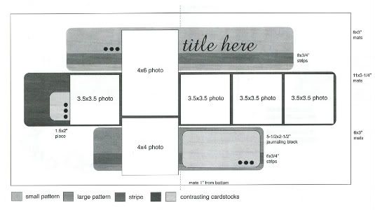
The sketch from Sketches for Scrapbooking, Volume 2 that I am using as the starting point for all five layouts this week.
Layout #2 - "The Popcorn Wins"
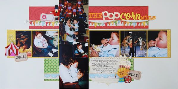
Supply List - Cardstock: Bazzill; Patterned paper: KI Memories (red, orange, yellow, and white stripe) and We R Memory Keepers (blue and green); Chipboard embellishments: K&Company; Alphabets: Prima (the and wins), SEI (pop), and American Crafts (corn), tickets: Tim Holtz and Jenni Bowlin; Jewels: KaiserCraft
There sure is a lot going on on this layout but it kind of fits the theme. A three ring circus is a pretty busy place and I somewhat tried to mimic that on my page.
Variation #1 - I added another 4 x 6 photo in place of the 4 x 4 photo suggested on the sketch. With doing this you are able to add a bigger picture without covering up anymore of the design than the 4 x 4 photo did. It still has the same over all look except that the two 4 x 6 photos go all the way to the top and bottom of the background cardstock.
Variation #2 - The bottom 4 x 6 photo had a lot of empty space so I added a 2 x 2 photo to help hide it. I added foam adhesive to it so it wouldn't get lost in the other photo.
Variation #3 - Instead of using just the 3/4" strip across the top and bottom patterned paper pieces I decided to add fun and different elements. On the top I made a banner by cutting little triangles and adding stitching across the top.
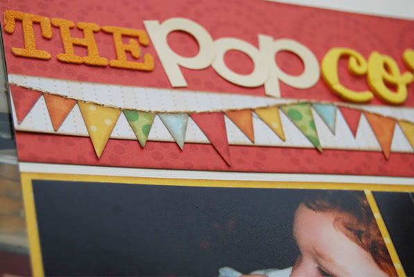
Along the bottom piece I added a scallop strip.
Variation #4 - This time I went without the rounded corners suggested on the sketch. This is one of the easiest ways to get a different look out of sketch.
Variation #5 - In place of the three cirlces and cardstock tab suggested on the sketch I kept within the circus theme and added a ring leader, a circus tent, popcorn, a tiger, and tickets.
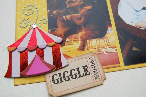
I also added some hand stitched swirls coming off the top of the tent.
Variation #6 - While the suggested journaling block would have looked just fine I decided to use a pre-cut journaling block with a fun decorative edge to it.
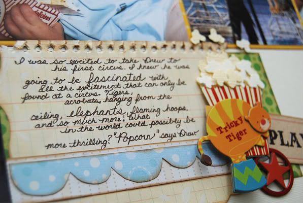
I wanted the decorative edge of the journaling block to be seen and I also didn't want to cover up the scallop strip so I have the journaling piece going underneath the strip.
Variation #7 - This time for the suggested 3 1/2 x 3 1/2 photos going across the middle strip I used several different sizes. I kept the same 3 1/2" height but cropped the width according to what was in the picture. I just worried about framing the subject and not what size I was cutting. Of course I did have to make sure they were going to all fit but other than that there wasn't a whole lot of measuring going on.
Day #2 means it's your second chance at winning a copy of Sketches for Scrapbooking and the awesome prize package Nikki from Nikki Sivils, Scrapbooker has put together. Here's a look at all the goodies:
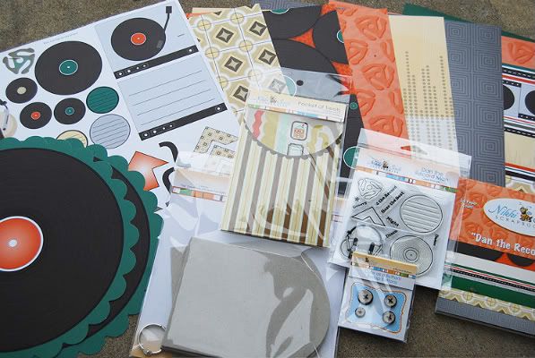
Whoever wins this fantastic giveaway will get:
• 2 sheets each of Dan the Record Man
• 1 6x6 mini pad of Dan the Record Man
• 1 stamp set of Dan the Record Man
• 1 package of the Burlap Buttons (black)
• 1 pocket of stickers
• 1 chipboard mini album
And the winner of the Friday giveaway is:
Michele Mc
You can email me at alidavis1919@hotmail.com with your shipping info and which volume of Sketches for Scrapbooking you would like. :)

89 comments:
More great variations that I would never come up with on my own! I love the banner with the stitching across the top!!
I too love the banner, and your hand stitching is GORGEOUS!!!
I am green with envy!!!!
As always...I LOVE it! Love the stitching you always add...it does add alot of texture to the LO drawing the eye to it!
Not usually a fan of the banner...I LOVE yours and here it is quite appropriate, I like that too!
TFS Allison!:)
I'm officially ready to try hand stitching. I'm motivated!
As always..more great ideas (banner, and stitching details are great)and great ideas. I really need to start writing some of this stuff down, I know I will never remember all I want to scraplift when I finally sit down to recreate all these layouts! LOL Thanks again
Amy
I love seeing the ideas that you give. The banner is adorable!
I love seeing all of the variations that you provide for a single sketch. I only recently discovered your blog and you have really openned my eyes to the possibilities that one sketch can provide. Thank you!
I love the little clusters of embellishments, that's something I need to work on in my own LOs.
I love your titles - they are always catchy and make me want to read the rest of the story. The banner was a fun element, too.
You are so inspirational on how you utilize stitching on your lay-outs. Ways I would never think of!
I just love all your cute embellishments. And the title is adorable.
Love the bright, fun colors used and the banner is AWESOME! I'm going to have to mimic it on a page...the hand stitching is what makes it extra-cool!
I absolutely love your super cute embellishments!
this is like such a cool layout allison!! love love love all your sketches and layouts!
I love how you made the banner. I have seen them a lot lately, but yours is the cutest one I have seen. Love the colors!
Again I love the hand stitching detail especially the string on the bunting.
Great sketch! Can't wait to give this one a try.
LouAnn
I love the banner!! and the different fonts on the title. SUPER cute!!
You have totally inspired me to use more stitching on my layouts and given me so many ideas!! I have a lot of embriodery floss from my cross stiching days...thank you so much for all of the great ideas.
There is so much to love on this layout, Ali. Like so many others have mentioned, that banner is great, but I really love what youdid with that title. All of the different letter stickers work so well together, and that POP in popcorn really makes it. I mix up the lettering in my titles, but I aspire to do so with your level of panache!
I miss the supply lists for your layouts. I recognize the papers from this layout, but still like to see a list of the materials you use. There is always something utilized that I missed while looking. :)
That layout is great, I may have to scraplift this one directly. We take our kids to the circus every year as part of a charity event and I love to see what part of the circus my boys are really excited by each year, since it changes as they grow.
Heather
I really like the sketch & layout. hope to have some time in the coming week to play with it!
I've wanted to try a banner for so long but never seem to have the right photos or layout to make it work, maybe I should throw caution to the wind and just do it. ha ha. thank for the inspiration Ali.
Love this layout. I especially like the banner across the top. It's just perfect for that layout.
I love the flag element (the little triangles with stitching). I think that is one of my favorite elements on this page.
Love this!
I really enjoy the 2 pagers and how the photos are in the middle, it just kinda explodes from the center. Wonderful.
I am getting so many more pages done using your sketch books. thank you
I love your banner and sketch. Stitching is a great look, but I have not tried it yet.
As always another great layout! Love the banner. Thanks for always reminding us that we don't have to run out & buy embellies, we can make our own!
Stacie in OK
I love the banner! I also love the fact that you changed up some photo sizes.
Sketch weeks always reminds me that I need to "think outside the sketch" a little bit more than I usually do.
I love the bright colors- especially the super cool banner!
I've been a bad blogging friend. Great niki giveaway! Love your sketch layout too. I'll email you soon.
Love sketch week.
debsusee@yahoo.com
Love this one! The handstitching is awesome! :D
I really like the tickets and banner! What a fun theme!
Really cute LO I love the little banner you did and of course the stitching. I often wonder how long your LOs take you as there is just so much detail on all of your pages, inking, painting, stitching and just so many layers. Love the work and it is worth it but just curious how long an average page takes you.
So sad that I finished my circus
pictures. After seeing this layout, I guess we need to go again! :)
I'm loving the banner with the stitching, the circus embellies are soooo cute! My son loves popcorn & eats it all the time. He had a big bowl last night & wanted another one. I think he could live on that stuff if I allowed him to. :) Love the added tickets as well. It all goes together so smoothly. I like the personal journaling as well. I know a lot of magazines only use computer generated layouts but I really love handwritten journaling & only use the computer for really large journaling.
Amy S (TX)
I love all the little details you put in your pages.
Very cool circus layout. Love all the embellishment clusters, the banner, and of course the stitching. :)
Another great layout! Love that banner!
Great LO. Love your banner. @Miranda, I was intimidated at hand stitching, but once you try it you look for ways to incorporate it.
Fantastic page! Your hand made accents, like the flags and the popcorn, never cease to amaze me!
I love the banner and the stitching.
Love all the fun embellishments and colors--it really does look like the circus!
This is such a cute l/o Allison!! Love the banner especially, I've done that 3 times before on birthday/fair rides layouts. All the embellishments are so cute and perfect. Sorry your blogger is giving you a hard time. I love the giveaway from Nikki this would be perfect for me to use on my girls pages from concerts, plays, etc. can't wait to see tomorrow's layout.
I love all of your layouts. Such cut uses for embellishments.
Did I miss yesterday??? YIKES!
Your handstitching always blows me away. Your attention to detail is amazing. When I grow up, I want to scrap like you! :)
Cute! I love the colors on this one!
I love the handstitched banner and the title....I have a hard time combining different letters to create a title but you do it so beautifully!!
Love the banner! I have got to start doing some stitching on my pages! :)
I love your layout, and I love all the little variations that you've done to it from the sketch (and I love how you explain them all in detail, so helpful and inspirational!). My favorite things about this layout is how you did the title with the different letters, and that banner, oh my! That stitching is the greatest idea! I've seen banners around, but never seen the stitching like this, and I am soooo going to lift that idea! Thanks!
Tish Sch, a/k/a GaMtnScrap
love the sketch and your layout! I'm gonna have to try this one!
Such a great giveaway!! Thanks for sharing all your tips and techniques!
very cute title and LOVE the banner!
As someone who never wins anything, I am beyond thrilled that I won Friday's giveaway! Funny coincidence but I was really bummed this morning because I was trying to win Paul McCartney tickets from a local radio station (as if I had a chance) so this was an amazine pick me up! That's saying a lot that you can take my mind off of Paul! :) Thanks so much for your generosity!
As for Day 2, again I am blown away by the little details like the stiching. That banner is too cute. Just curious as to what color ink you use for all your edging? It looks very 'antique'. I've tried black and it often turns out too harsh looking.
Why am I suddenly craving popcorn?
Love how you switched it up and love the hand-stitching!
I am inspired to try hand stitching after seeing the cute flower stems and banner! My little boy loves popcorn too.
i love the banner too! also, your handwriting is way better than mine, i think mine looks like a child's, lol!
Love your style!
I love all of your creativity and sure do wish some of it would rub off on me. Great ideas!!
Love the banner across the top! This is a great sketch.
You are so clever. Does your brain ever rest...ha! This page is adorable.
Linda from KS
Nice of Nikki to donate such a nice package of goodies.
Oh the memories! I remember feeding my kids popcorn when they were little too! I'd pull or bite out the kernal part and then just give them the puff part. I couldn't feed it to them fast enough. Fast foward 10+ years and it's still their favorite TV watching snack. Great layout. I love the way the banner ties the two pages together.
Love the variations in today's layout and the banner is so cute!
- Heather B
You put so much thought into all the little details, like real stitching at the top of the banner instead of just drawing it. I love the attention to detail and that banner is just simply adorable!!!
I got my sister to try scrapping a layout based on a sketch yesterday for the first time. She would only use predesigned kits so she wouldn't have to think. She was shocked by how easy it was and how great it looked. Thanks for your guidance.
Banners are so hot right now, though they haven't really been my thing, but when I saw your layout I just loved how you used one- it just really worked- it added a bit of whimsy, but also blended well as a simple design element. I might have to add one myself in place of a ribbon or a paper strip on one of the layouts I am working on:-)
LOVE LOVE LOVE the banner. But your journaling and Drew's comment is so funny. Priceless!
Wow! You can really SEE so many visions in the sketches. I envy that creative eye you have - love the layouts!
Thanks for sharing your awesome scrapbooking talents! I have a little boy, too, so I love the boy layouts!
Love the color combo on this layout!!
Another great layout. Thanks for sharing.
I love the colors in this layout, and the banner is priceless. Did you stamp the edges on those, and if so, what color? I love how subtle it is, yet how much it adds to the page.
LOVE your layout! So creative! I just love sketched, especially for two page spreads! Thanks for sharing this!!!
this looks great.......haven't gotten to see the Nikki Sivils product IRL.....so this looks wonderful! thanks for the inspiration!
What a great use of the visual space on the page, not too much white space nor overwhelming clutter. The photos and embellishments really tell the story of a fun time together.
OMGosh, Ali! This is the cutest circus page ever! Love all the elements you've included and the changes you made to the original sketch!
Amy from KC, I'm so glad you said something about the supply lists. I was in such a rush to get the post up on my blog that I completely spaced on adding the supply lists. I knew I was forgetting something! I went back and added them and I'll make sure to get it on all the other post this week! :)
Lori G., I love that..."think outside of the sketch"! Great way to say it.
Latrice, it's good to see you on here! :)
budletsmom, If I'm using a sketch I would say it takes about 1 hour to 2 hours. It all depends on how much stitching I do. The rest of the pages goes really quick but the stitching is kind of time consuming. If I'm make a page without a sketch it might take me a little longer. :)
Christa, my tip for different letters in the title is to have one a script and the other a "normal" straight type of font. It makes each word of the title stand out. :)
Michele, I'm so glad it brightened your day! :)
mmspiker, glad to hear your sister liked it! :)
Michele and Colleen, I edged all the patterned paper pieces with Colorbox Fluid Chalk Ink in Creamy Brown. It's my favorite "go to" color for ink. It works with all colors so well, even bright ones.
Thank you so much everyone for the wonderful comments! :)
Fantastic layout! I love the stitching and the banner...I really need to use a banner on one of my layouts!
I am just going to have to break down and add stitching to a layout! I love the detail it adds.
I was supposed to be going to bed, but decided to do a quick check of e-mail and facebook, and then I got sidetracked someway and got onto the SG site, then off to SG facebook, then to Scrapbooking Ali ... and look! I'm still up ... and I have to go to work tomorrow ... and I'm not going to want to get up ... but it has been such fun wandering around here and seeing all the sketches ... and I LOVE this one, by the way ... and I'll get up in the morning and make it through the day ... and then after work I can check out tomorrow's sketches ... but maybe a little earlier than tonight ... or morning, as it is.
I really love the little clusters of embellishments on this layout!
WOW! love it! i will have to try this sketch. Thank for posting and giving inspiration
WOWZA~ I discovered your blog last week and I am so enjoying this sketch week. I have been totally inspired to get back in my scrapbook gear! You are amazing!
I love sketch week! You are so incredibly talented, and I especially appreciate the close ups of the various details on the layouts. So fabulous! I took my kids to the Olympics in 1996- the younger one was 3- popcorn and snacks were her highlight, too. :)
I love that border punch, and I've really got to come get some of that memory thread!
I bought some memory thread the other day....can't wait to use it! I also love the little banner, it just screams circus!!!!
Candy Conner
The fun that you had at the circus really shines through on this layout! The colors and embellishments are perfect for the page!
This is soooo cute!! Love the banner.
scott.lisa3@verizon.net
I wish I had the patience to do all of the stitching you have on your layouts-it adds so much!
Post a Comment