I try to be very open minded when using a sketch. If you want to get multiple uses out of a sketch do what I do with Sketch Week and try to challenge yourself to do something different each time. It could be the papers, the photos, or the embellishments but do something that makes it differ from the others you've done.
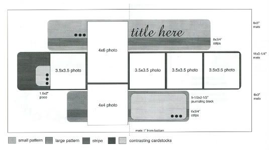
The sketch, from Sketches for Scrapbooking, Volume 2, that I have used as the starting point for each layout this week.
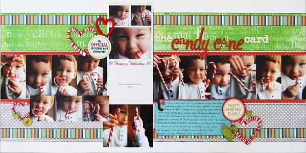
Supply List - Cardstock: Bazzill; Patterned paper: BoBunny and Crate Paper; Chipboard hearts: Maya Road; Alphabets: Prima, Making Memories, and American Crafts; Stickers: Scenic Route
From the year that I was born to the year I turned 18 my mom had Christmas photos taken of my sister and I for our Christmas Cards. The only thing I liked about it was getting to see the photographer's indoor goldfish pond with a bridge and the spiral staircase. Other than that I hated it. Of course now I understand why she did it and I have the same tradition with my kids.
One year for Christmas, Mom gave me a scrapbook with every single Christmas Card from year one to eighteen in it. It is one of my favorite scrapbooks to look at. Since I do the same photo Christmas Card, minus the professional photographer and goldfish pond, I knew that I wanted to make a layout for each year. I wanted to have the actual Christmas card of the year, some of the photos that didn't make it onto the card, and, of course, the story behind it all.
Variation #1 - I'll start with the papers first. I, at first, was just going to make each of the background strips the same length but after seeing the amount of photos I wanted to include I decided to go ahead and extend the strips to the edges. The strips of patterned paper have the same height as suggested on the sketch but the width on all is 12".
Variation #2 - I kept the 3/4" strip on the bottom in the same place as on the sketch but on the top one I moved it to the top edge of the patterned paper background. For some reason, with the strips extended off the page, I just thought it looked better on the top.
It always bugs me when I can't give a better explanation than "it just looked right". I don't have much of a background in design other than my time in high school. Most of the time when it comes to designing I do things the way I do because it looks right to me, not because there is some design rule that I feel I must follow.
Variation #3 - Since I was using one of our Christmas cards on the layout I thought the best place for it would be where the 4 x 6 photo was. I used foam adhesive so that it stood out from all the other pictures.
Variation #4 - Since I extended the papers off the page I did the same with the photos along the middle strip. They all have the 3 1/2" height but I changed the width to 2" so I could fit a lot of them onto the layout.
On the left page, the measurements would have been off if I would have started a picture flush with the left edge of the card. I would have ended up with a space on the left end of the paper or I would have had a picture going off the edge of the page. I wanted the overall look of those pictures to look the same as the right page so I started on the left edge and worked my way to the right. I didn't want a big gap in between the fourth picture and the card so I took a scrap piece of a picture and adhered it so that the row of pictures appeared to go underneath the card.
Variation #5 - For embellishments on this page I tried to create something similar to the hearts that Drew was making in the photos with the candy canes. To do this I first paint a chipboard heart with a pearl paint and then wrapped red embroidery floss around it. I left spaces all over it so that it kind of resembled a candy cane.


Variation #6 - On the left page of the sketch, beside the photo on the left there is a tab with three small circles on it. I ran into a little bit of a problem with where to put that embellishment piece on my layout since there isn't an end the row of photos. I felt that the embellishment was needed to help frame all of the photos and journaling with the other two groups of embellishments. I could have overlapped the hearts onto the photos in the general area of where it is suggested but with these photos it would have covered up too much. Here's a closer look at my solution.
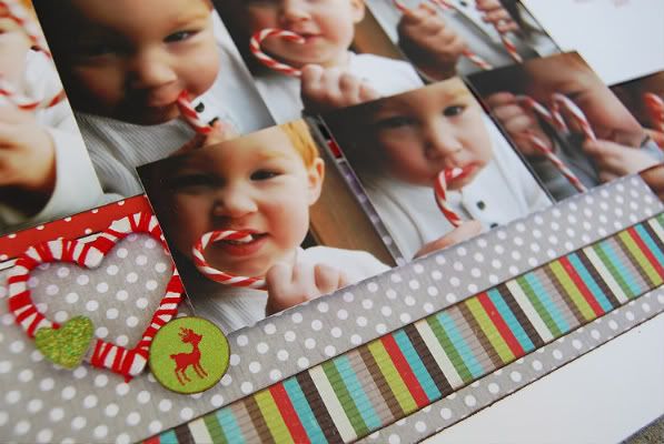
I added three 2 x 2 photos and placed my embellishments at the left edge of those. It's still in the same general area but this way it isn't covering up parts of any pictures. Plus this was an easy way for me to add even more photos! (There are eighteen total photos on this layout!)
The sketch, from Sketches for Scrapbooking, Volume 2, that I have used as the starting point for each layout this week.

Layout #5 - "The Candy Cane Card"

Supply List - Cardstock: Bazzill; Patterned paper: BoBunny and Crate Paper; Chipboard hearts: Maya Road; Alphabets: Prima, Making Memories, and American Crafts; Stickers: Scenic Route
From the year that I was born to the year I turned 18 my mom had Christmas photos taken of my sister and I for our Christmas Cards. The only thing I liked about it was getting to see the photographer's indoor goldfish pond with a bridge and the spiral staircase. Other than that I hated it. Of course now I understand why she did it and I have the same tradition with my kids.
One year for Christmas, Mom gave me a scrapbook with every single Christmas Card from year one to eighteen in it. It is one of my favorite scrapbooks to look at. Since I do the same photo Christmas Card, minus the professional photographer and goldfish pond, I knew that I wanted to make a layout for each year. I wanted to have the actual Christmas card of the year, some of the photos that didn't make it onto the card, and, of course, the story behind it all.
Variation #1 - I'll start with the papers first. I, at first, was just going to make each of the background strips the same length but after seeing the amount of photos I wanted to include I decided to go ahead and extend the strips to the edges. The strips of patterned paper have the same height as suggested on the sketch but the width on all is 12".
Variation #2 - I kept the 3/4" strip on the bottom in the same place as on the sketch but on the top one I moved it to the top edge of the patterned paper background. For some reason, with the strips extended off the page, I just thought it looked better on the top.
It always bugs me when I can't give a better explanation than "it just looked right". I don't have much of a background in design other than my time in high school. Most of the time when it comes to designing I do things the way I do because it looks right to me, not because there is some design rule that I feel I must follow.
Variation #3 - Since I was using one of our Christmas cards on the layout I thought the best place for it would be where the 4 x 6 photo was. I used foam adhesive so that it stood out from all the other pictures.
Variation #4 - Since I extended the papers off the page I did the same with the photos along the middle strip. They all have the 3 1/2" height but I changed the width to 2" so I could fit a lot of them onto the layout.
On the left page, the measurements would have been off if I would have started a picture flush with the left edge of the card. I would have ended up with a space on the left end of the paper or I would have had a picture going off the edge of the page. I wanted the overall look of those pictures to look the same as the right page so I started on the left edge and worked my way to the right. I didn't want a big gap in between the fourth picture and the card so I took a scrap piece of a picture and adhered it so that the row of pictures appeared to go underneath the card.
Variation #5 - For embellishments on this page I tried to create something similar to the hearts that Drew was making in the photos with the candy canes. To do this I first paint a chipboard heart with a pearl paint and then wrapped red embroidery floss around it. I left spaces all over it so that it kind of resembled a candy cane.


Variation #6 - On the left page of the sketch, beside the photo on the left there is a tab with three small circles on it. I ran into a little bit of a problem with where to put that embellishment piece on my layout since there isn't an end the row of photos. I felt that the embellishment was needed to help frame all of the photos and journaling with the other two groups of embellishments. I could have overlapped the hearts onto the photos in the general area of where it is suggested but with these photos it would have covered up too much. Here's a closer look at my solution.

I added three 2 x 2 photos and placed my embellishments at the left edge of those. It's still in the same general area but this way it isn't covering up parts of any pictures. Plus this was an easy way for me to add even more photos! (There are eighteen total photos on this layout!)
If I would have put the hearts in the same spot I have it now without the 2 x 2 photos it would have just looked odd. I'm a big fan of everything being grouped together on my layouts. I think it's just easy to see everything that way.
A few things to share:
• I loved the glittery chipboard letters I used in my title and knew I wanted to use them. When I realized I was short on "A's" I was a little bummed. After trying a few other alphabets I was determined to find a way to use the glittery ones. I decided to replace the "A's" with alphabet stickers from a different set.
• The journaling on this page was so easy to my blog. If you don't have a blog I strongly encourage you to start one. Not only is it so easy to post a quick little daily update but you'll be amazed when you go back and read past posts and realize how much you had forgotten. Another great reason to have a blog? Sometimes, like on this layout, you don't have to worry about the journaling because it's already been done. I used the blog post I did with these pictures as my journaling. Talk about quick and easy!
Today is the last day of Sketch Week and the last day for the Sketches for Scrapbooking and Nikki Sivils, Scrapbooker giveaway. I'll be posting the winners on Monday along with the starting date for July Sketch Week and maybe a little hint about our July sponsor. Trust me, you'll love it!
Have a great weekend! We've got a busy one full of 5-year-old birthday festivities. :)
I'll answer all questions in the comments on Sunday evening. I usually do that after I post the next day but I'm stuck in party planning mode right now. So please don't think I'm ignoring you because I'm not. I'm just up to my ears in Scooby Doo party details.

68 comments:
Very cute. Love the outline heart wrapped in fibres which mimic the candy cane.
This is my first time commenting on your blog. I've been a fan for about a year and now use your sketches on almost ALL of my layouts (and I only have one sketches book). Thanks for all your ideas that spur my creativity. I was thrilled to catch your Friday post late Thursday night, guess it pays to stay up late in Seattle.
Love the look of this layout! Would have never guessed it came from that sketch.
I love everything you did with this layout---Exteding the patterned paper, the candy cane looking hearts and how you managed to get 18 photos on here! Wow! Thanks for another fabulous sketch week!
I love how you explain your variation. I have a hard time deviating from a sketch so this helps me a lot!
Again...nice layout. Thanks for sharing layouts with us this week.
I can't wait to see the birthday party photos on a layout.
Happy Birthday to Drew.
Linda from KS
The candy cane hearts are great!
I can't believe it's Friday, went by way to fast for me. I love this layout and the story behind it that you told. How sweet of your mom to put all those in an album for you. I like all the changes you made would never guess it was the same sketch. I think your A's in the title look good, love the paper strips. cool idea for the hearts. Thanks for another fun week. I can't believe Drew will be 5 already, have a great birthday weekend!! Happy Birthday Drew, and can't wait to see bday pictures from it.
My favorite part of this layout is the "candy cane" hearts. They are just so cute! I find Christmas layouts difficult because they always turn out so similar, but I may have to try some of your sketches. I think they will liven up those Christmas pages!
Simply WOW! I love how you varied this. I am a very "do it just like the sketch" girl and I thank you for showing us how to think outside the box.
Sad to see it is over for this month. Have a great Scooby Doo weekend!
Love this series of pictures, and yes, the glittery red letters are perfect for this layout!
What a great way to add more pictures! Love how you wrapped the hearts. Always some clever detail that I never would have thought of. Maybe that's why you're the designer.
This layout is super cute- the papers are so bright and cheery, the embellishments are perfect and I love how you incorporated the actual Christmas card ( I will have to copy that)!! I can totally see the sketch, but it's so different from the rest you would never know unless you were really looking:-)
Thanks for another wonderful Sketch Week!!!
I love the idea of giving the kids a scrapbook of all the Christmas photos. I too subject my kids (all 4) to pose for Christmas photos every year, I have found that a group shot is nearly impossible so we get individual shots and design a card in PSE (that is my favorite part)
Thank you for sharing your ideas with us all.
Love how you "Candy Caned" up the heart Allison!!
I'm really hoping to win...I know it's a long shot but I keep trying. LOVE the sketches each month and the multiple variations!
LOVE THIS!!! From the photos, to the papers/color combo, to the theme, to the embellisments.... hands down, my favorite of the week.
Thank you for the ideas for how to scrap the photo Christmas cards. I have been wanting to do something with them for several years, but didn't know where to start. Now I do (especially love that you included the "outtakes" since that will keep the memory of the photo session alive.... reminds me of the year I held my camera in one hand an an Oreo cookie in the other as a bribe... the things we do to get photos of our children).
Happy Birthday to Drew! May Mr. Pouty Pants stay away this year. :) Hope you all have fun.
Love how this looks completely different than the other layouts and those pictures are sooo cute!
Another great layout! Love, love, love the chipboard heart wrapped with embroidery floss! Thanks for showing another way to modify a sketch!
Until I "discovered" your blog over a year ago, I did not realize how versatile sketches are. Thanks for sharing your talent, and good luck on your party this weekend!
Traci
I'm glad you were able to find an A that worked!! This layout is adorable!!
My favorite of the week. I LOVE how many pictures it has, and what cute pictures they are. I hand q different sketch of yours picked out for our Christmas photo shoot, but I just may have to switch to this one.
I like your explanations for the variations. I have no problem with "it looked right". Very nice layout.
Another great layout. I especially love the hearts wrapped in embroidery floss. Thank you again!
Love how you got so many pictures on one layout. I always have lots of pictures too.
All I can say is "Wow-zer"!
Last night I tried stitching in my layout for the first time after seeing you do so for awhile and also as encouraged by your blog. It did add another dimension to the page. Thanks for your fine examples.
I can't believe you fit in 18 photos in one layout. It doesn't look too crowded either. Amazing work!
This was the best day for me. To see how you transformed the sketch was great.
It's amazing how many different looks you always achieve. It goes to show how versatile sketches really are. I love how you were brave enough to change the A's. Me, I need to do that at times but haven't. It totally works though. I love the wrapped hearts. Such a cool idea & adds to the theme so well. I like the circles with text on them as well. Thanks for another great sketch week!
Amy S (TX)
Wow I love how you changed this one up to work with the photos you had and I love the heart emelishments you made - what a great idea.
I love how you expanded the pattern paper the whole way, never thought of doing that. I love this sketch, it is so versatile. Love the layout. Thanks for a great week of inspiration.
Love this layout! My favorite part is how you were able to use so many pictures.
Stacie in OK
So cute! The green glittery elements add just the right touch!
I love how you've included so many pictures on this one. I have scrapped all of our family Christmas cards but never the outakes.
LouAnn
You continue to show us how versatile your sketches really are! Love the candy cane heart and how you got 18 pictures on a layout without it looking overcrowded!! "Rots of Ruck" with the Scooby Doo party!!
I am impressed with 18 pictures on one layout and it looks great!
scott.lisa3@verizon.net
I love those adorable hearts! You're so creative and clever!!
This just might be my favorite variation. I often end up going in a different direction myself when using sketches. LOVE how you wrapped the white hearts with red. I'm going to have to try that. Your creativity just amazes me!
another great way to use the sketch. i love all your embellishments you use on your LO's and they are always perfect for the LO!
All I can say is WOW! I need to start really thinking further outside my box when I use the sketches now! Loved the hearts wrapped like candy canes and everything else.
Happy Birthday to Drew! Hope you have a great day and nice weather to help the celebration!
I love what you did with the christmas card photos. I do the same layout every year as well, with the actual card and all the outtakes.
Sometimes the outtakes are better than the card.
Thanks for a wonderful sketch week again.
Love this! It's nice to see the layout stretched a bit.
I am truely amazed at your ability to think outside the box! I love this variation on the sketch. I love how the patterned papers extend to the edge and love the fact that there are 18 photos on this layout.
Another great week of ideas. You come up with such great variations of one sketch. It is time for me to think outside the box when using sketches. Looking forward to next month.
You've outdone yourself, again! I love all the pictures and your explanations are superb!! Thanks!!
CarissaH
Scooby Doo-cute! Our 5 yr old went with the firefighter theme. LOVE how you painted and wrapped the hearts. I still need to scrap Christmas pics from 2008 and 2009.
WOW!! You never cease to amaze with your attention to detail and how you alter your embellishments to fit the layout....LOVE IT!!
Again, I can't stress enough how much your CREATIVE interpretations help me to think outside the box when I'm doing my own LO's. I LOVE that you substituted other "A"s instead of abandoning your original choice. If you hadn't explained it, everyone would have just thought you were being creative. LOVE IT!
Thanks for a great week of sketches. Can't wait til JULY!
another beauty!
This is amazing! I can't beleive how many photos you managed to get on there! And I LOVE the floss wrapped hearts, too cute!
I really like the cheeriness of this layout. It all flows so well together. I love how you scrap Christmas in June...it keeps it exciting and new all year round that way!! I tried going in order..but what fun is that when we make such new and fun memories today!
Wow 18 phots. Great use of space to include so many photos.
Amazing! As usual I love it. I have really enjoyed this week and feel inspired! So many variations available, you help me so much, I have to jsut do it.
Love how you used soooo many photos!! We also do the yearly Christmas card shoot and sometimes the bbo-boos seem to be the best to portray us!!
Really enjoyed your variations for this sketch, thanks!
Such a colorful layout!
I like how you fit so many pictures on here without it seeming crowded or overwhelming!
Have a great party! I am so thankful you take the time to do this each month. I have a hard time going outside the box with sketches, I always want to stitch to it exactly, your variation tips really help me to go beyond my comfort zone.
It is amazing how different this layout looks compared to the others this week. Keep on inspiring us to stretch our creativity.
Great layout! love all the variations on the sketch. I usually end up modifying whatever sketch I am using to fit the supplies and photos that I am using. I'm certainly not as creative as you though!
Laura
I love the way you create your own embellishments! Also love that you got 18 photos on this layout - just the inspiration I need since I take a LOT of photos for every event.
- Heather B
I love how clean the layout looks with so many photos! I also like how the pattern paper extends to the end of pages!
Love this layout for Christmas cards-we use the same size photo card every year. I've always put our Christmas card layout in our regular yearly album-but I love the idea of a book with just card layouts. fabulous!
Love this layout!! Especially the candy cane hearts - TOO CUTE!!
jennifer hamilton
I don't know how to pick my favorite thing about this layout! I really like the strips of paper from edge to edge, and those chipboard hearts wrapped with embroidery floss to look like candy canes are wonderful. I remember when you first posted these pictures, ages ago. This is a great layout!
I think i like this layout best. Thanks again for great variations!
Cute layout! I like how you filled in the gap between the card and picture. Also love the candy cane hearts.
I love the candy cane hearts you made! You are always so creative and add the perfect extras to your layouts.
Great variation of the sketch!!
I really love this variation!
Wow! What a transformation! Your sketches provide endless options for pages and are so versatile if you apply some creativity!
Post a Comment