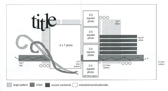
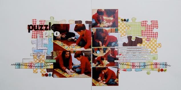
The sketch, from Sketches for Scrapbooking, Volume One, and the starting point for each of my layouts this week.

Layout #4 - "Puzzle Pro"
 Supply list - Cardstock: Bazzill Basics Paper; Patterned paper: October Afternoon (red, yellow, print, green, stripe), My Mind's Eye (blue), Scenic Route (green dotted), and Cosmo Cricket (brown); Alphabets: American Crafts; Word stickers: Creative Imaginations and Making Memories; Arrows: Creating Keepsakes KOTM; buttons: Fancy Pants Designs
• Variation #1 - I think I would be safe to assume that the background design is the most noticeable difference. This layout took such a different turn than I had originally planned, but in a good way. I had wanted to show how adding one solid piece of paper in place of the four 3" x 7" pieces is a quick and easy way to change up the look. Well, the wheels in my head started turning and I eventually found myself digging through Drew's puzzles.

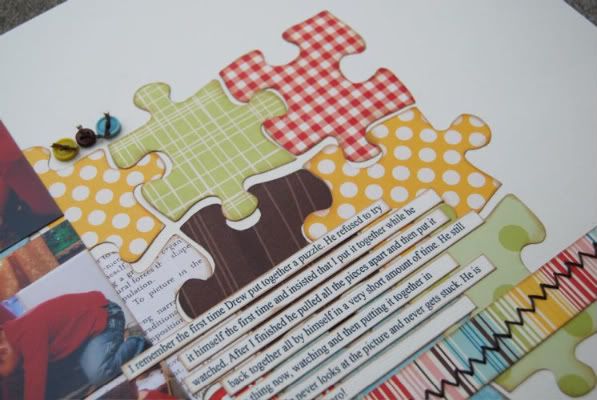
I ended up going the opposite direction of quick and easy but I couldn't resist the idea that was swirling in my head! To make this background I took one of his puzzles and put it together to see if it would work in the suggested space. After pulling off the flat edge pieces it was the perfect size. I traced and cut each piece out of different patterned papers and then inked the edges. When it came to adhering it all down I didn't worry about each piece fitting perfectly together. Since I hand cut each one the chances of them fitting together was pretty slim. I overlapped some and left a little bit of space here and there. I really tried not to worry about if it looked even and perfect.
• Variation #2 - The pictures on this layout are quite a bit different than the ones suggested on the sketch. In place of the larger 5" x 7" photo I used two 3 1/2" x 5". This is a great option for those of you who like using 4" x 6" photos. You really aren't cropping off that much to make a 5" x 7" block of two photos.
For the four 2 1/2" square photos I instead used four wallet size photos. They still have the 2 1/2" height but are 3 1/2" in width.
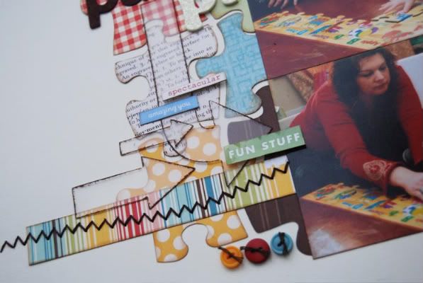
• Variation #3 - I struggled a little with the flourish element on this one. I loved the puzzle pieces as the background and was a little hesitant to cover too much of it up. Then I remembered the box of clear embellishments in my scrap closet.

The clear arrows were a perfect fit and I didn't have to worry about completely covering the puzzle design. I added a little bit of brown paint around the edges of the arrows so they didn't get completely lost in all the different patterns and colors.
• Variation #4 - Just like layout #3, instead of having the journaling strips straight and even, I went with a uneven look. The strips are also 4" instead of the suggested 6". I wanted as much of the puzzle design showing as possible.
Another day and another chance at winning a copy of Sketches for Scrapbooking! :)

39 comments:
those puzzle pieces are so cool!
Wow! I love this! I'm impressed with the tracing and cutting of the puzzle pieces....I'll be lifting this!
I'm with you and Drew, this one is my favorite! I love those puzzle pieces! Thanks for sharing some of your thought process, too. It's very helpful for my own layout problem solving. :D
OMG, this is just really showing us how to 'stretch' the sketch, and adapt it to our needs, I love it.
dang girl...the puzzle pieces are GREAT!
What a great idea when scrapping a child's daily playing activities! Brilliant!
You never cease to surprise me. I love the puzzle background on this layout. This may be one of those times that I plan an activity (putting together puzzles) around a scrapbook page I want to make.
Love love love this one! It was worth all the work!
This is so awesome again. I'm happy to say that when my son was 31/2 I took pictures of him doing his first 24piece puzzle on his own. I actually made a layout with them even years ago. I just went and looked it up in his album and it's boring, I took up half the page just telling the story for him. He looked so proud and happy in his pictures, took him a week to do it by himself.
Fast forward 4/12 years and I now own a puzzle punch so I used it on a page for my cousin and put on the last page for her album " we love you to pieces" and it came out cute. I love the way you did it though. Great job with the colors and cutting out, all the little details.
What is holding down the arrows?
How long did it take you to do this page? How long for all your other sketches you do for us. You always put such details in them, that's what makes them so great. I can't believe there's only one more day left for this week. Can't wait for next month. Thanks again Allison!!!
Really cute! I like the acrylic arrows, they do go great in that spot, not taking away from your wonderful piece-work.
Hello Allison's mom,
I saw the comment you left me the other day. While I was growing up my mom only took pictures of the big days, school, bdays, holidays, etc. not the everyday life things. The reason I scrapbook is for those little moments in their lives. I want them to remember their childhood as much as possible. When they grow up and have kids they can tell/show their kids all about their childhood. I'm hoping my girls will continue the hobby into their own families too.
I think you and your daughters are so lucky to have each other and be so close everyday. You have done an amazing job raising your children just from what I read here on your blogs. Have you made any scrapbooks about your kids growing up and what do you scrapbook about now? I wish so badly that I lived closer to your area so I could visit your store and come to the classes. Have a great day!!!
I was impressed with the last LO (and I still am) but this is such a fantastic Layout. I absolutely love the puzzle background it is so much fun. Thanks for sharing yet another gorgeous layout Ali :)
Fabulously cute As always! Obviously Drew takes his puzzles very seriously! LOL
TFS! Awesome!
Super cute:-) I love love love the puzzle pieces- I will definitely use this idea with some puzzle pics I have:-)
Love the puzzle pieces. What a great idea. Very colorful,thats waht I like most about your LO they are very colorful. Thanks for sharing
Wow! Love how you take one sketch and show us how to use it over and over and still make it different. You're a genius! :)
Amy in OH
How do you come up with such cute and unique ideas? So very cool. I love the puzzle background. I am definately going to have to use this idea on a layout. And I have the perfect story to tell...
My kids and I hit the library book sale just at closing time when they let you fill a bag for something like $2. In the back there was a table full of puzzles and well my 2 girls wanted a few, so I agreed to let them get a bagfull. Well they couldn't stop themselves and filled up 4 bgs full of puzzles. They loved the pictures - to the point that they used their allowances to buy them. Almost a year later and I am still picking up random puzzle pieces. Ok it doesn't sound as cute as it was then, but anyway thanks for the great idea to scrap a random day in out lives. :)
Interesting twist. Not sure I'm willing to put in that much time (in cutting out all the pieces), but a technique I'll keep in mind, nonetheless.
I love how you used different size pictures again. It's really making me start to think outside the sketch every time I scrapbook.
The puzzle pieces and clear embellishment are great! I'm going to have to dig through some older photos and see if I have any of my own kids doing puzzles.
Just love how you change everything up. Thanks for the info on journaling strips. Going to give it a try. I have been typing my journaling inside a box. Love the look of the strips.
I love the puzzle pieces. Using those clear arrows was perfect cause it doesn't hide those cute puzzle pieces. I usually steer clear of using clear accents but this has let me see a whole another way to use them, thanks!
I saw this one at the store...and loved it...so cute!
Like everyone else, I love the puzzle pieces. Another beautiful layout, with lots of great tips. Thank you so much. Traci
I think this is my favorite so far this week. Love the look of the puzzle pieces. I just remembered that I have a coluzzle template that would make this very doable.
LouAnn
I love the puzzle pieces and the flourish is perfect. Because it is clear it doesnt take away from the puzzle pieces but adds just enough pizazz! Love your work!
I love this layout!! Thank you so much for sharing. I just took pictures of my daughter with a completed puzzle and now I realize I need to go back and get some shots of her actually doing the puzzle. Such a great spread. Thanks!
What an awesome combination of layouts from one sketch! I love the variations you offer!
Wow, I really like how you have varied this sketch. I agree with Drew also, my favorite! Jody, IA
LOVE IT...very creative:)
I love everything about this page! The puzzle pieces are great, and something I am definitely going to have to use for a LO for my own little puzzle pro. I also love those clear arrows. I find myself painting clear acrylic shapes for my layouts more and more. In fact, I just used your removable adhesive dot paint trick from a previous post on clear Bo Bunny letters for a layout. I was pretty pleased with how they turned out. Thanks for that!
The biggest impact this week is having on my own scrapbooking is that I cannot wait to print some pictures in wallet size. Wow! I love how they look, and am now finding myself looking through all of your sketch books and thinking "I could use a wallet pic there...and there...and there too..." :)
It's amazing, the same sketch but each layout has a unique look. Another beauty.
I have been so busy this week, that I just now visited your blog. I am so excited to see you use this sketch! It's one of my favorites. Your pages are awesome. I love seeing how each layout looks so different even though you are using the same sketch. Thanks for using my request.
This layout is just the cutest little thing. You are amazingly creative!
debbi, I've done that before! I've also dressed my kids to match a certain paper I loved! lol!
Dawn, the "we love you to pieces" theme sounds so cute! Might have to use that one sometime. To answer your questions, I used a vellum adhesive for the arrows. This page did take awhile. I would guess around three hours maybe. It didn't help that I was watching my favorite show at the time and kept getting distracted! If I'm using a sketch it usually takes me around a hour to complete a layout. It would probably take a lot less if I didn't do so much hand stitching! If I'm making a layout from scratch it takes me anywhere from one to three+ hours. It just depends on my mood and where my creativity is taking me. :)
Amy in OH, I'm going to show your comment to my husband. We are in an ongoing battle of who is the smartest. ;)
Renee, we are in the same boat! I swear I pick up at least ten puzzle pieces a day. It's a wonder that we ever put one together that actually has all the pieces! I love your story and think that it is perfect for a layout! One that you and your kids can get a good giggle out of later on. :)
Thank you so much to everyone! :) This has been such a fun week!
You have the BEST ideas! Thanks for all the inspiration!
Allison,
I would have to say the puzzle layout is one of the cutest ones I have seen in a long time!! I absolutly love it!!! Great job!!!
Michelle Dorland
I love the puzzle it is one of the cutest ones I have seen is a while I love it!!!
Michelle Dorland
I love seeing the 4x6 pics on the left. Also love the zigzag stitching and the puzzle background. Very cute!
How do you come yp with this stuff? all the great ideas and so much color- I love it
Post a Comment