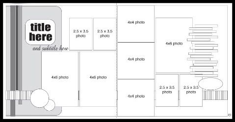
Here is the sketch, from my personal bank of sketches, that I will be using as the starting point for all five layouts this week.
 • This sketch is now available to download. All you have to do is click on the "Downloads" link on the right side of my blog, it will take you to the downloads page where you can download and print the sketch.
One of my favorite things about this sketch is that it fits 10 pictures in many different sizes. It's has a great balance of large, medium, and small photos. Over the course of this week I'll show you several different options for the photos, large and small. Plus I've done several variations on the right side with the papers.
Layout #1 - "...Drew"
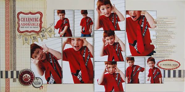
Supply list - Cardstock; Bazzill: Everything else; My Mind's Eye
I instantly fell in love with this collection from My Mind's Eye at first sight while at CHA. I also instantly knew which pictures I was going to use with it.
This layout follows the sketch almost exactly so instead of telling you about variations today, I'll show you in detail some of my design ideas.
• Title
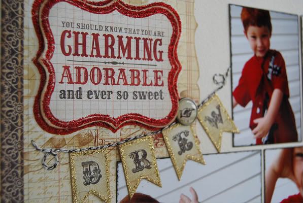
When I read the charming, adorable, sweet quote on the die cut piece I knew it would be a perfect fit for these pictures of Drew. The die cut patterned paper piece that I used on the right side of the page actually had the same quote already on it but since I have a slight obsession for pop dots I added the die cut quote on top of it. The die cut was smaller than the quote printed on the paper and ended up framing the die cut perfectly.
I added the "Drew" part of the title with cute banner alphabets for two reasons. One, because I loved the stickers and two because it drives me crazy to have inconsistent gaps between things. Notice that the margins between my photos are all the same. Now look at the margins between the three strips of patterned papers going down the left side, they are the same. I am big on all of the margins on my page being consistent. I also like for most everything on the layout to be grouped together; the title, the journaling, and the pictures. When they are grouped together they are the main focus of the layout, together. (This could quite possible be another proof of my OCD personality.) Without the "Drew" banner the title was just too far away from the main focus of the page. Adding in the banner brought it all together.
• Embellishments
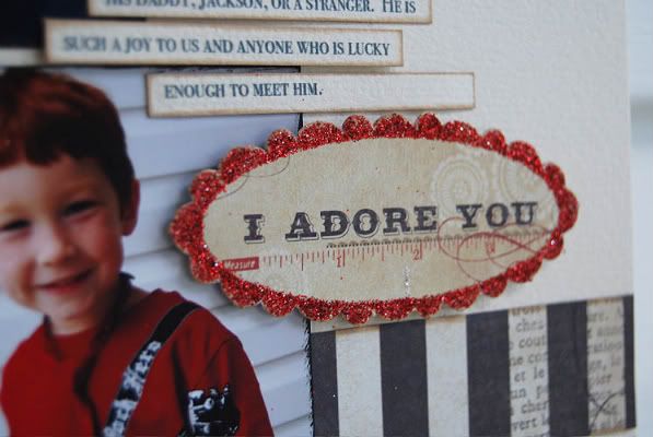
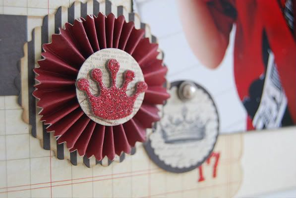
Adding the embellishments can be a tricky part to a layout. You don't want to add too much and take away from the photos. The embellishments are often a nice finishing touch that bring the whole layout together. My rule is to have three areas on my layout for embellishments. I explained in my last post about using a visual triangle and how I like using it to frame my photos.
I counted the title as one embellishment area since I had the banner and a brad. The second area I added a pre-made embellishment and die cut tag from MME. The third is the "I Adore You" die cut. To add interest to these areas I try to make at least one thing in each area dimensional by using pop dots. See I told you I had a thing for pop dots.
Again, like with the title, I like for the embellishments to be consistently grouped with the rest of the design. What I mean by that is, if you have embellishments, your title, your journaling, and your photos spread out inconsistently all over the page the person looking at it has to search for everything. Using the same consistency keeps everything all together and you instantly see the title, the photos, the journaling, and the embellishments.
• Journaling
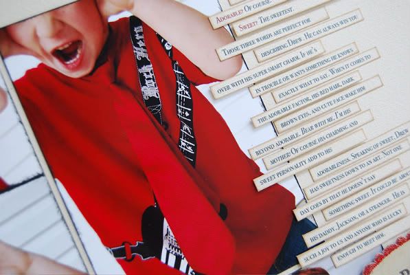
I always talk about how much I love to use journaling strips and one of the things I love doing with journaling strips is...any guesses? Adding pop dots to a few of the strips. Surprising, I know. I always want the story of my layout to stand out and adding dimension to it is an excellent way to do just that.
When I start creating a layout the first thing I think about is the journaling. What story do I want to tell? What aren't the pictures saying? What do I want to remember about this very moment? Sometimes I instantly come up with what angle I want to take and other times I come up with nothin'. Sometimes pictures, like these of Drew, can be difficult to journaling about. There really wasn't much of a story other than Drew looking super cute in his tie. Sure I could use "Drew looking super cute with his tie" and the date and call it good but I like to add a little bit more of personal touch to my journaling. With these kind of pictures I like to take the time to tell a little about the subject's personality or maybe a story that I don't have exact photos for.
In this case I wasn't sure what direction my journaling was going to take until I read the quote on the title die cut. Drew is definitely charming, adorable, and sweet, so this was the direction I took for my journaling by explaining what makes him charming, adorable, and sweet.
I think it was a pretty much a landslide vote on the giveaway for this month from My Mind's Eye. If you missed the last post, there will be three giveaways. Each giveaway will include three collections from My Mind's Eye who so generously donated one of everything from their newest collections. I'm still in amazement at just how much product that is.
Giveaway #1
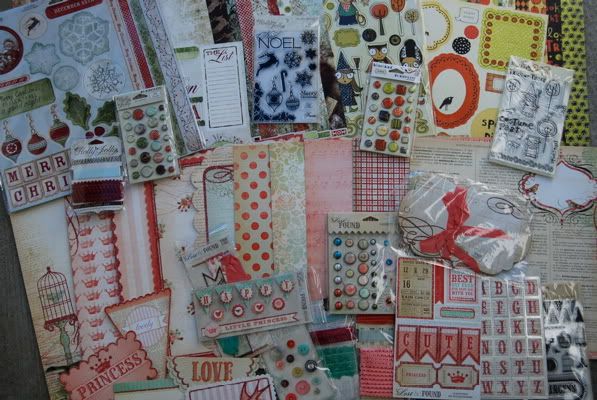
Giveaway #2
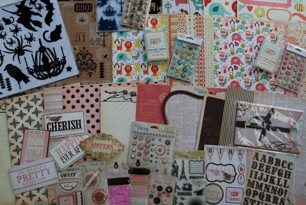
Giveaway #3
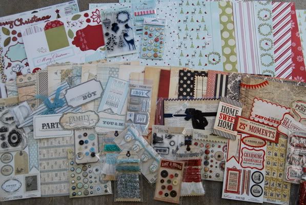
On top of that each giveaway will also have a copy of Sketches for Scrapbooking included, volume choice is all yours. :)
Here's the rundown of how the giveaways work: I'll be posting everyday, Monday - Friday. All week you'll have a chance to leave a comment and next Monday I'll post the winners. You can leave more than one comment through the week to be eligible but not on the same day. (five days = five chances to win!)

276 comments:
«Oldest ‹Older 201 – 276 of 276This is such a great sketch, perfect for my amusement park pics. Thanks!
Thanks so much for making the sketch printable! It's so much easier to read than the others have been.
Beautiful! I love the colors you used, and they work so great with your cute pictures.
Thanks for your free sketch and expertise. :)
Love the sketch!! I also love the "Carnival" feel of the embellishments and papers.
Love the sketch and LO- looking forward to this week! Thanks for the chance at an amazing giveaway, especially excited about the sketch book!!
Love the papers, and Drew is such a ham!!! LOL
Great layout. The pictures go so well with the new MME products.
Thanks for the great giveaway.
Leslee in MT
love the sketch and your layout is fantastic. ( as usual)
Your layouts rock! Love the papers also!
This is an absolutely adorable layout! What a great start to Sketch Week! :)
I can never get my waves to look as nice as yours.
I love this layout. It is one that can be altered slightly to match the sizes of photos you have. Look forward to seeing your variations this week.
I really love this sketch. It will be very easy to alter to fix the size and number of photos each person has. Looking forward to seeing your variations.
I so love MME, and with this giveaway I love them even more!
Love the sketch and the MME papers and embellies!
Fabulous sketch and Fabulous layout! and MME is such a generous company!! Thanks for the chance!
Love the sketch and what a great giveaway.
Cutest layout! Your son is adorable! And wow how generous is that give-away?! MME is so awesome to do that for you.
Oh this is an awesome sketch, I am trying to get some pics together to follow a sketch of yours. Will post link if I ever get it done!
Love these layouts... and the giveaway! wheee
Great sketch! Love using lots of photos on a layout.
I love all the red glitter accents- so cool! MME is my favorite company! So excited to see what you do with all the new collections!
Holy Cow...great sketch...great giveaway! Thanks so much Alison and MME.
This is my first visit to your blog and it is fantastic! Love the layout and the explanations of your design, definitely inspiring! Will be watching your blog regularily! Keep up the beautiful art...
So thrilled with your sketch that uses TEN pictures! I usually have so many I want to use so this will work amazing for me. Thanks for sharing a "new" sketch!
My mouth is watering at the chance to win one of those prize packages! My Mind's Eye is one of my top favorite brands. Love love love!
OMG Those pics are A-dor-able!!!! And this giveaway is Awesome!!! I heart sketch week!!!
I am new to your site and sketches-I have only been scrapping for about 20 months. I love your sketches, and I am trying to learn more on how to vary them so these sketches aznd how you adapt them are so very helpful. I love MME and was excited to see them as the sponser for the month!
Love the sketch and the giveaway is amazing!
Love this sketch and how you explain what you have done.
Awesome sketch! I can't wait to use it!
I Love the new MME lines so much and to have you using sketches with the lines is a "girls dream come true"
Love, Love, Love the glitter. Love the Lollies, and that little banner with Drew's name. It just sets that page on fire Along with the coordinating red hair and shirt. LOL
WOW! They sure were generous with the giveaway stuff! Looks like some great gifts!
As for the layout, it was beautiful as always. By the way, your journaling strips always look GREAT. Do you have any tips for getting them spaced on the word program and getting them cut so neatly??
I love the sketch I completed a lo last night using it... I will attach a link to post part 2 comments tonight (have to go to work soon) if you would like to see it & I will email it to you incase you don't catch it there. Thanks for the great easy to follow sketches... they are awesome! ~ Staci
I love embellishments, but I can never seem to get some sort of balance... Thanks for the tip!!
I love embellishments, but I can never seem to get some sort of balance... Thanks for the tip!!
Gretchen, they were already glittered. Four of the collections have glitter accented throughout all the papers and embellishments. They are so beautiful!
Moody Girl, woohoo! :)
Carmen, congrats!! Wishing you both a healthy delivery!
Thank you everyone! I love hearing that you are learning from my process and ideas. It makes this girl smile. I love the teaching side of scrapbooking so this is so much fun for me!
i have just fallen in love with all of your sketches!
Great sketch, I love that you can fit so many photos on it. Really like seeing all the variations of it too.
Love the sketch and layouts. What a fun giveaway!
Love MME and the sketch and can't wait to see how you change it up. Great giveaway. Thanks for being so generous :-)
I love a sketch that offers spots for so many pictures!
This sketch came just in time! I'm using an older line that has Christmas colors in it and have SO MANY Christmas photos from the past I need to "layout"!!! Thanks for the great ideas and for posting a chance to win! This would be SO AWESOME!
cute sketch! love how you interpreted it!
I am a BIG fan of your style and layouts...loving the sketches.
I am a BIG fan of your style and layouts...loving the sketches.
Can't wait to visit your store and join in some crops! Love, love, love your sketches
Perfect papers for those photos!
I would love a chance to win...well not really the chance-but to win!
I love MME products.
This sketch is really cool, I love there are so many photos on it.
Awesome sketches.....awesome prizes...love SG
Fantastic sketch and layout! I always look forward to sketch week.
Love the layout and those photos are just so perfect!
Fabulous sketch
Love how this all comes together!
Kelly K.
Love the glitter around the banners. And it is the perfect placement between the title and photos.
I love all the new MME. Great prize packs.
WOW! Now, that's what I call a giveaway! I would love to win one of your sketch books too. Can you say BONUS?
Glad to see that the sketches can be downloaded too. I will definitely be doing that as I love this sketch and how versatile it is!
K in PA
wow!!! amazing prizes and i LOVE this sketch!!!
Thank you! Hope to use this sketch today!
WOW! I love how the sketch includes so many photos! This will be perfect for all the vacation pictures from this summer. THANKS!
I love your layouts! Love the MME products also! Makes me want to go do a Christmas layout!
Loving the giveaways! Thanks for the chance to win!
I love how the pictures are repetitive with just the facial expressions being different. So cute!
oh.my.word!
I was anxious to see what you did with those adorable photos- love this sketch and finished LO!
I love sketch week. I feel like I learn something new every time. Your sketches have really transformed my pages. Thank you!
Awesome boy layout!!! Love the colors!
Wow! Love these pictures and how you used them on the layout. He's a cutie!
WOW!! Love, Love, Love this LO ... I love that you can create so many DIFFERENT LO's with ONE sketch - superb talent indeed ... AND AS FOR THE GIVEAWAYS ... YUMMMY!!
Love, Tracy G
MUST.HAVE.THIS.PAPER. I am a total primary girl and red is my favorite color - loving it!! Great job!! And totally love MME!!
Beautiful Layout! I love this :)
Awesome layout and I can't wait to see the variations on the sketch!
Awesome layout! Love the variation and how many photos you can include!
Sonia
I love your sketches, just started using them now I need to find the books
I used this sketch and made a fantastic layout of my son at his girlfriend's prom back in 2005. It worked great! I'm saving it for a Christmas layout and/or a baseball layout of my grandson. It works so perfectly for multiple pics of occasions like that! Thanks Alison, for the inspiration!
Oh My Gosh! My friend Leslie, at A Cherry on Top just posted your link because I asked what everyone used as their inspiration. So I took a look at your blog and I LOVE IT! Then I saw your giveaway, and I LOVE IT TOO! I'm signing up right now for your blog updates!
Post a Comment