Showing posts with label Jackson. Show all posts

Friday, March 22, 2013

Sketch Week, Day 3

Day three is here! If you haven't had a chance yet be sure to visit the Scrapbook Generation online store to grab the free sketch for March. It the same sketch that I've been using as a starting point for my layouts this week.

Scrapbook Generation's Free March Sketch
* you can download by clicking here
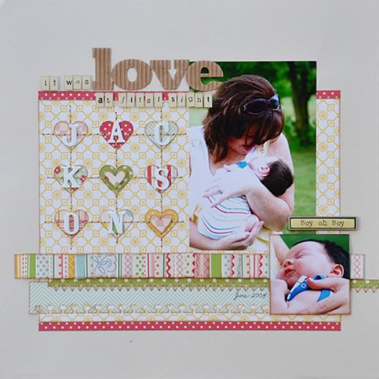
"One of a Kind Jackson"


Supplies - Cardstock: Bazzill; Patterned paper: Echo Park; Alphabets: Echo Park (one), October Afternoon (of a kind), and American Crafts (jackson); Star punch: EK Success; Brads: Doodlebug and unknown; Ink: Colorbox Fluid Chalk Ink; Embroidery floss: DMC
The biggest change on this layout was with the design/papers.

Variation #1 - I am in love with the look of banner/notched/(insert whatever you call them) strips. In love. You can take a plain strip and with just a simple snip you get a whole different look.

I followed the sketch as far as the width of the strips, the 4", but I cut an inch off the length to accommodate the notched ends. Another idea would have been to the leave the top edge of the strips straight and just cutting the bottom end.

Variation #2 - I wanted to add in some more colors and patterns so I add a few smaller strips in different sizes. They are kind of filling in for the striped strips on the sketch. One reason I like to use a stripe on my layouts is that stripes are great for tying all the colors on the layout together.
Variation #3 - I used a 6 x 4" photo in place of the two 3 x 3" photos on the left page. There is only a 1" difference so I didn't have to make any major adjustments for the photo to fit. Using a larger photo in place of a few smaller ones is always a great way to adjust a sketch to fit what you want to use. Most of the time it only requires a few small adjustments. In my case, I just moved the top photo up a little so that the two photos together had pretty much the same spacing from the bottom of the bottom photo to the bottom of the layout and from the top of the top photo to the top of the layout. (Hopefully I didn't confuse you with that one!)

Variation #4 - I didn't add the banner across the page. Part of this had to do with the larger photo I mentioned in variation #3. There just wasn't a lot of room left for the banner. If I would have had a picture that had some open, empty space at the top I could have gotten away with still using the banner and overlapping it onto the picture. Since Jackson's head is all the way to the top of the photo I couldn't do that without covering him up. I wasn't too worried about it though since the background banner strips added so much more interest to the layout. 
Variation #5 - I used a larger title than the sketch suggests. This is one of those areas that I don't worry about following the sketch exactly. A title is always an easy way to add a unique look to each layout and very rarely does the title I want to use or make fit the actual title on the sketch. 


Variation #5 - I used much smaller embellishments than suggested on the sketch. Again, this is an area that I usually don't follow often. I use the sketch in areas of title and embellishment as more of a suggestion of where those elements should go, not exactly what they should look like. 


I used small stars accented with brads for my embellishments. The title was long and had so many colors and textures that I didn't feel like I needed a large embellishment. I thought simple was the way to go.

Check this out!

On Sketch Week, Day 1 there was a comment linking to a wonderful (and very clever) use of the sketch this week that I really wanted you all to see. 

Ruth at scrapmachine.com tried out a little experiment and used the sketch from this week for her Project Life layout. And I don't mean like a normal 12 x 24" layout. She used the sketch and made it all fit into the divided Project Life page protectors. You can check it by clicking here and reading about where she got the idea and how her experiment went. 
It think it might be kind of fun to start sharing some of the layouts you all do based one the Sketch Week sketches. If you create a layout based on the sketch from that week leave a link in the comments and then on Monday I'll post all the links so everyone can go check them out. 

Wednesday, March 20, 2013

Sketch Week, Day 2

Day two is here and since we added the new March downloads to the Scrapbook Generation online store you can go grab the free March sketch. The free sketch is the same sketch that I'm using as a starting point for my layouts this week. If you haven't had a chance yet, you can also check out the other March downloads that I posted about yesterday. 

Scrapbook Generation's Free March Sketch
* you can download by clicking here


"Pawsitively Adorable"


Supplies - Cardstock: American Crafts; Patterned paper: We R Memory Keepers; Stickers: We R Memory Keepers; Alphabets: My Little Shoebox and American Crafts; Ink: Colorbox Fluid Chalk Ink; Dog bone clips: unknown; Embroidery floss: DMC

Variation #1 - The biggest change I made for this layout is the pictures. All of the photos that I wanted to use were vertical 4 x 6" photos instead of the suggested horizontal 6 x 4" photos.

On the left page I had to make sure that I didn't lose the space for the title so I lowered the picture. I also added a photo mat to help that photo stand out. Because the width of the photo is the same as the strip behind it (4") it looked a little odd and the picture was getting a little lost. The mat was an easy solution.

On the right page I didn't need to do much since the two 4 x 6" photos filled the space of the photos on the sketch very closely. There is a slight difference in both the height (a 1" difference) and width (a 2" difference) but it isn't enough to need to adjust anything to fit the differences.

Variation #2 - I switched the title/embellishment up a little. I moved the embellishment (the hearts on the sketch) to the left of the title (the paws). The banner came down low enough on the top right side near the picture that I didn't want to cover it up with an embellishment.


Variation #3 - I pretty much followed the same banner as on the sketch but I added in a few dog bone clips to fit the theme of my layout. I also used dog paws in place of the hearts on the sketch.


Be sure to check back Friday for the last layout I have created based on the free March sketch and then Monday to see who has won the download giveaway. 

Tuesday, March 20, 2012

A day with Jackson

A couple of weeks ago I drove the boys to school like I always do. We dropped Drew off first and I noticed that Jackson was abnormally quiet in the backseat. I walked Jackson to his classroom and he gave me the same hug and kiss I get every morning. It was all very routine. Except for Jackson's mood. He just seemed kind of sad.

I drove home to get ready for work and I just couldn't get his sad little face out of my mind. I felt terrible about it. I got home, got ready and drove back to Jackson's school to pick him up. I'm in a very unique and lucky situation where I can pretty much do whatever I want job-wise. And on that day I made the executive decision that he could spend the day at Scrapbook Generation with me.


I could not stand to see him so sad when I dropped him off and then go about my day like it was normal. Not when I have the freedom I have with my job. I spend way too much time saying "Goodness, time is flying by!" and often times without doing anything about it. I know I can't slow it down but I can make the most of it!

Jackson isn't going to be this age much longer and I love this age! I'm going to blink and he's going to be in Kindergarten. Two blinks and he'll be graduating high school. I needed to take a day (and many more) to spend with him and enjoy the three-year-old Jackson before he's all grown up!

 This cute smile is so much more important than work!

Now is it professional to have a three-year-old running around the store belting out the lyrics to Michael Jackson's Thriller? Probably not. Was it funny and quite possibly one of the best times I've ever had with Jackson? Absolutely!
••••••••••••••••••

Wednesday, April 6, 2011

O' dare

I think I am raising a hillbilly. I guess you could say redneck too. Neither one of those terms are really my favorite words in the world. Living in an area where your accent automatically causes others to deduct points from your IQ, not always fun.

I, myself, have to be cautious of particular words or else they come out all rednecky. Mike gets a big kick out of it when I'm excited and get to talking too fast and out comes "sail" (with a heavy accent) instead of sell. He thinks that because he lived in Los Angles for six years he got the redneck out but I hate to tell him, over the years I hear that accent of his getting worse and worse. He often stops mid sentence to ask, "That sounded really redneck, didn't it?"

Now that Jackson is starting to talk more and more, I'm seeing him take on the hillbilly way of pronouncing words too.


He says: fire in da ho. He means: fire in the hole.
He says: hersey. He means: horsey.
He says: MawMaw. He means: Mama.
and my all time favorite, He says: o' dare. He means: over there.

So when he says something like, "MawMaw, I see a hersey o'dare by the fire in da ho!" I can't help but to laugh and imagine him dressed in cut off overalls, a flannel shirt, a straw hat, and bare feet just like the hillbillies in the shows in Branson. I wish I sounded and looked at cute as he does when he talks like that!

He's my little hillbilly baby.

Tuesday, March 15, 2011

I remember


Jackson was just one month old in these pictures. Gosh. One month old. He's going to be three in a month!

I remember this exact moment that picture was taken.
I remember the exact thoughts that were going through my head.
I remember how much I loved cuddling him when he was sleeping.
I remember how it felt so weird to be able to hold a whole person in a little teeny, tiny ball in my arms.
I remember how in that moment I was feeling pure happiness.
I remember thinking that life doesn't get any better.
I remember feeling complete.
I remember wondering how it was possible to love someone so much.
I remember thinking that I could hold him, right there, in that moment forever.

I love that one look at a single picture can bring back those feelings in an instant. Like I'm right back there, in that exact moment, feeling those exact feelings all over again. If anyone ever scoffs at the amount of pictures I take or the overflowing amount of scrapbook pages I make, well, they just don't know what they are missing. It's like a time machine, minus the Back to the Future DeLorean. With one look I get to experience all of these wonderful moments all over again.
•••••••••••••••••••••••••••••••••