Friday, November 22, 2013

Sketch Week, Day 3

The last day of Sketch Week has arrived and I have my last layout to share with you. It's crazy to think that Sketch Week won't return until 2014 and there will be some changes to it then. It's nothing major, I'm just going to be incorporating the concept of Sketch Week into the magazine. The great news is that there will be more layouts than the three that I have been doing! The only thing that is really going to change is how much I share here on my blog. Most of Sketch Week is going to move into the magazine. This shouldn't be a big deal because the magazine is free! F-R-E-E. Free.  It's the same concept, just a different location and one that will be easily acessable to everyone.

If you haven't had a chance yet to check them out be sure to visit the links below to see more layouts based on the free November sketch. Today I'm adding the wonderful and talented Andrea Friebus to the list!


 Scrapbook Generation's Free November Sketch
*Download by clicking here.
 
 
 "A Cake For Grandma"
 
 
Supplies - Cardstock: Bazzill; Patterned paper: Simple Stories; Alphabets: October Afternoon (a, for) and American Crafts (cake, grandma); Stickers: Simple Stories; Jewels: Kaiser Craft; Ink: Colorbox Fluid Chalk Ink; Embroidery floss: DMC

Variation #1 - One of the biggest changes on this layout has to do with the pictures. I always like to show how easy it is to simplify a sketch. I know there are a lot of scrapbookers out there that aren't too fond of the smaller 2 x 2", 3 x 3", etc photos. Just because a sketch has those sizes, whether it's just a few or a whole lot, you can always adjust things to bigger sizes like 4 x 6" or 4 x 4".

I followed the pictures sizes suggest on the sketch for the two 3-1/2 x 5" photos and the top row of photos (the 4 x 4", 6 x 4", and 4 x 4"). The biggest change I made was to the bottom that was filled with 2 x 2" and 3 x 3" photos. I basically just copied the top row of photos and used it in place of the smaller photos. Since I wasn't really taking up more space, I didn't have to adjust anything. 

Variation #2 - I love finding ways to incorporate the theme of my layout into the design. Technically we do that all the time if you consider themed patterned paper and embellishments but, that's not really what I'm talking about. It's more than that. For example, on my layout today I used birthday candles in place of the squares. 
 
 
I used 1/2" strips, hand stitching, and circles with stickers and jewels to make the candles. 
 
I love finding elements like this on a sketch that I can really play around and get creative with. Just think of the possibilities: baseballs, small Christmas trees, flowers, a road with cars, trucks, and buses driving on it, snowy hills (made with wavy strips), pumpkins, falling leaves, waves with fish, or music notes. There are endless possibilities! 

Variation #3 - This is the second biggest change I made, I removed all of the background papers. I tend to go more minimal when it comes to patterned paper. It's not that I don't love paper (trust me, I have an addiction to it), I just tend to lean more towards using less. With this layout in particular, I wanted the main focus to be on obviously the pictures but also the candles. 

Variation #4 - I moved the journaling area. I had intentions of having a 4 x 4" journaling block on the right page, below the top 4 x 4" photo but, I saw that 4 x 4" card with the cake and had to use. It was so perfect for the page. I decided to use it and move my journaling below the two 3-1/2 x 5" photos. I also switched to journaling strips.

These aren't really variations but instead things that I kept the same:

I kept two of the smaller 2 x 2" photos and placed them beside the cake 4 x 4" card.


I also kept the title in the same area as suggested on the sketch.


The gold glitter letters have a special meaning on this page, kind of a personal touch. I used them because my mom has a strange obsession with gold glitter. Since the page is about her birthday I thought they would be the perfect little personal touch!

Have a great and safe weekend! Be sure to check back on Monday to see the giveaway announcement!

Wednesday, November 20, 2013

Sketch Week, Day 2

Yesterday was download day so if you haven't had a chance yet make sure you go grab the November free sketch at the Scrapbook Generation online store. It's the sketch that I'm using as my starting point for all the layouts this week. You can see all the new downloads (there are 32 total!) in my post yesterday.

Sketch Week picks back up today with my next layout and a layout from Christy Arthur. You can click the link below to find her version of the sketch on her blog. If you haven't yet, be sure to visit all the links below to see more versions of the sketch. To me it's always fun to see how different people interpret a sketch!


 Scrapbook Generation's Free November Sketch
*Download by clicking here.


"Cool Like Daddy"


Supplies - Cardstock: Bazzill; Patterned paper, vellum circles, cardstock buttons, alphabets, die cut circles, and stars: Pink Paislee; Ink: Colorbox Fluid Chalk Ink; Embroidery floss: DMC

I changed a lot with this layout!

Variation #1 - The biggest change is on the right page. I removed the photo mat behind the two 3-1/2 x 5" photos. I love, love, love the circle design on the paper from Pink Paislee and wanted to find a way to work it into the design of this sketch. I decided to use it as the photo mat/background. I had to change around the arrangement of the pictures a little to make it work but it wasn't anything major. 


I overlapped and tilted the two 3-1/2 x 5" photos so that I wasn't covering up the whole circle design. I also rearranged the smaller, 2 x 2", photos for the same reason. I mostly placed them in areas that wasn't covering up too much of the circles.

I added a few more circles to the design on the paper and added some hand stitching along the white edges.

Variation #2 -  I moved the title to the bottom of the photos on the right page instead of the top. Because I had rearranged the photos, I felt I needed to move the title too. 


I liked the look of it, with the arrangement of photo and the circle design, on the bottom more than I did on the top. 

Variation #3 - I made the bigger background a lot smaller. On the sketch it stretches over most of the two pages. On my layout I just kept it 12" wide and it only overlaps onto the right page to the edge of the circle design. 

Variation #4 - I used smaller photos along the top of the layout. Because I had to change things up for the circle design and photo arrangement, I adjusted the remaining photos to work with that. It was an easy fix too! I just used two 3 x 4" photos in place of the two 4 x 4" photos and one 4 x 4" photo in place of the 6 x 4" photo. 

Variation #5 - I really wanted to keep the same circle theme throughout the whole layout so instead of a row of squares underneath the photos, I created a clustered row of circles. 


The row ended up being slightly taller than the 1" squares on the sketch but I just overlapped them onto the bottom of the photos so I wasn't taking up too much more space. 

Variation #6 - I used journaling strips in place of the journaling block on the sketch. I actually ended up overlapping the strips on both pages. I have never split my journaling between two pages but it worked out pretty well with journaling strips. The reason I split them has to do with the new arrangement of photos I used. It left some gaps on the bottom left of the right page and being the OCD scrapbooker that I am, I just couldn't stand to leave that space open. I tried to center my journaling in that open space and journaling strips allowed me to do that even though it was split across the two pages. 

Tuesday, November 19, 2013

Download Day!

There's more Sketch Week layouts to see today too! Check the links below to see how Ruth, Jennifer, and Lynette all used the free sketch:


It's more like Double Download Day this month! After lots of emails about wanting more, I've got double the sketches that I usually do! This month there is a double take that feature 5 x 7" photos, a double take that features 8 x 10" photos, a trio that uses only 4 x 6" photos, a four pack that features 7 photos, another four pack that features 8 photos, two mini-bundles with fall themed sketches and much more!

If you don't know what download day is, on the third Tuesday of each month we upload a bunch of downloadable sketches that are available to purchase. You can buy some individually (for only 49¢) or in many different sizes of groups (double take, trio, four pack, and bundles.)

Be sure to go grab the free sketch that I'm using for Sketch Week this month. You can find all the new sketches in the Scrapbook Generation Online Store. Here's a look at the new sketches I have for this month. 


Mini-Bundle: Fall - one-page sketches - $2.29

Five Fall themed one-page sketches designed by Allison Davis. You can get more information or purchase by clicking here.


Mini-Bundle: Fall - two-page sketches - $2.29

Five Fall themed two-page sketches designed by Allison Davis. You can get more information or purchase by clicking here.


Four Pack #1 (7 photos) - $1.79

Four two-page sketches designed by Allison Davis that all feature 7 photos. You can get more information or purchase by clicking here.


 Four Pack #2 (8 photos) - $1.79

Four two-page sketches designed by Allison Davis that all feature 8 photos. You can get more information or purchase by clicking here.


 Trio #1 (4x6 photos) - $1.29

Three two-page sketches designed by Allison Davis that all feature 4x6 photos. You can get more information or purchase by clicking here.


Trio #2 - $1.29

Three two-page sketches designed by Allison Davis from a past kit. You can get more information or purchase by clicking here.


Double Take #1 (5x7 photo) - 99¢

Two two-page sketches designed by Allison Davis that feature a 5 x 7" photo (one horizontal, one vertical). You can get more information or purchase by clicking here.


Double Take #2 (8x10 photo) - 99¢

Two two-page sketches designed by Allison Davis that feature an 8 x 10" photo (one horizontal, one vertical). You can get more information or purchase by clicking here.


 Individual One-page Sketch #1 - 49¢
 
A one-page sketch designed by Allison Davis. You can get more information or purchase by clicking here.


Individual One-page Sketch #2 - 49¢
 
A one-page sketch designed by Allison Davis. You can get more information or purchase by clicking here.


 Individual Two-page Sketch #1 - 49¢
 
A two-page sketch designed by Allison Davis. You can get more information or purchase by clicking here.


Individual Two-page Sketch #2 - 49¢
 
A two-page sketch designed by Allison Davis. You can get more information or purchase by clicking here.


Be sure to grab the new free sketch! The same two-page sketch that I'm using as my starting point during Sketch Week. 

Free two-page sketch - you can download by clicking here.

This isn't a new bundle of sketches but I thought I would share it too. It's the Fall bundle from last year:


Fall Bundle - $10.00

The fall bundle has 6 two-page fall themed sketches, 6 one-page fall themed sketches, 3 fall themed card sketches, 4 fall themed add-on sketches, Fall quotes, Fall titles, Fall templates to make tree branches, apples, leaves, and trees. You can purchase and get more information by clicking here. 


Monday, November 18, 2013

Sketch Week, Part 1

It's Sketch Week time! It also happens to be the last Sketch Week of the 2013 year. In December I'll be taking a break to gear up and prepare for our new magazine, Scrapbook Generation's Create Magazine! I can't wait for you all to see what we've got in store for it! It's going to be a great publication.

Now on with Sketch Week! If you are new to Sketch Week here's a little run down of how it works:

Each month I'll be using the free download sketch that you can find in the Scrapbook Generation online store. (On the third Tuesday of the month we introduce a bunch of new sketches both as individuals and as groups of sketches that you can download for a small price. We also offer a free sketch each month. I'll post all information for the new November downloads tomorrow.) Today you are getting an advanced look at the free sketch since it is the sketch we are using for Sketch Week.

I'll be posting layouts on Monday, Wednesday, and Friday and will have links throughout the week to more blogs sharing layouts based on the free sketch. Today two talented ladies, Ruth Bonser and Jennifer Larson, are sharing their layouts based on the free sketch. You can check them out by visiting their blogs here:


This month the free sketch is a two-page sketch:


Scrapbook Generation's Free November Sketch
*available for download on Tuesday, November 19
 
 
 "New Traditions"


Supplies - Cardstock: Bazzill; Patterned paper: Simple Stories; Stickers, brads, die cuts, and alphabets: Simple Stories; Ink: Colorbox Fluid Chalk Ink; Embroidery floss: DMC

I stayed really close to the sketch for my first layout of Sketch Week. One thing I really like about this sketch is the wide variety of photo sizes.

Variation #1 - I didn't add the strips on the left page. If I'm going to be honest with you all, I just simply forgot. I got in a hurry and just forgot all about them!

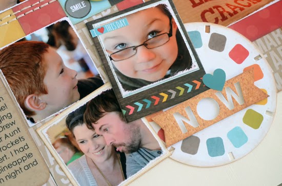
Variation #2 - Instead of stars I used circles as the main embellishment throughout the layout. Here's a closer look at some of them.


Along the strips of squares I used a combination of circle stickers, circles cut from patterned paper, and brads.


On the right page I used a view finder (I used to love those things!) die cut in place of the larger star and added the "now" piece on top of it.

Sketch Week Giveaway

This week the winner of the giveaway will receive their choice of one of my online classes (Sketch Support, 6 x 6 Paper Pads, or Photo Arrangement Replay) or one of the sketch bundle downloads (Halloween, Fall, Christmas, Winter, Love, Spring/Easter, Birthday, Girls/Mother's Day, Boys/Father's Day, 4th of July, Summer, or School) or one of our Sketch ebooks.

To be eligible you can leave a comment each day. If you just comment one day you have one chance, if you comment on two days you have two chances, and if you comment each day you have three chances. (If you comment twice on one day, only the first comment will be eligible for the random drawing.) After Sketch Week is over I'll post the winner of the giveaway on Monday. 

Be sure to check back often:

Tuesday (evening) - to get the information and links to the new November downloads
Wednesday - to see layout #2 for Sketch Week
Friday - to see layout #3 for Sketch Week
Monday - to see who won the download giveaway

Friday, November 8, 2013

Winner, Winner!

Thank you so much to everyone who took the time to leave comments! The winner of the Simple Stories giveaway is...

Andrea Green said...
Fabulous sketch - as always! And LOVE the Simple Stories albums and pages, just getting started with them so this is a great chance to win!!! Thanks!

Andrea, you can email me at allison@scrapbookgeneration.com so we can you get you your album and Pocket Pages! :)

Have a great weekend everyone! 

Tuesday, November 5, 2013

A New Simple Stories Sketch and a Giveaway!

I've got another Life Documented sketch available for download at Simple Stories today! Here's a look at the sketch:


If you want to download the full sketch with measurements and placements be sure to visit the Simple Stories blog and check out my post. You can find the link to download the full sketch right under the picture of the sketch.

Here's a look at my layout based on the sketch:


For the last few layouts that I've created with Simple Stories products, I've been using the Sn@p! Sets. I love the large variety of cards and designs and it's made putting layouts together super easy. I even used the cards for the strips on the left page of my layout. The largest card is 4x6 and those strips are 9" long. To do that I cut two strips and hid the seam behind the hearts.

Simple Stories Giveaway

During the last Sketch Week I did a giveaway for a Simple Stories leather album and some Pocket Pages that went unclaimed. So, today we're going to try that again!

I will be randomly selecting one person to win:


A Simple Stories Album (color and size choice is all yours!) 


I am in love with the Faux Leather Albums and use them myself. The quality of both construction and look is fantastic. I especially love the stitching and metal accents.


The winner will also get Pocket Pages to use in their new album! 

You can see the different designs in the variety pack below (my favorite!)


I personally love the choices in the variety pack but you can also find a design you like (you can click here to see them all) and just get that one design. My favorite things about the Pocket Pages is that they are true to size and they have enough room to add dimensional embellishments.


To be eligible for the giveaway leave a comment on this post AND my post at Simple Stories. Be sure to use the same name on both posts so I know who is who! I'll randomly select one winner and announce them this Friday.

Wednesday, October 23, 2013

Trampoline Witches

Drew and Jackson have always loved taking pictures on the trampoline. They jump and I take pictures and then they giggle at the outcome, them frozen in the air in numerous poses. They stick their legs out, they make faces, they morph into ninjas, it's endless entertainment for them.

The other day they decided to take this trampoline picture taking thing to whole new level, Halloween style.


Hello witches on broom sticks! Who knew that a broom could provide such funny pictures and provide so much laughter? Each time I would take a picture they would yell, "Let me see it!" They were laughing so hard after seeing the pictures that they couldn't jump anymore.

Now that we've done this I'm afraid that the regular trampoline photos won't be as fun. We're going to have to amp it up and come up with more creative ways to take jumping pictures now!

Monday, October 21, 2013

Sketch Week, Recap and Giveaway Winners

I really hope everyone enjoys using this sketch because I sure did!

I always love ending Sketch Week with a quick look at the sketch and all the layouts together. It's always fun to see how the inspiration from one sketch can produce so many different results! 

Scrapbook Generation's Free October Sketch
*Download by clicking here.

 "Jackson And Stacey"


"Stacey Chaos"


"Super Dad"


There are more layouts that you can check out by visiting the links below:

Plus, we had a few people leave links in the comments to layouts that they created based on the free sketch!

Thank you so much to everyone who came to check out the layouts last week and those who left comments! 
The winner of the regular Sketch Week giveaway is:
ConnieC said...Great sketch. I think it's a great idea to have your child do the journaling. I can't wait until my little girl can tell me stuff to add to her layouts.

The winner of the Simple Stories giveaway is:

Shalini said...
I recently discovered Simple stories and fallen in love with the snap series after my visit at the booth at Scrapfest in Mall of America. I have tried tried their Albums yet but that's next on my list. :-) Pick me!

Both winners can email me at allison@scrapbookgeneration.com!

Happy Monday! 


Friday, October 18, 2013

Sketch Week, Day 3

We have reached the last day of Sketch Week! Today I've got another layout to share and the lovely Lynette Jacobs has one you can check out on her blog. Below you can find the link to her blog and other blogs that have created a layout based on the free October sketch.

 
Scrapbook Generation's Free October Sketch
*Download by clicking here.
 
 
 "Super Dad"


Supplies - Cardstock: American Crafts; Patterned paper: Fancy Pants; Alphabet stickers: Fancy Pants; Chipboard alphabets: American Crafts; Embroidery floss: DMC; Ink: Colorbox Fluid Chalk Ink

I think I'm quite predictable when it's comes to one-page sketches! I almost always stretch it into a two-page layout! I tend to use a lot of pictures and just, in general, feel more comfortable with two-page layout design.

Variation #1 - I extended the larger background strip on the sketch to a full 12 x 12" sheet of patterned paper. It is actually placed fairly close to the same place as the sketch, it just happens to stretch across the page more. When using a one-page sketch to create a two-page layout it's all about extending or stretching the elements on the sketch to fit a larger space. 

Variation #2 - Since I was working with a larger space I used a larger strip on the background instead of the 1/4" strip on the sketch. I hand cut a few decorative strips from a piece of patterned paper. 

Variation #3 - I really like the circles on the decorative strip that I cut out so I cut more circles and star to go with the design. 


I used the circles and stars in place of the stars on the sketch. I also added some accent stitching to some of those pieces.


Variation #5 - I extend the photos to fit across the two pages. I didn't change anything about the photos and used the suggested size on the sketch. 

One thing I love about 4 x 3 and 3 x 4 photos is that they work so well with 4 x 6 photos. If you need to use less pictures or want to include a larger photo you can just substitute a 4 x 6 (or 6 x 4) for two 4 x 3 (or 3 x 4). If you want to use more photos or include smaller photos you can substitute two 3 x 4 (or 4 x 3) photos in place of one 6 x 4 (or 4 x 6) photo. 

Variation #6 - I added a small photo mat to the whole photo block. I wanted those photos to stand out against the patterned papers.

Variation #7 - I went with a smaller striped strip along the bottom of the photos and removed the scallop strip. I didn't want to cover up too much of the circle on the bottom so I went with just one, smaller strip. 

In case you missed it, Wednesday's post includes a great giveaway from Simple Stories! I hope everyone has a wonderful weekend and be sure to check back to see who won the giveaways on Monday!

Wednesday, October 16, 2013

Sketch Week, Day 2: with Simple Stories

Today I have a Simple Stories layout and a Simple Stories sponsored giveaway!

Yesterday was download day so if you haven't had a chance yet make sure you go grab the October free sketch at the Scrapbook Generation online store. It's the sketch that I'm using as my starting point for all the layouts this week.

Also, be sure to visit the blog links below to see more Sketch Week layouts!


 Scrapbook Generation's Free October Sketch
*Download by clicking here.


 "Stacey Chaos"


Supplies - Cardstock: Bazzill; Papers, stickers, alphabet stickers: Simple Stories, Sn@P! Everyday; Heart punch: Martha Stewart; Ink: Colorbox Fluid Chalk Ink; Embroidery floss: DMC

For day two of Sketch Week I thought it would be fun to throw my Simple Stories style into the mix. As part of the Simple Stories Life Documented Team, my job is to pair the fun Pocket Pages with traditional scrapbooking. I love this way of scrapbooking! It has some very similar benefits to using sketches, I get pages done quickly while still getting to unleash my creative side.

Variation #1 - I used the one-page sketch for the left side of my layout and then a Simple Stories Pocket Page for the right side. I love stretching one-page sketches into two-page layouts and this approach, using the Pocket Pages, is by far the easiest.

Variation #2 - One the left page I eliminated the background papers and centered the grouping of photos. Here's a closer look:


I didn't have a big reason for eliminating the background paper. I just happened to lay the photos and "smile" card on the paper and liked the way it looked. I liked the white space around the photo block and decided to leave it that way, without those background pieces. It's funny how things like that can just come together. I was just sitting the pictures and card on the paper to get them out of the way!

Variation #3 - I changed the strips below the photo block a little. I extended the striped strip so that it stretches a little longer than the photo block and cut a notch at both ends. Instead of using a scallop strip I used a simple 3/4" strip.

Variation #4 - In place of the star I used a cluster of hearts, cameras, and arrows.


Variation #5 - I added a few stitched lines to two corners of the photos block.

Variation #6 - I replaced the journaling block with the "smile" card and moved my journaling to the right page.


Variation #7 - On the right page I used a Pocket Page (Design 2) made up of 4x6 pockets. Here's a closer look at the details on the right page:


Anyone who has visited my blog before knows that I love hand stitching. I love finding ways to incorporate stitching on the Sn@p! cards and do it often! I added a simple stitched border to the heart on the 3x4 card. 


I saw this 4x6 card and instantly knew that I wanted to add some small (1") pictures to it. Usually I don't work with pictures that small but I thought it would be a cute addition to the page. Most of the pictures I used on this layout are not the best quality (a big reason for why I switched them to black and white) so I had a large selection of photos that I could shrink down and use there. With them being so small the quality isn't as noticeable.


On this card I added a photo to the Polaroid and the small heart stickers with the stitched line through it.

Simple Stories Giveaway!

Today I have a special Simple Stories sponsored giveaway! I will be randomly selecting one person to win:

A Simple Stories Album (color and size choice is all yours!)


I am in love with the Faux Leather Albums and use them myself. The quality of both construction and look is fantastic. I especially love the stitching and metal accents.

The winner will also get Pocket Pages to use in their new album! 

You can see the different designs in the variety pack below (my favorite!)


I personally love the choices in the variety pack but you can also find a design you like (you can click here to see them all) and just get that one design. My favorite things about the Pocket Pages is that they are true to size and they have enough room to add dimensional embellishments. This girl loves her foam adhesive!

To be eligible for the Simple Stories giveaway, leave a comment on this post. I will randomly select a winner and announce who that is on Monday, the same day I announce the usual Sketch Week giveaways.